
Built Responsively
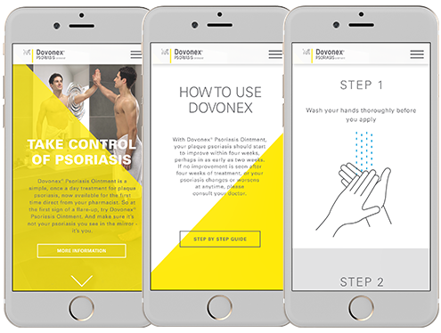
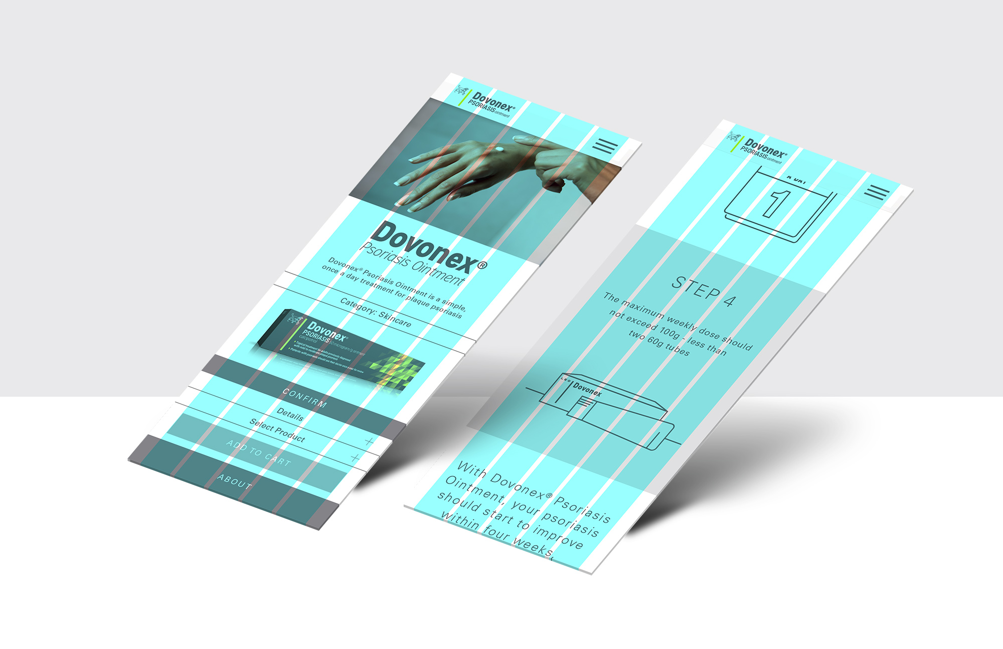
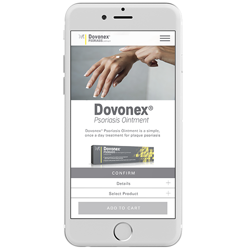
Controls are placed lower on the screen to ease navigation on mobile devices. Each step in the user journey process features a button to prevent mistakes. The entire mobile site is focused on a seamless user experience.
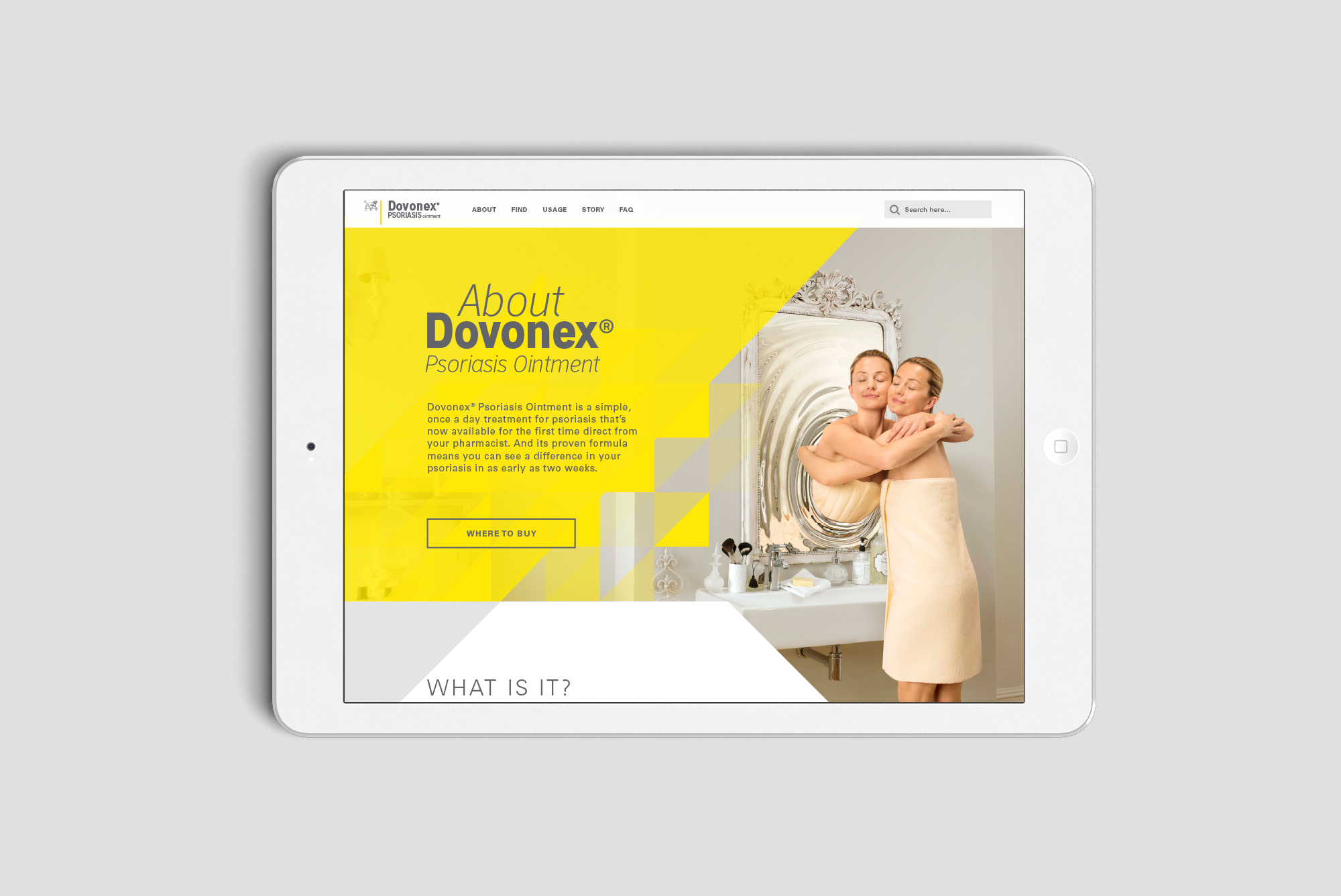
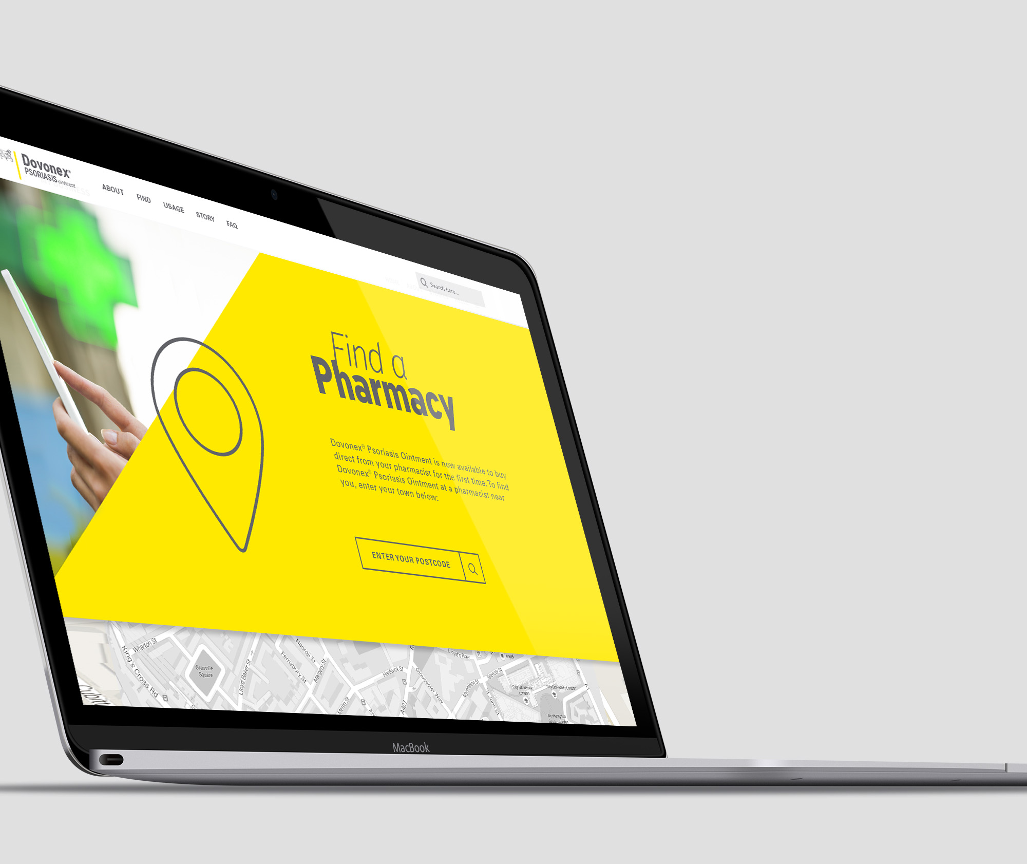
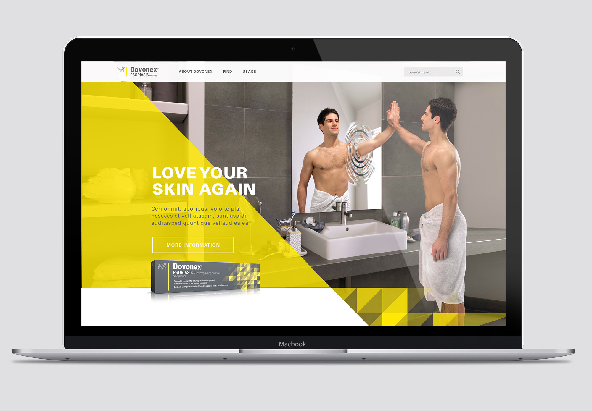
Visit DovonexPerfect On All Devices
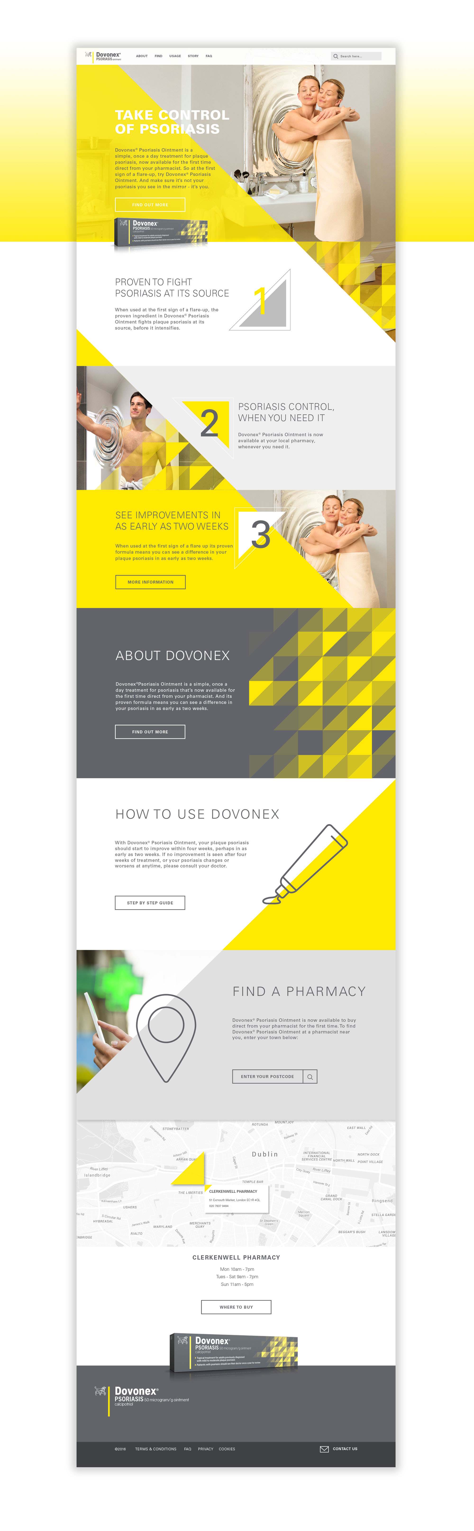
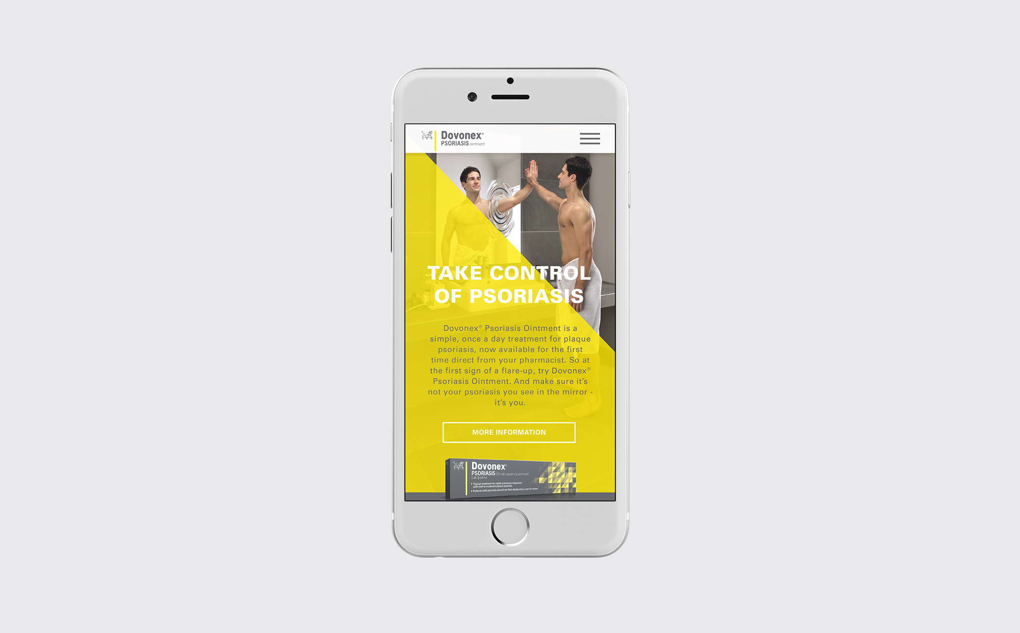
The website design was to provide an experience which links directly to the Dovonex identity and brand campaign at all times. The website opens with hero imagery of the with the man or woman campaign image transitioning between one or the other. The site’s structure is flexible and adapts to scale down smoothly for ease of use with mobile and tablet devices!
View the Dovonex Site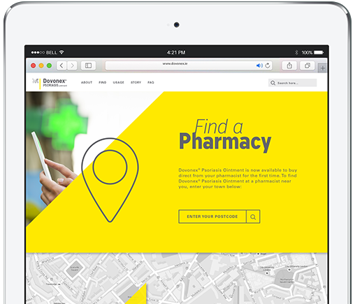
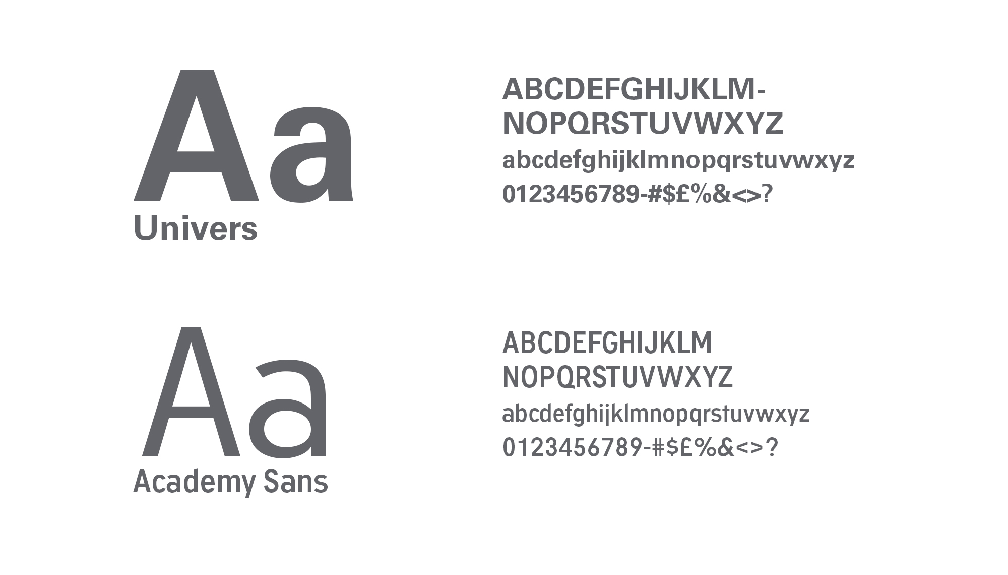
TYPOGRAPHY
The typography of Academy Sans and Univers are both sans serif faces and are derived from the LEO Corporate brand.
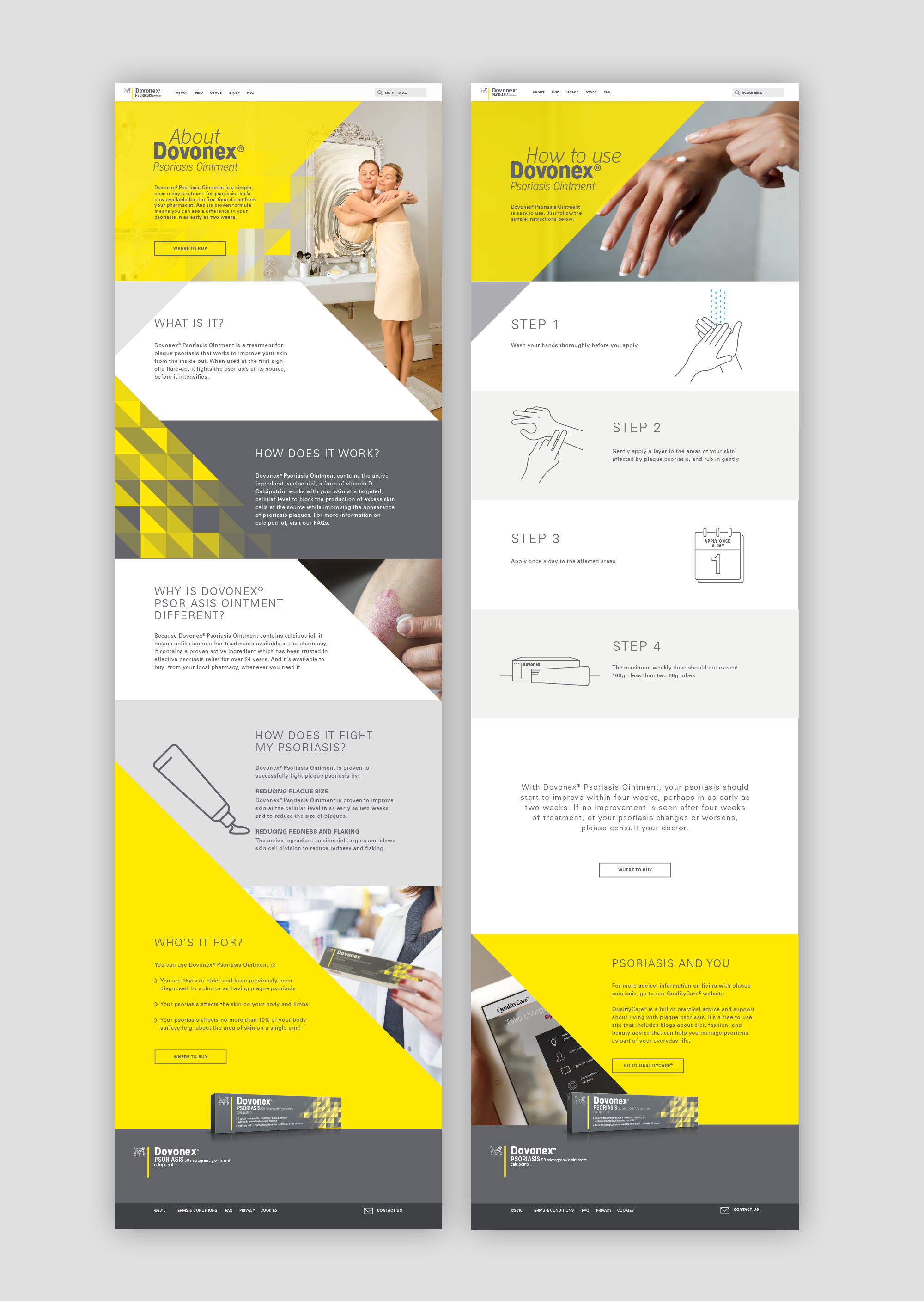
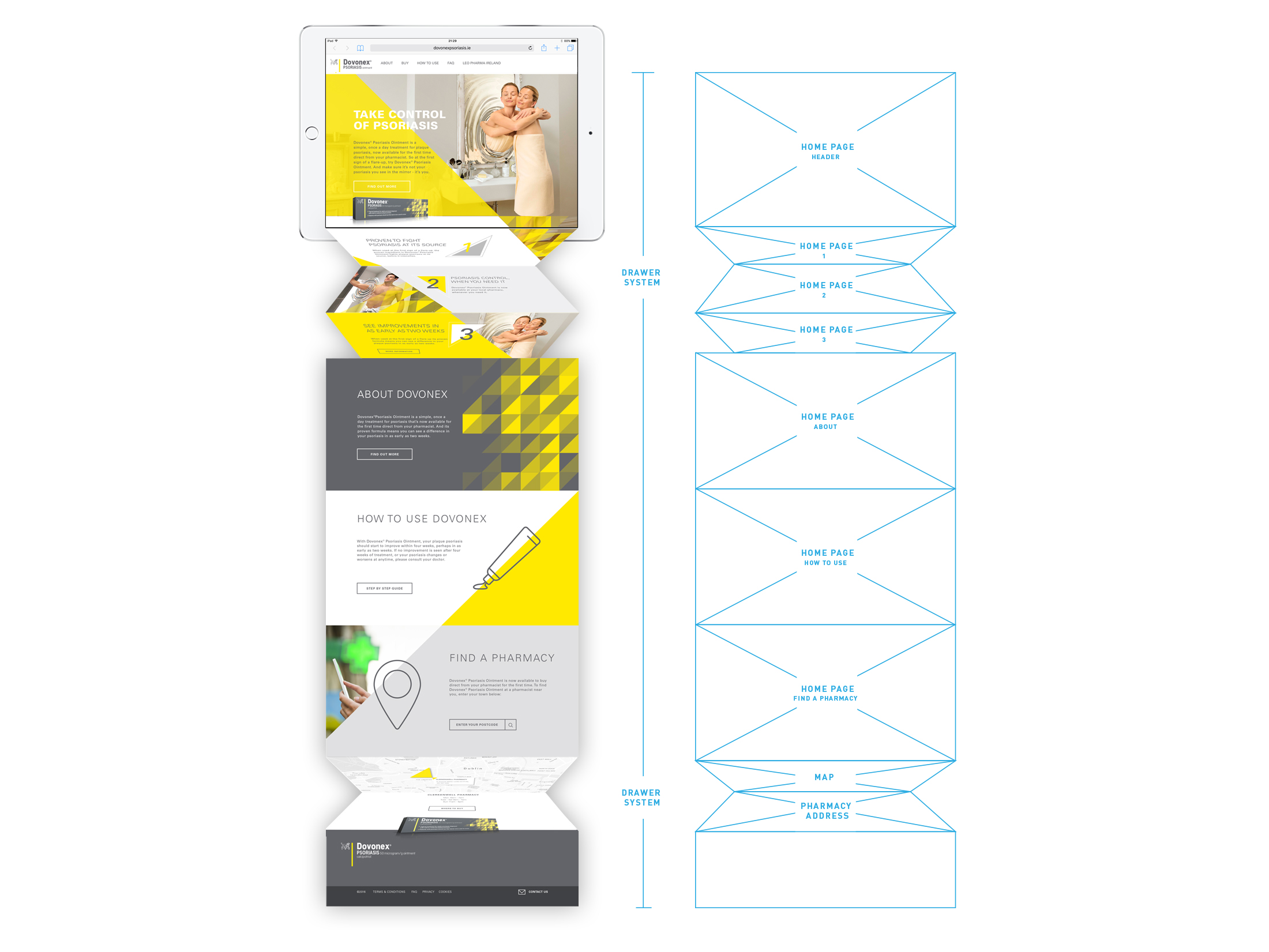
PAGE FLOW & DESIGN
The initial concepts for the site began by sketching a drawer system that highlighted the product categories and sections: 123, About, How to use and Find a Pharmacy. This would allow us to improve the user experience by easily organizing a large amount of content in a digestible manner.
The page flow is built on smooth movement. One click on the homepage pushes the page down to reveal the section pages. Sliders slip in under campaign to reveal key details. The entire site is tailored to the geometric brand identity design element. .
MOBILE DESIGN
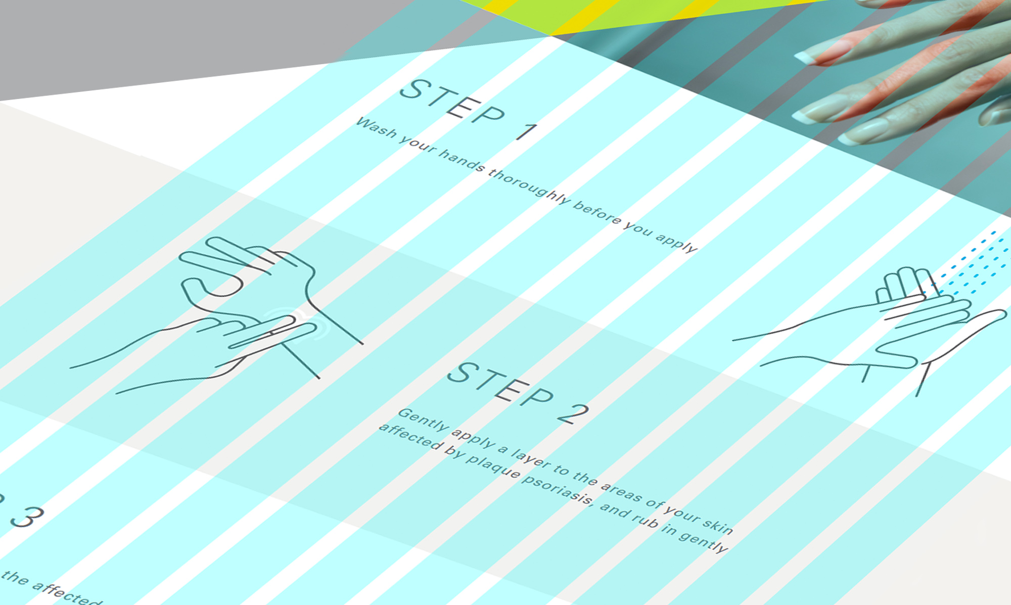
The site was designed to be simple to use on any digital platform. Information is concise, quickly palatable, and presented with smooth scrolling pages. The focus is kept on the product, where it belongs.
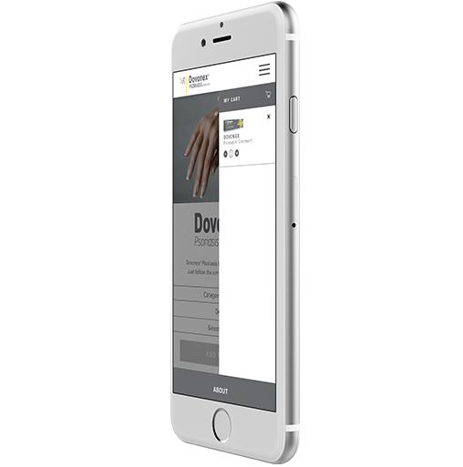
Mobile Shopping
The mobile buttons are clear and concise for the user to purchase the items Shopping with Dovonex is a guided affair. Animation ushers the customer through each step in the experience, with product information and images. Everything is designed to mimic a real-life retail experience as close as possible.
Mobile SiteMobile Checkout
The cart slides out from the right, and smoothly expands and contracts. The product selected and the quantities for each are easily adjustable within the cart.
Checkout