Scope
- Brand Identity
- Print Materials
- Creative Direction
- Advertising Campaign
- Digital Design
Project Overview
ACare is patient support program from Abbott which specialises in five key therapy areas. The identity involved creating uniformed identity for the ACare overall brand and therapy areas as the previous therapy area identities all had separate identities which a made a disjointed brand. So a blank canvas was given to design the identity apart from the existing Acare logo which had to remain.

Logo
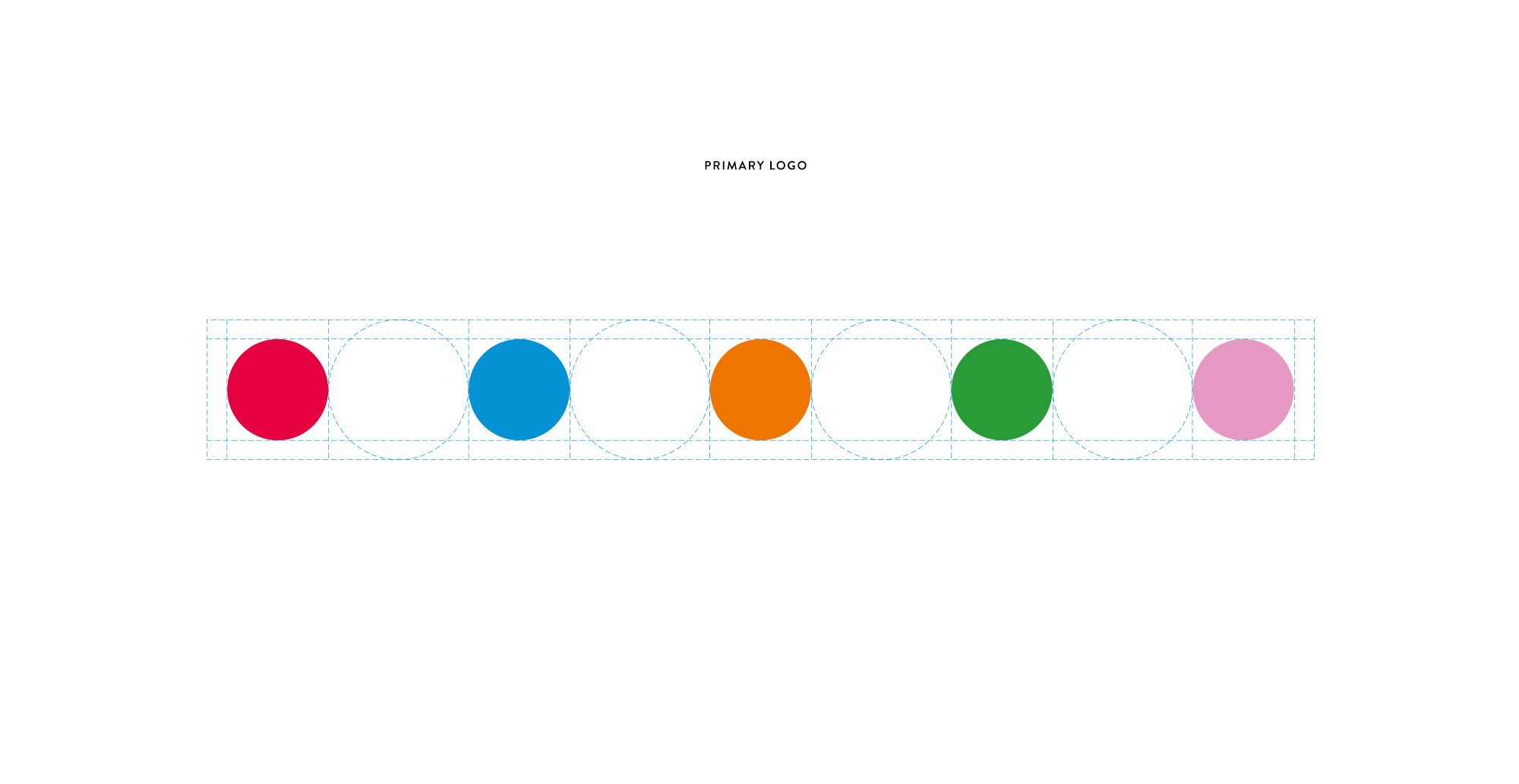
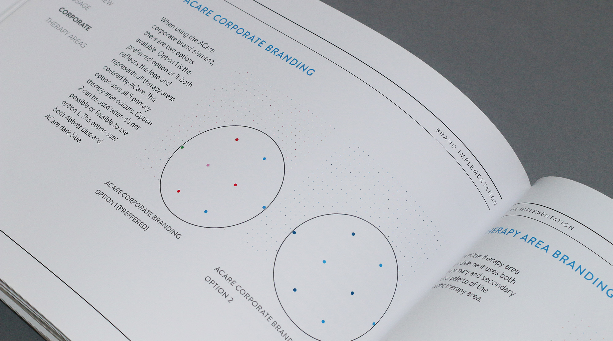
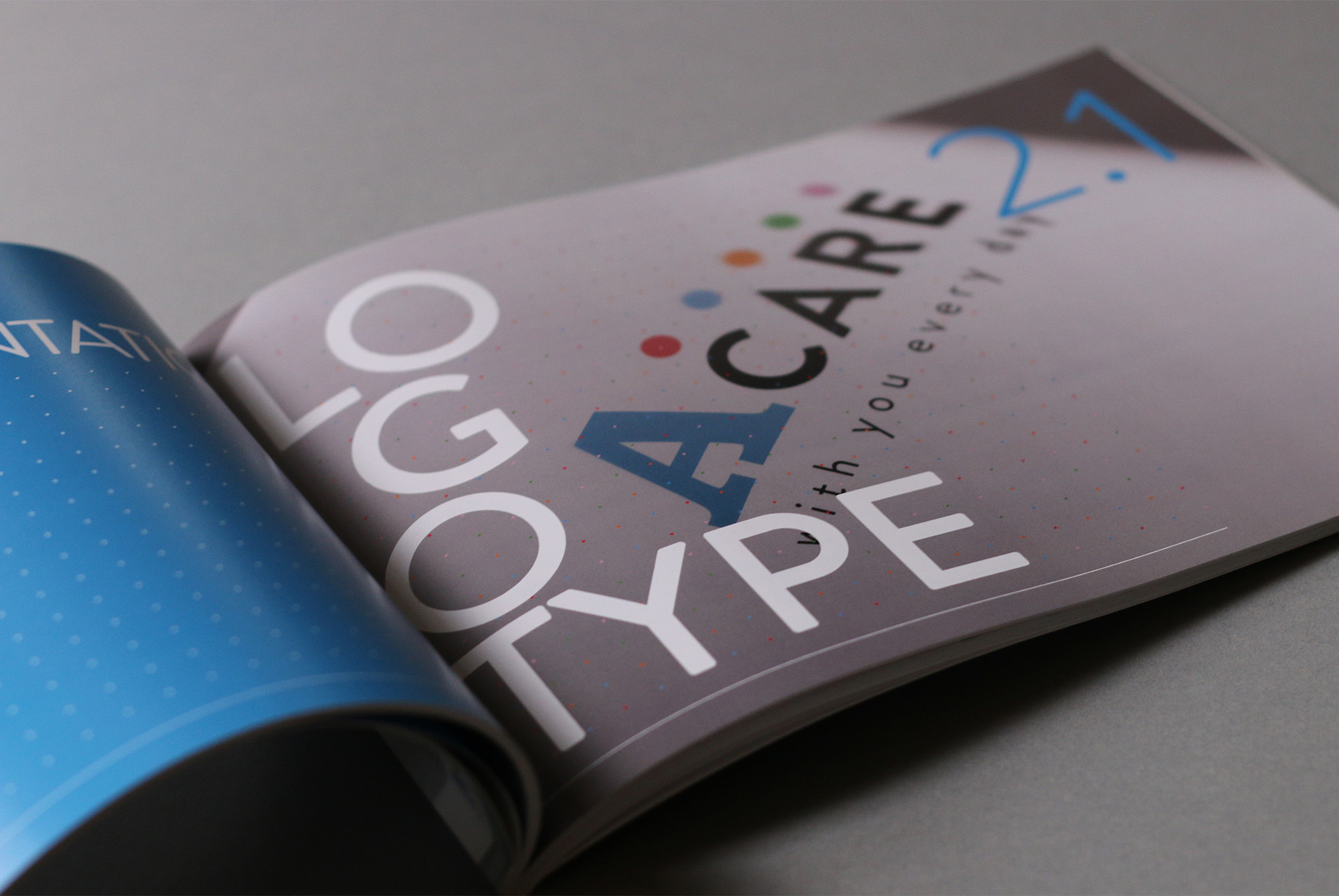
The ACare logo was the only element which had to remain from the previous identity. However by using the coloured circles together on their own made for an exciting logo alternative when possible. The white logo ‘tab’ was also created for when the logo was to be placed on busy photographic backgrounds for example using the same rounded corner size derived from the Abbott A logo.

Brand Element
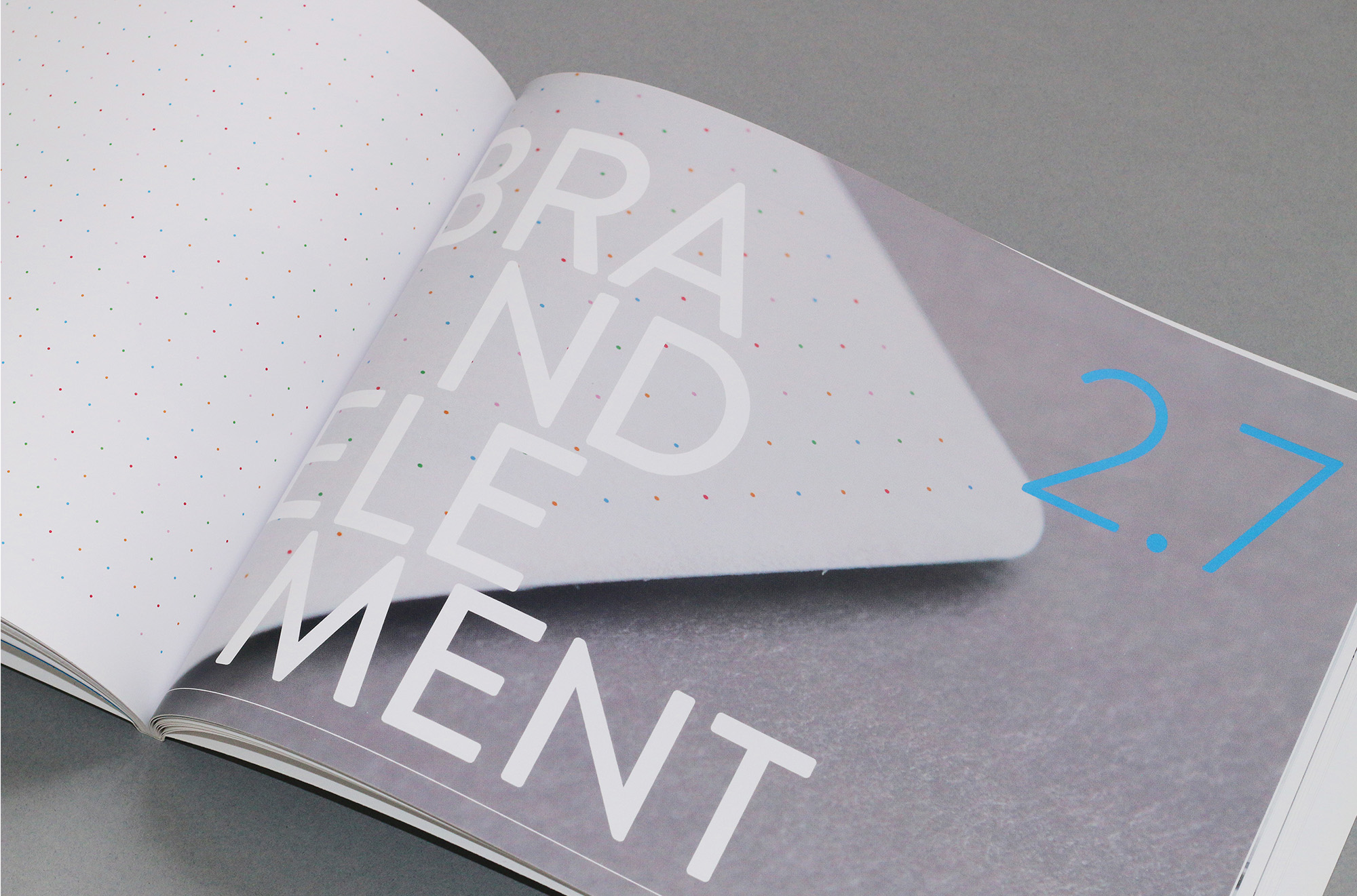
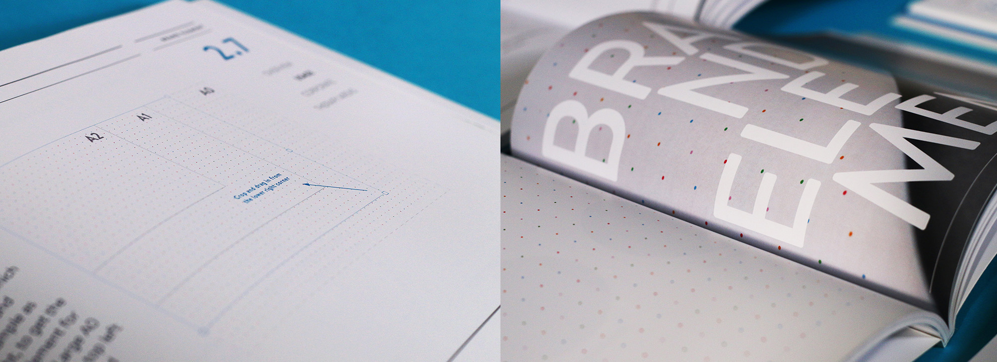
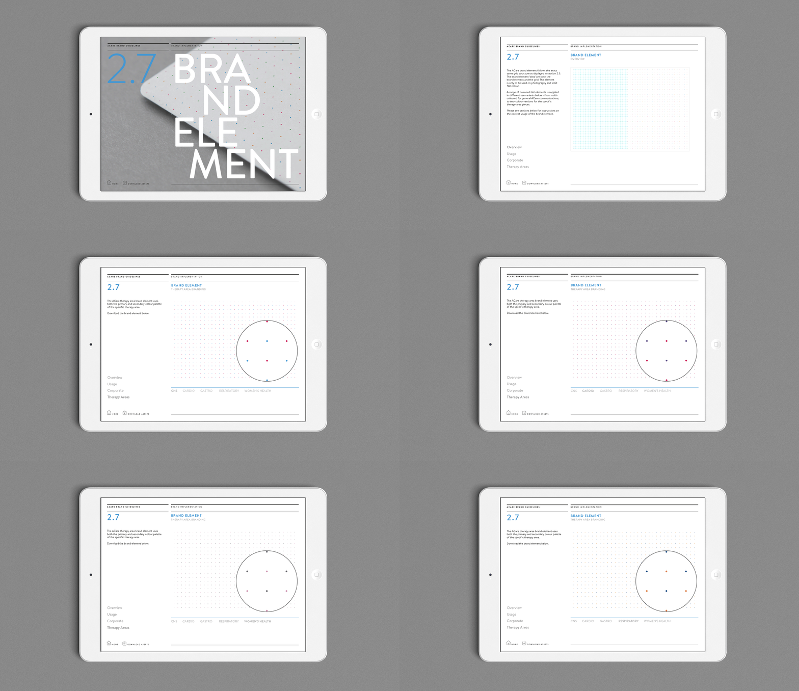
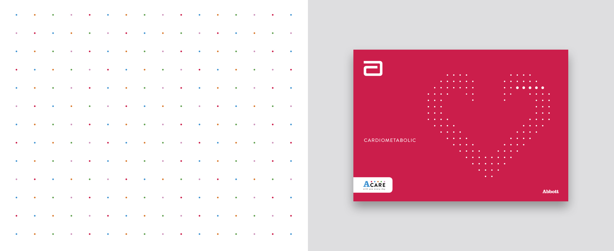
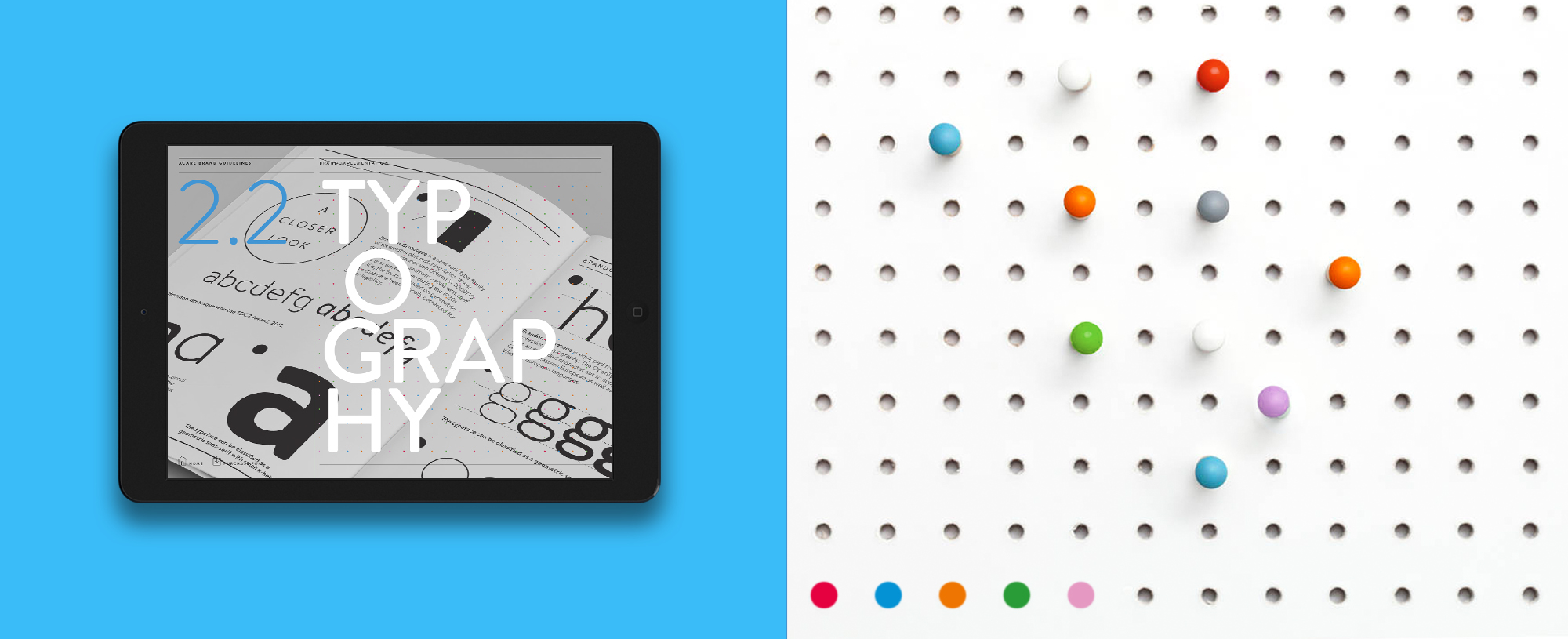
The brand element ‘dots’ are both the brand element and the grid. The element is only to be used on photography and solid flat colour. A range of coloured dot elements is supplied in different size variants as shown – from multicoloured for general ACare communications, to two-colour versions for the specific therapy area pieces.

Typography
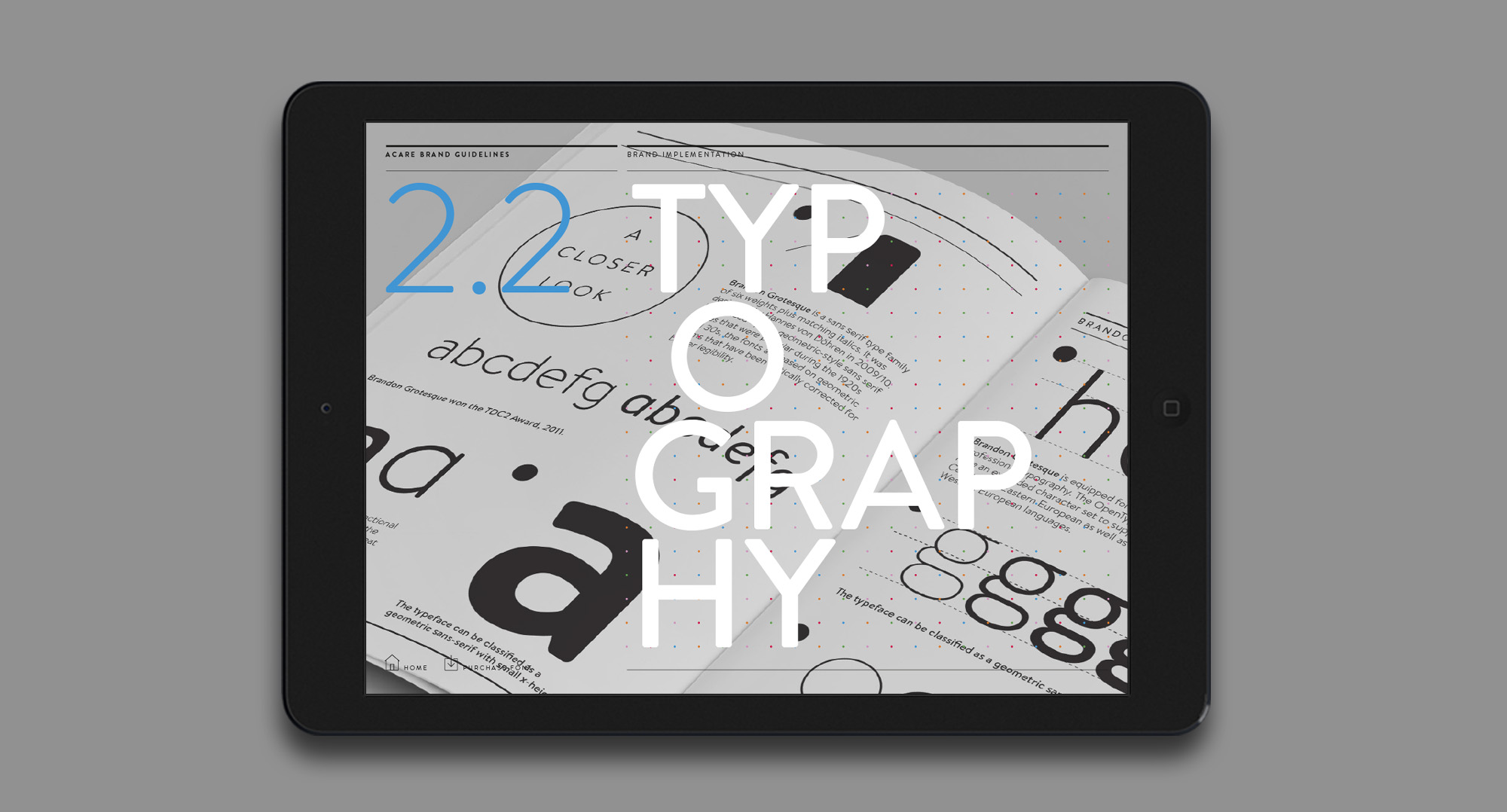
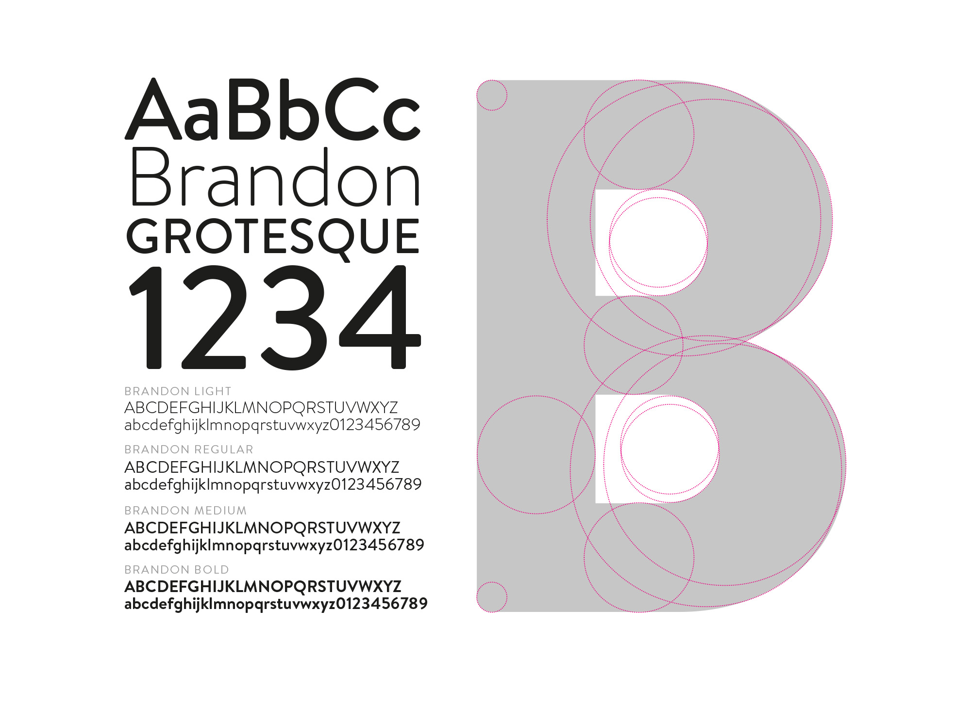
The ACare identity is defined by strong typographic style and expression. The typographic principles are based on function, format and purpose. They are designed to maintain a distinct look and feel across all media. Brandon is Abbott’s sans-serif typeface. Its geometric style and functional, yet approachable, design complements ACare’s brand values.
.
Colour
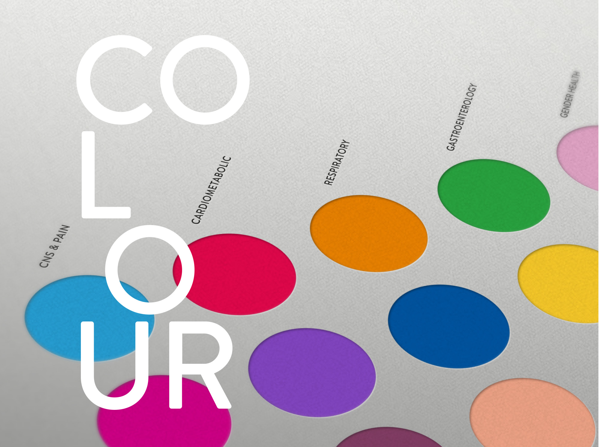
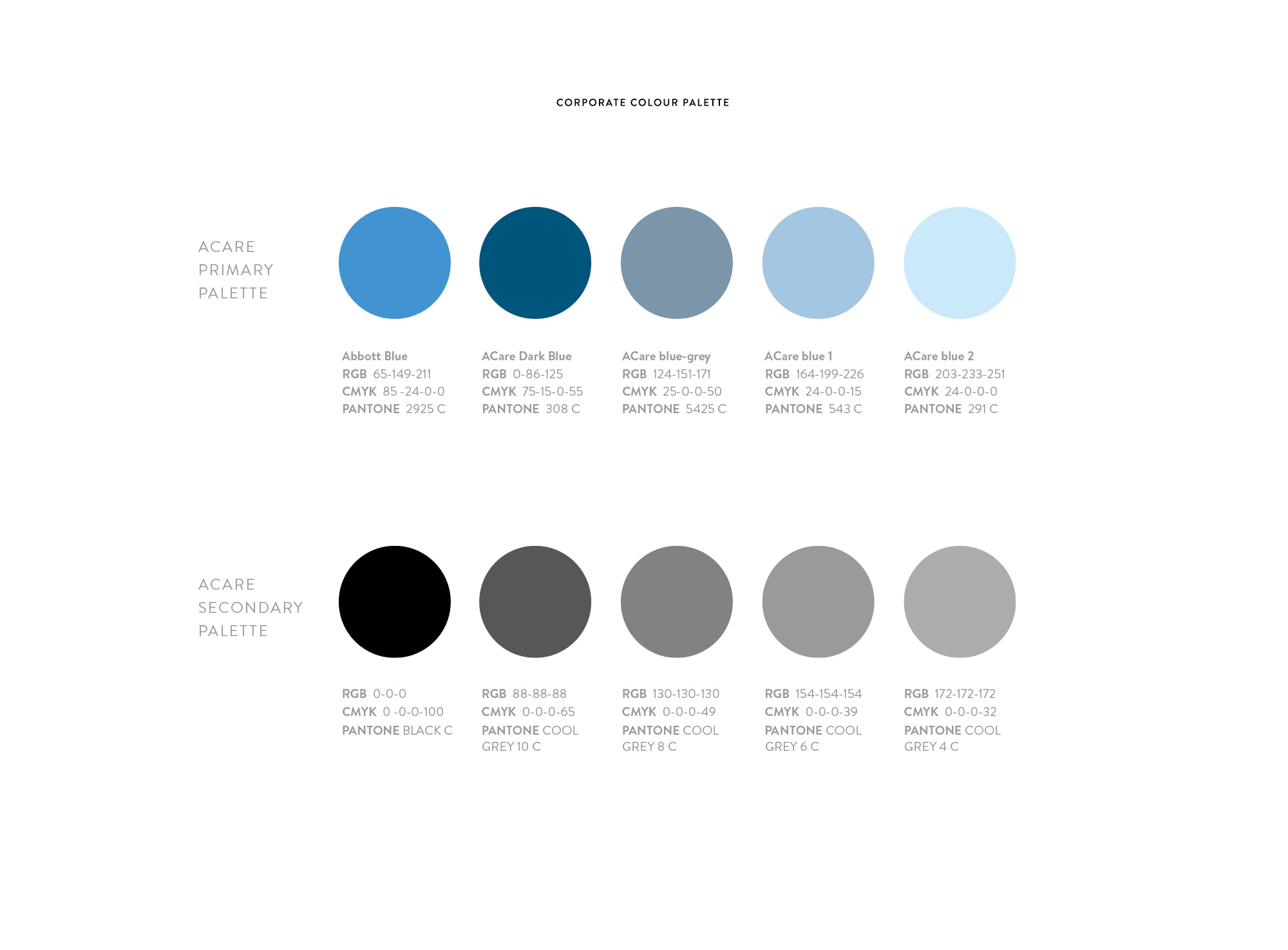
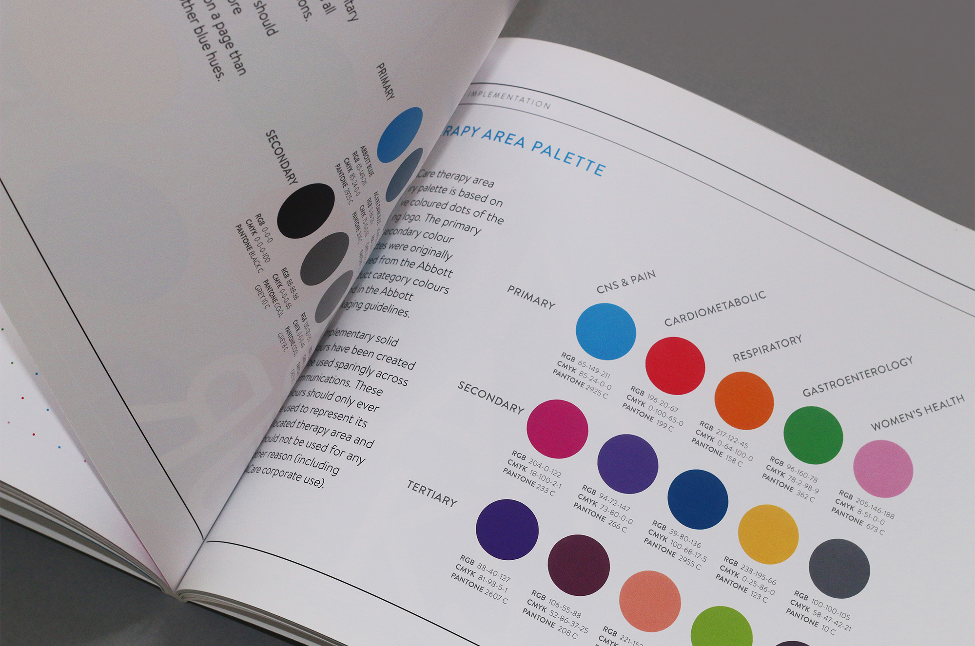
The existing logo is the starting point for both the ACare palette and the Therapy Area palette. Using a combination of blue hues, we give the Abbott blue a selection of complementary colours for use across all ACare communications. The Abbott blue should always have more prominence on a page than any of the other blue hues. The ACare therapy area primary palette is based on the five coloured dots of the existing logo. The primary and secondary colour palettes were originally derived from the Abbott product category colours found in the Abbott packaging guidelines
.
Icons
In order to reflect the brand concept, specific therapy area icon markers have been created, which complement our brand element and follow the same grid structure. These markers connect, and work in harmony with, the brand element. The icons can also be reduced in size, and are placed in the same specific therapy area-coloured circle. They should be used across communications to define each therapy area.
.

CNS & Pain Icon Design
Cardiometabolic Icon Design
Gastroenterology Icon Design
Respiratory Icon Design
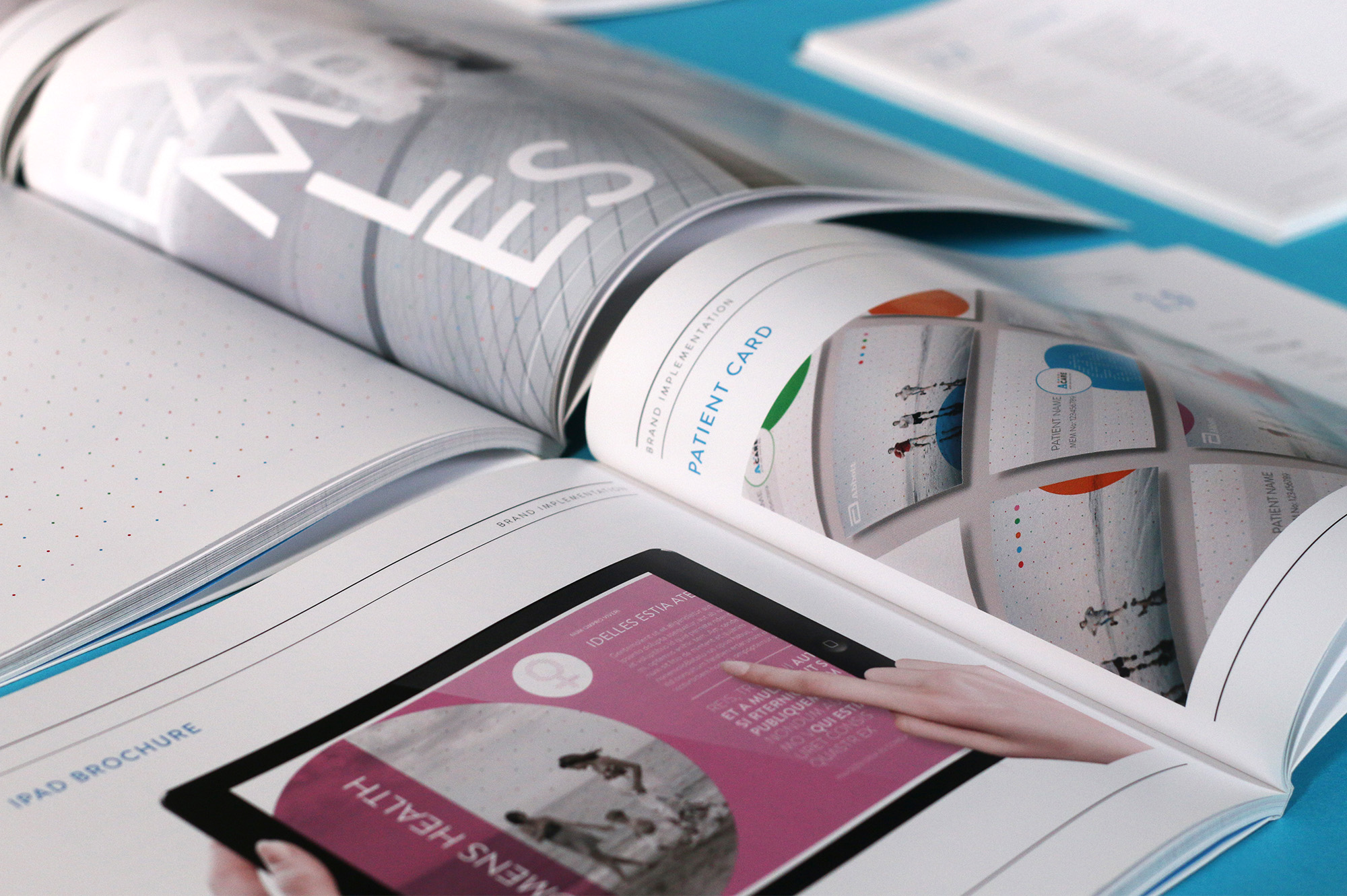
Business Cards & Patient Cards
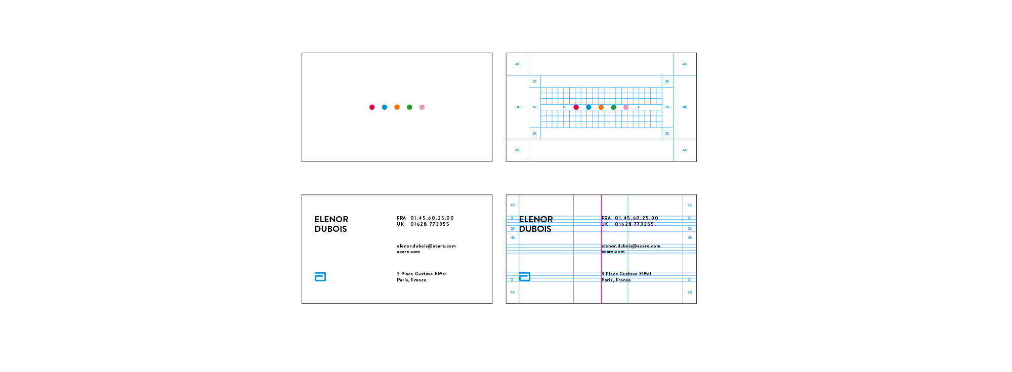
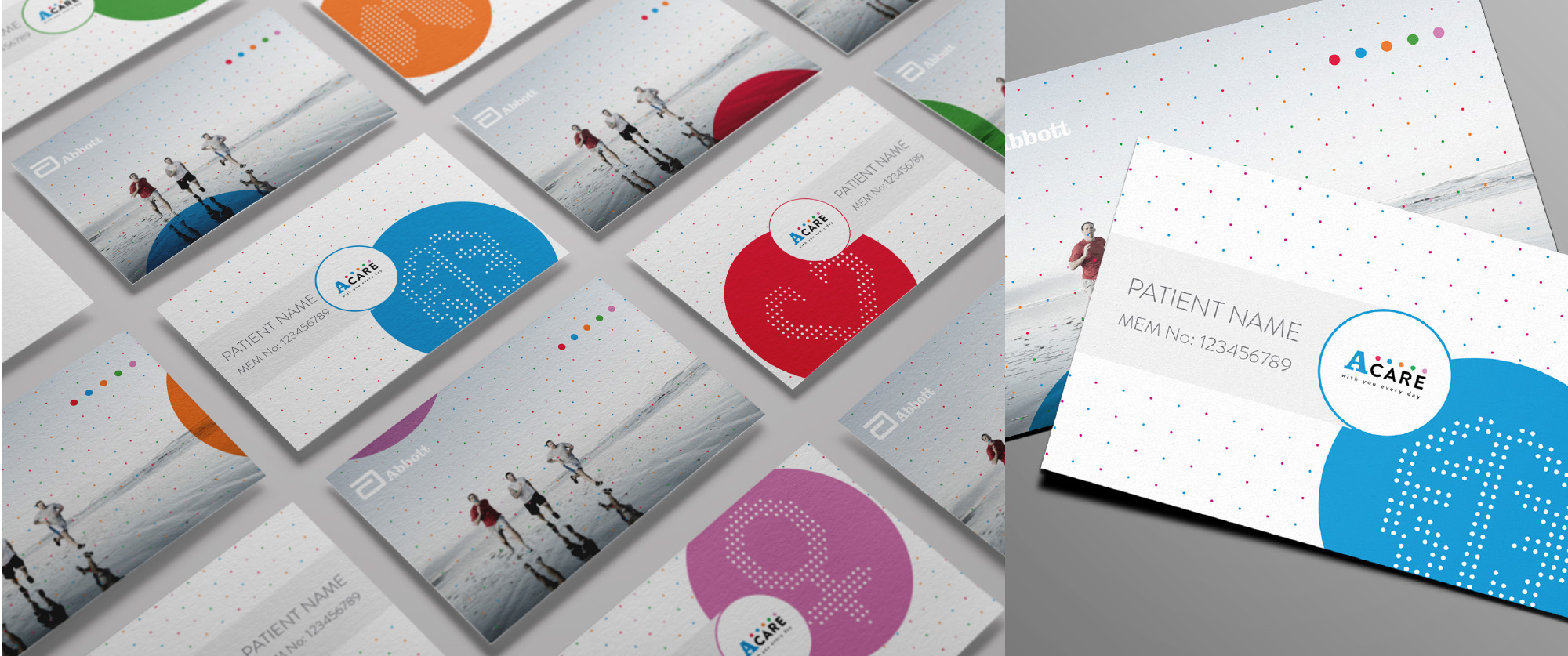
A layer of Abott blue Mohawk paper were compressed between two outer layers of matte white stock for the business card. All spacing on the face of the card is based on the height of the logo, which is proportional to its size. The spacing on the back uses the cap height of the contact information on the right side of the card.


ACARE Brand Guidelines
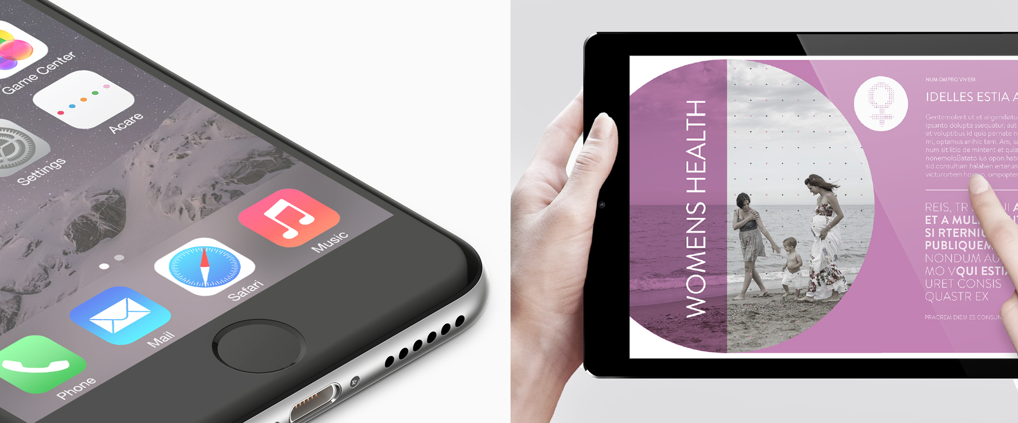
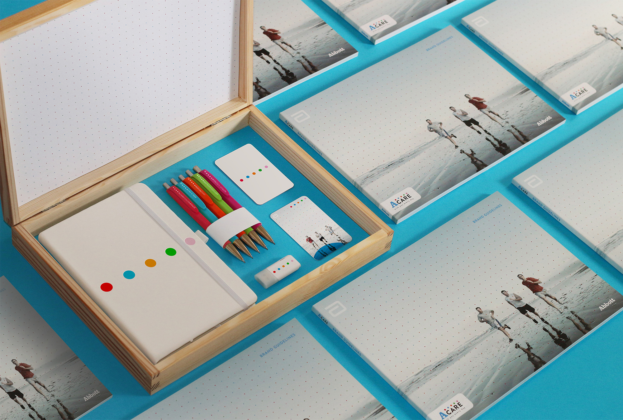
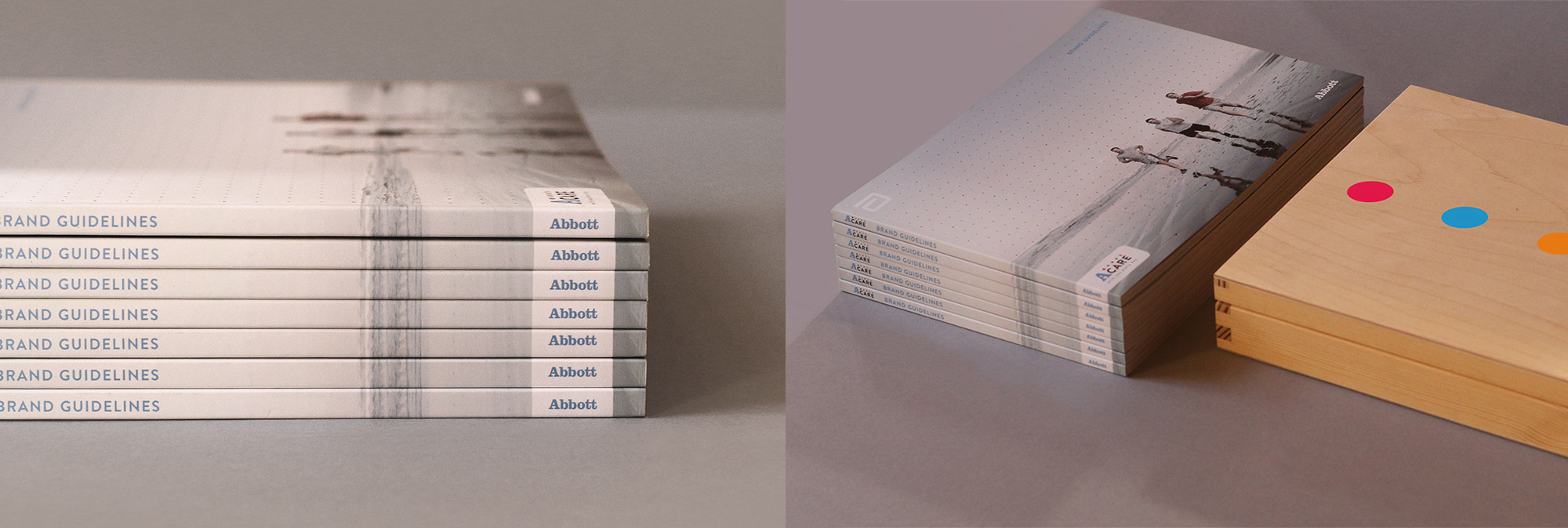
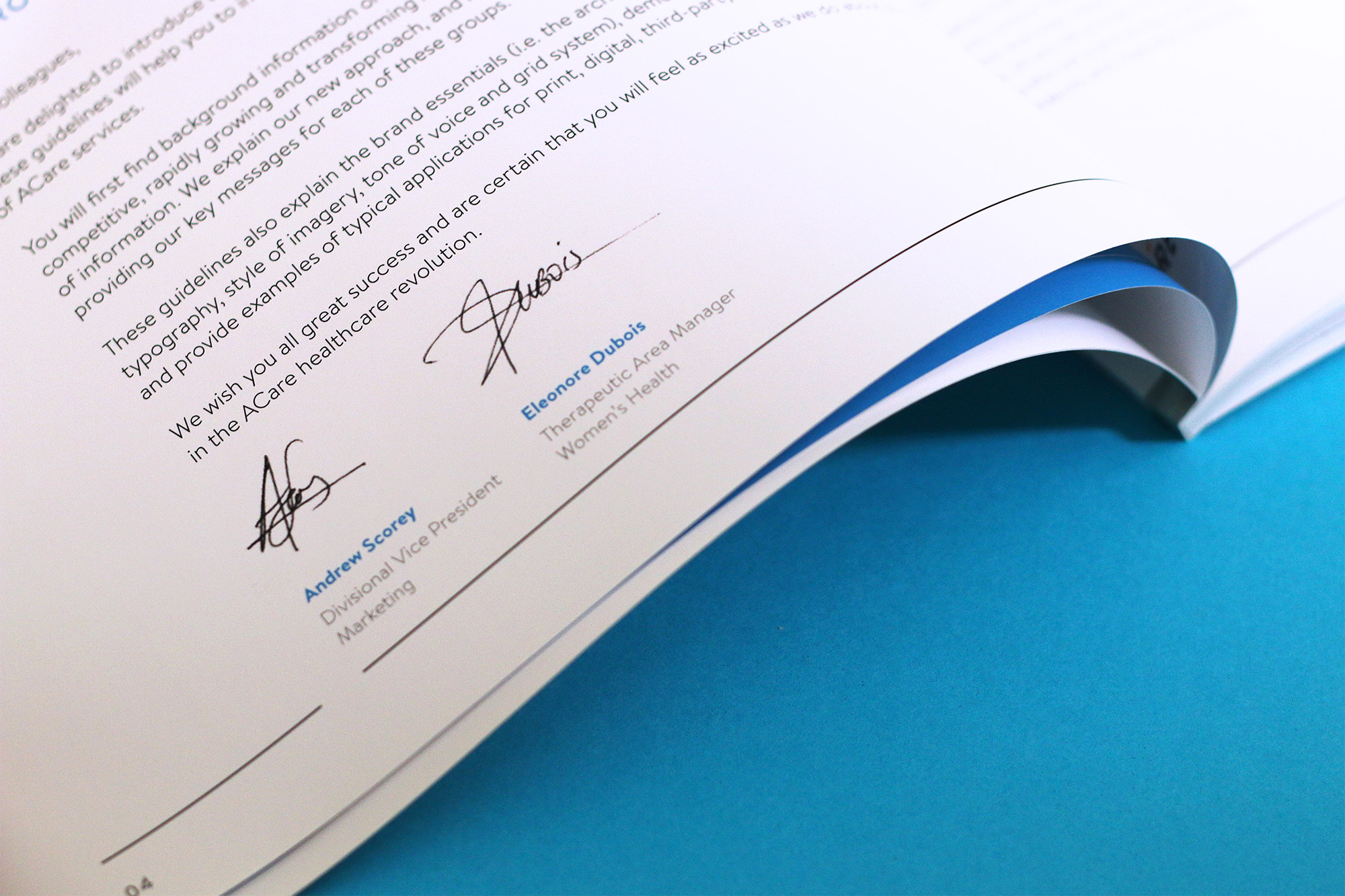
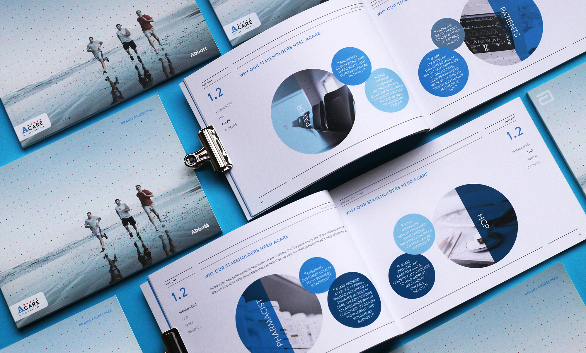
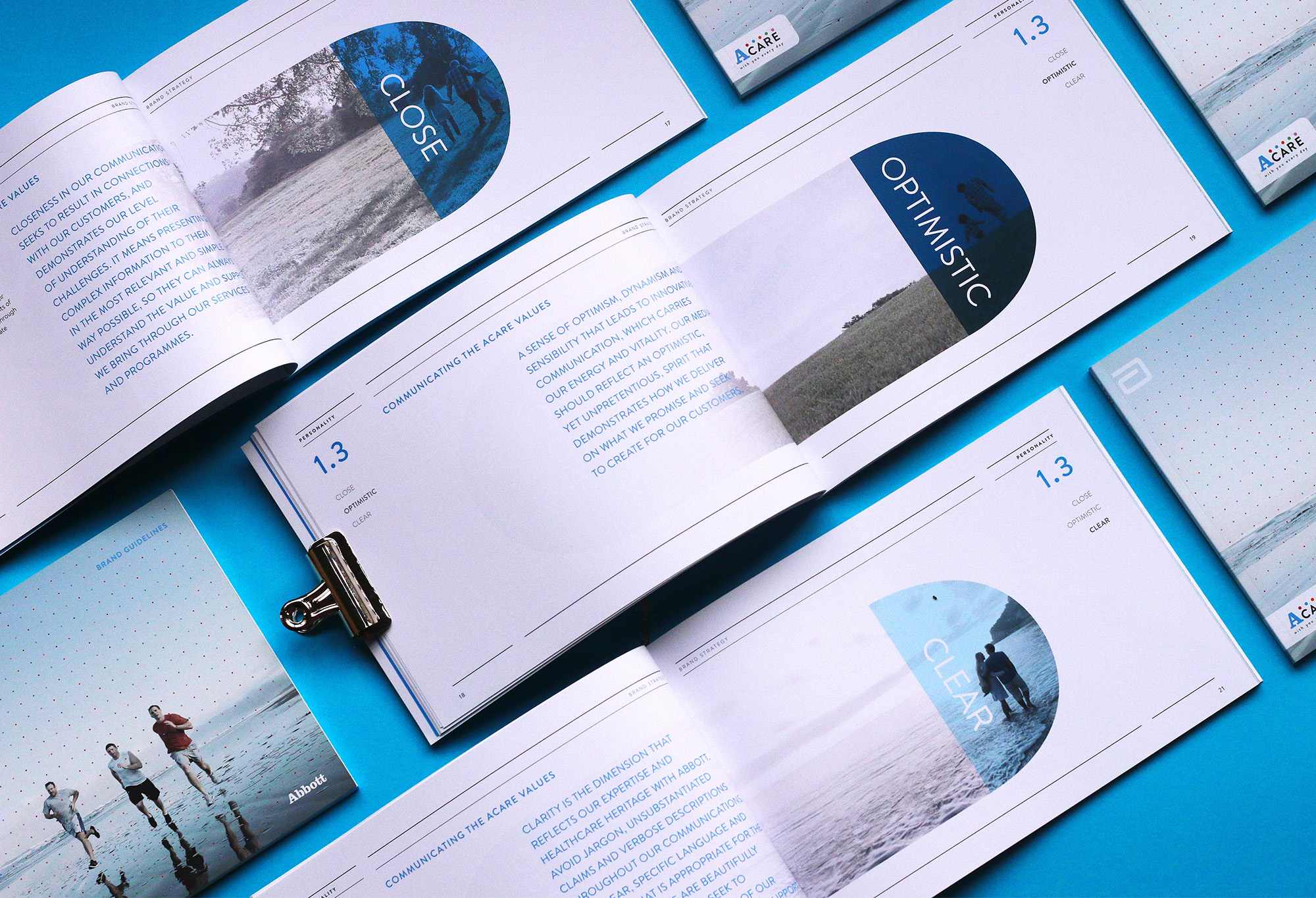
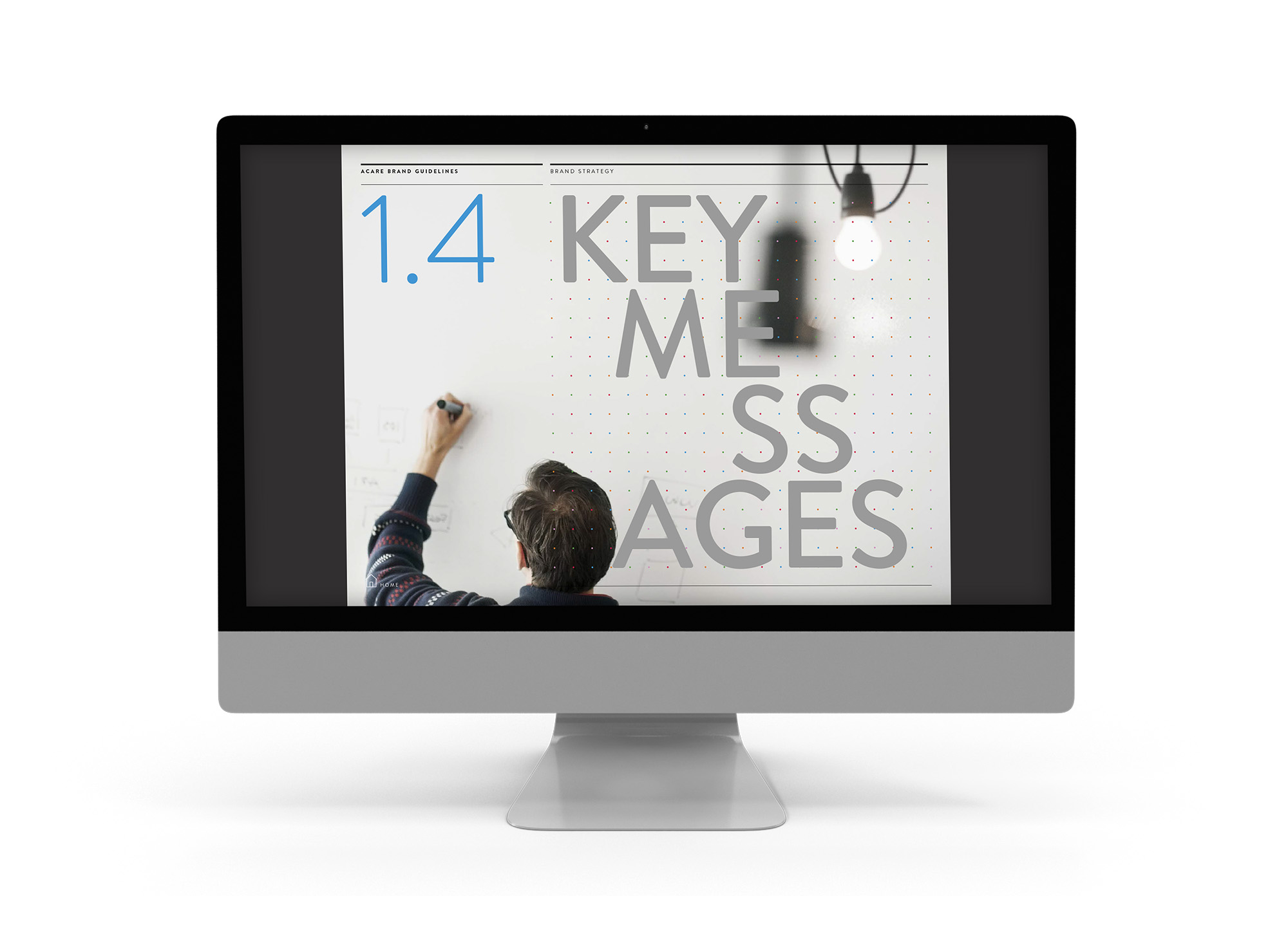
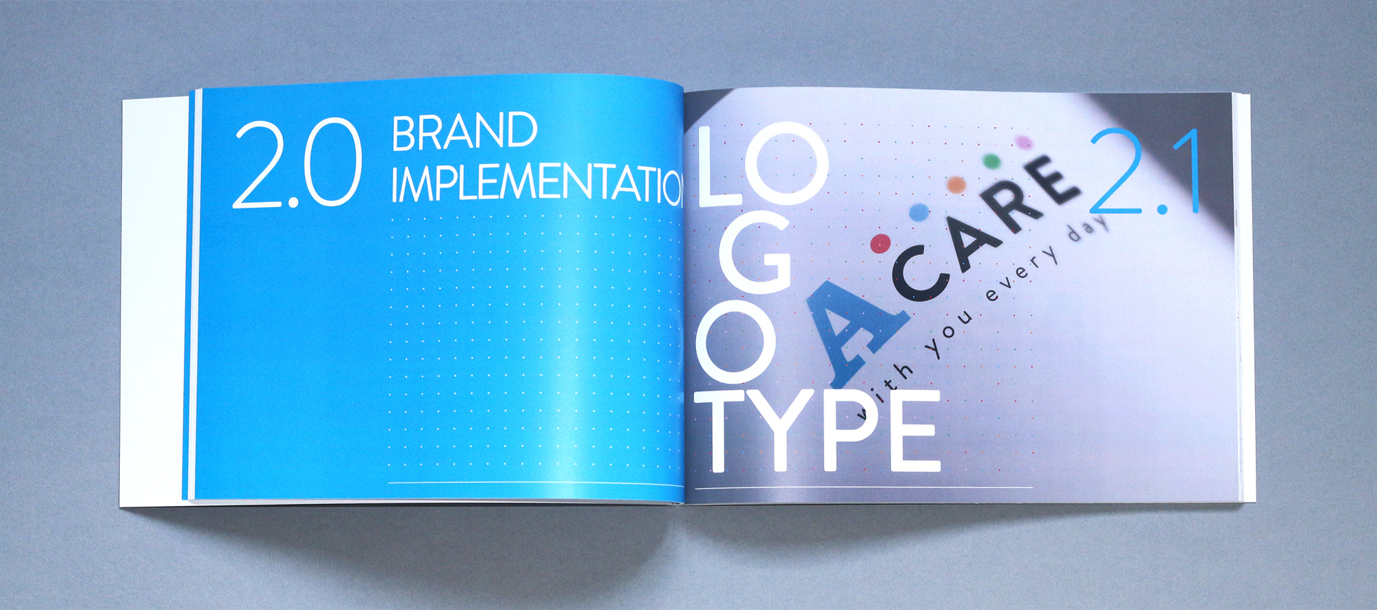
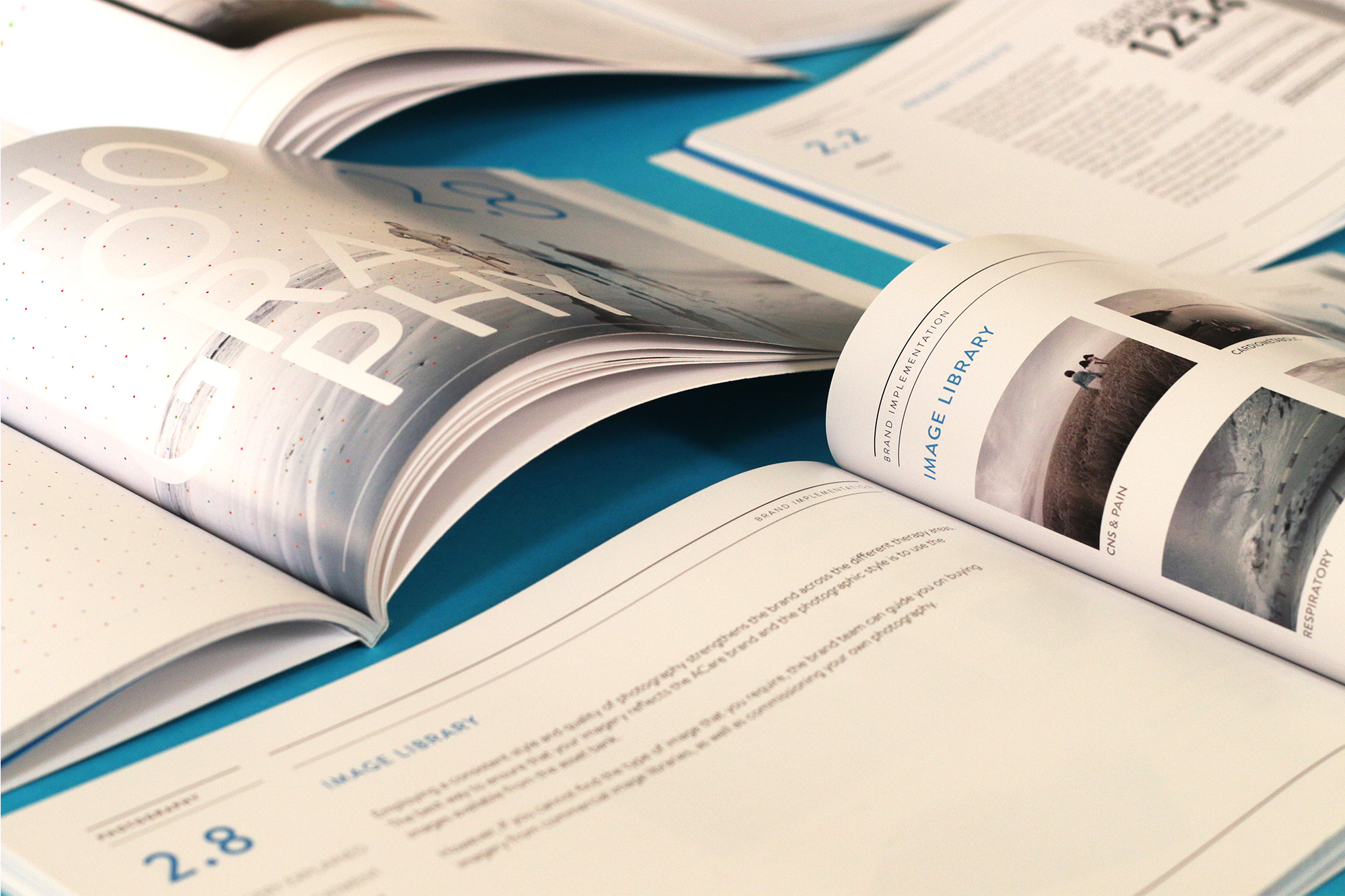
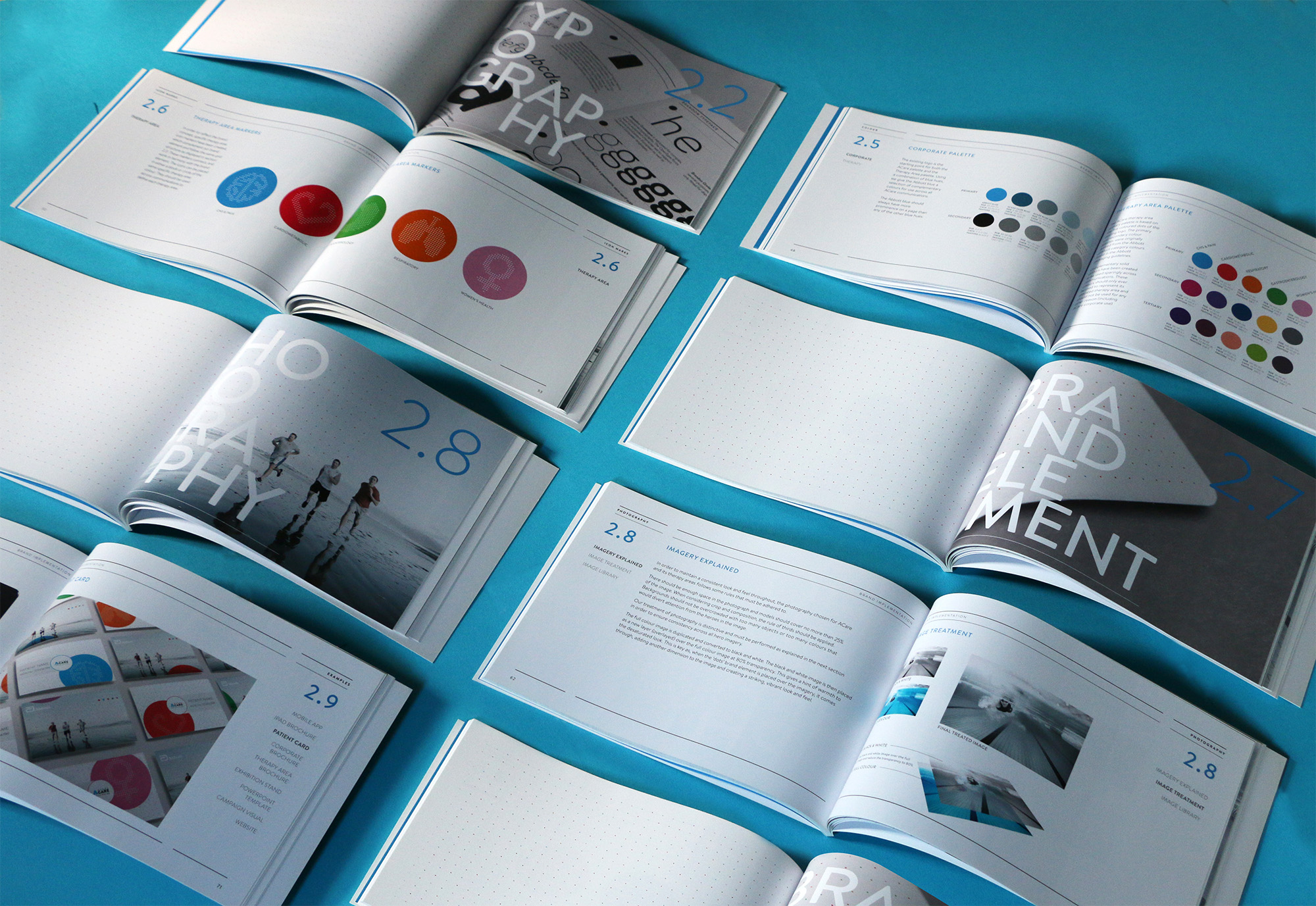
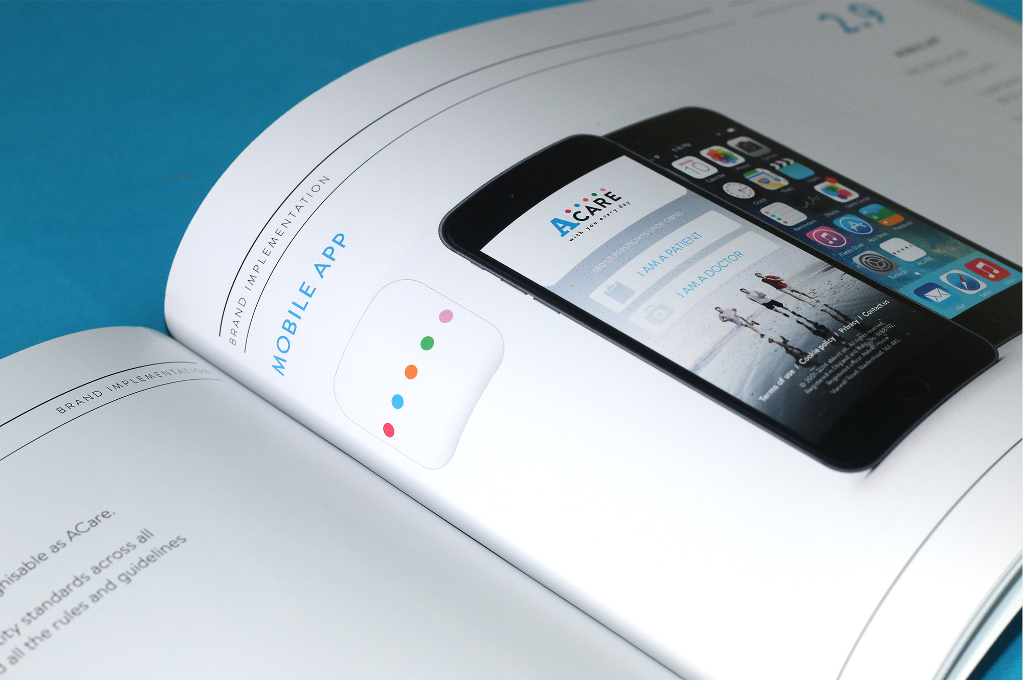
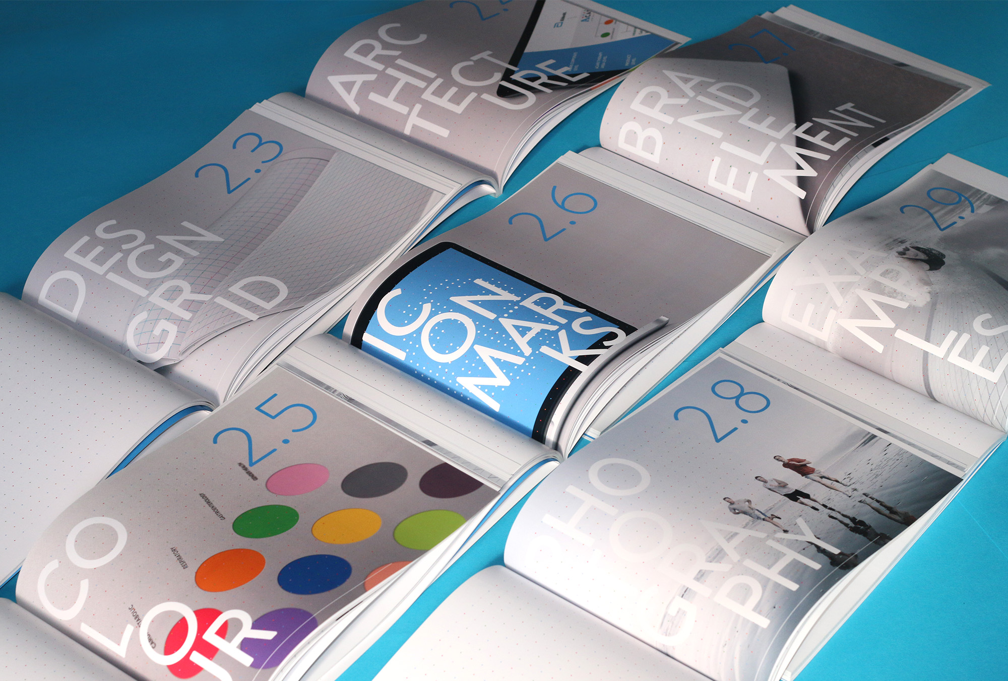
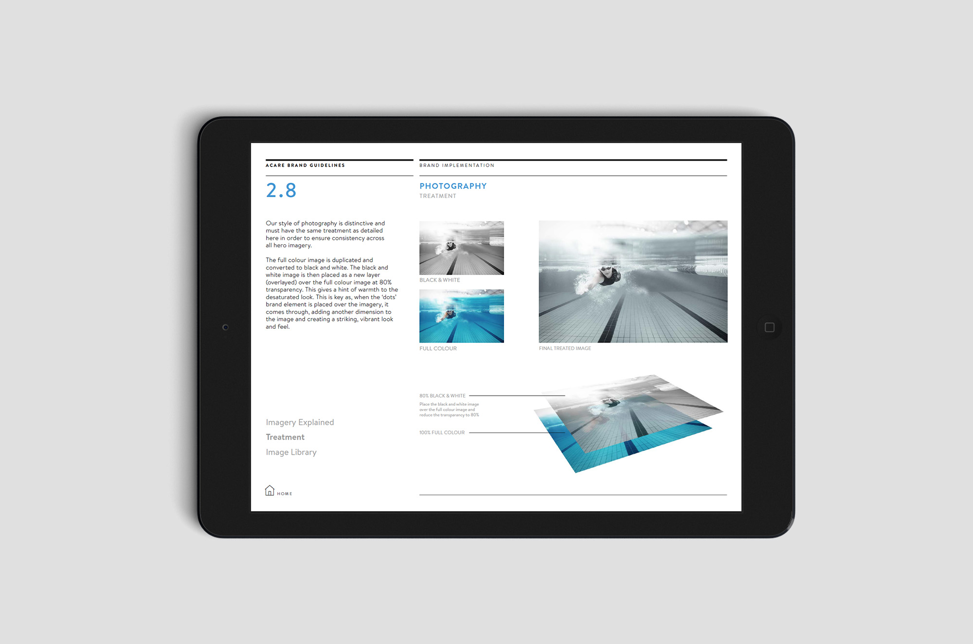
Once the identity was ready to roll out a set of Brand Guidelines were created in both an online digital format as well as a printed version to be kept safe at hand and to refer to at any time. The digital version was created as a main hub for all things ACare and a downloadable asset templates and artwork files were available at the click of a button.
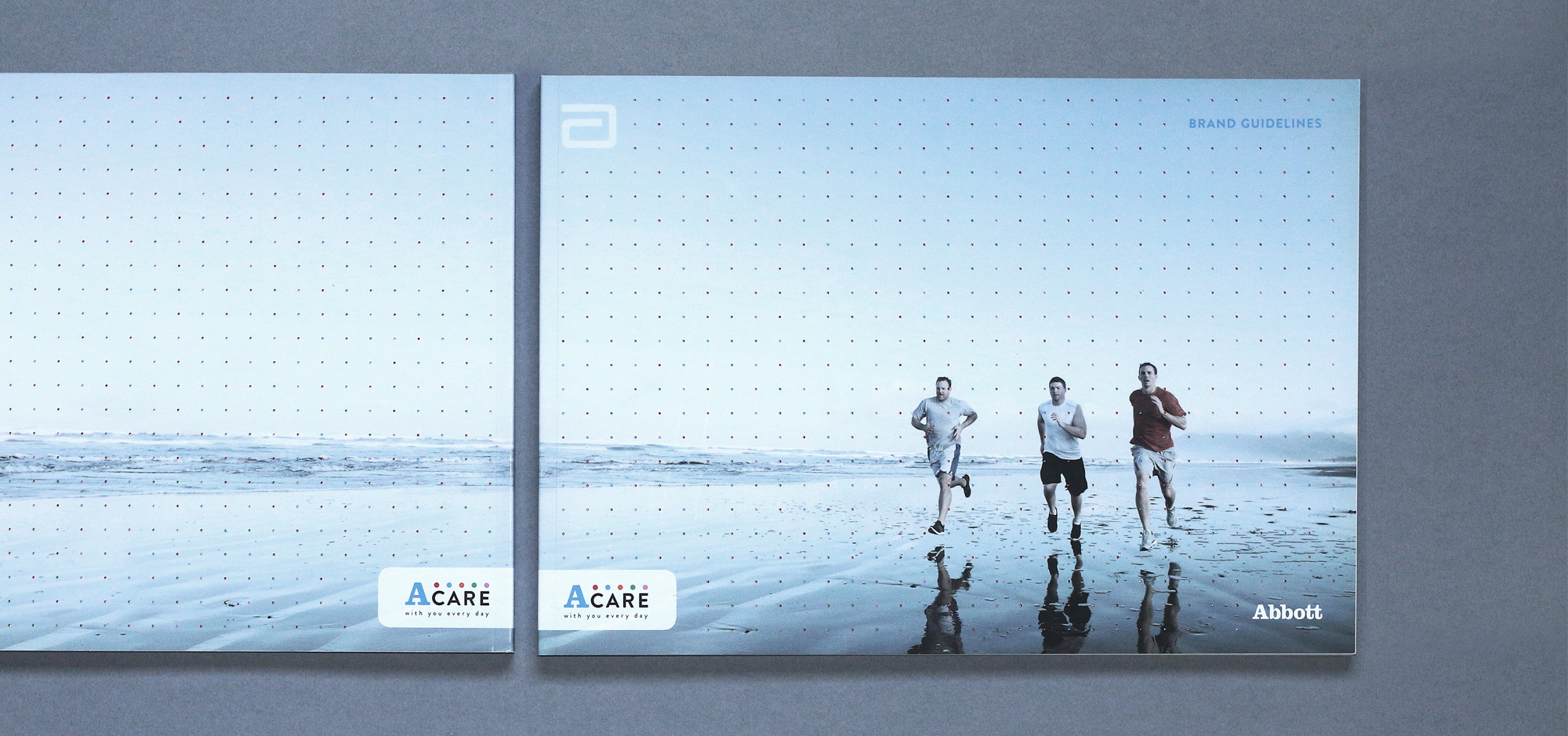
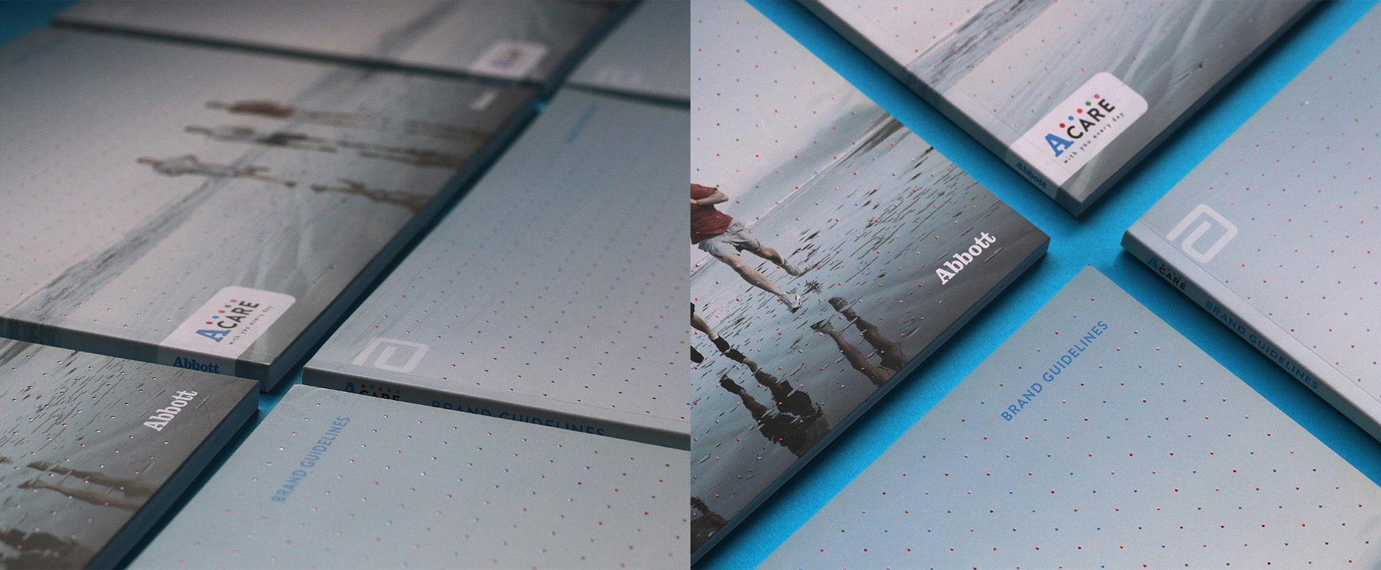
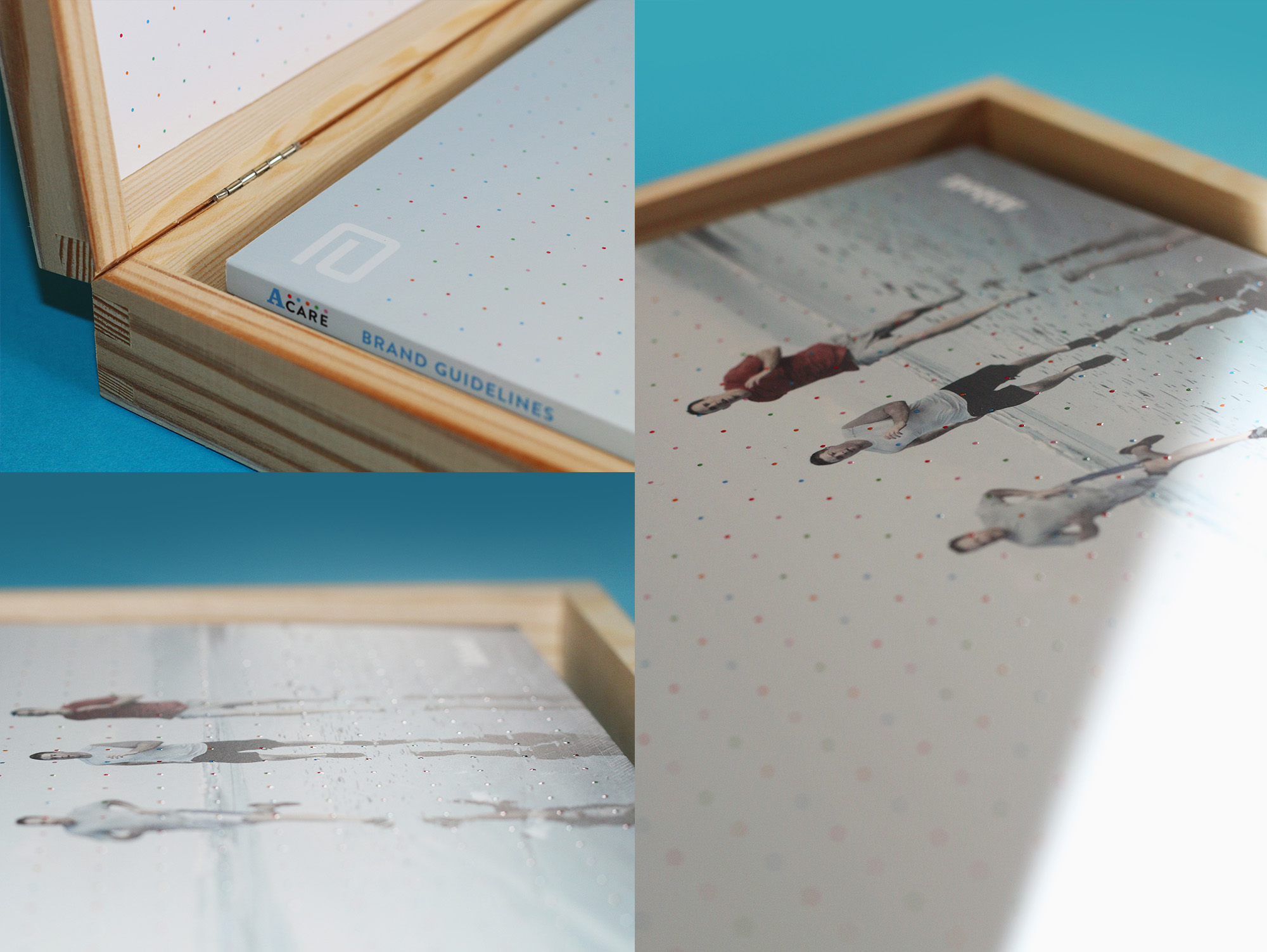
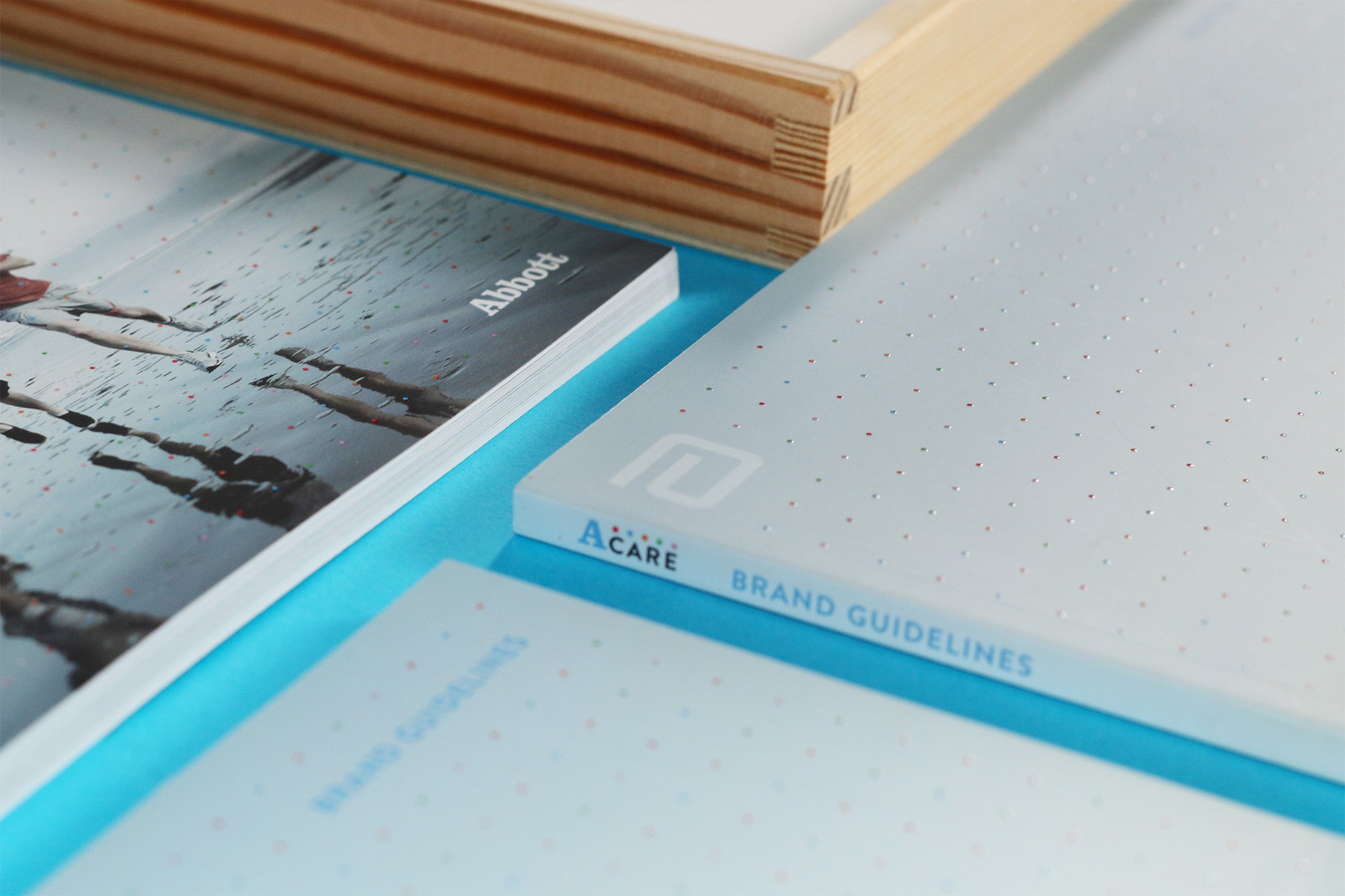
The printed Spot UV cover
The ACare brand ‘dot’ element on the cover was put on a raised spot uv varnish on the printed versions of the guidelines. This gave a really sophisticated and elegant high end look and feel to the brand for its fresh launch.
ACARE Presentation Box
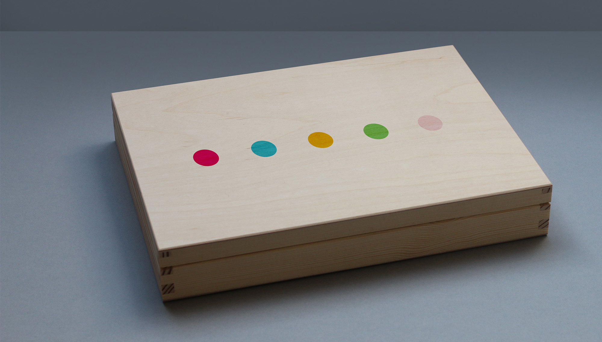
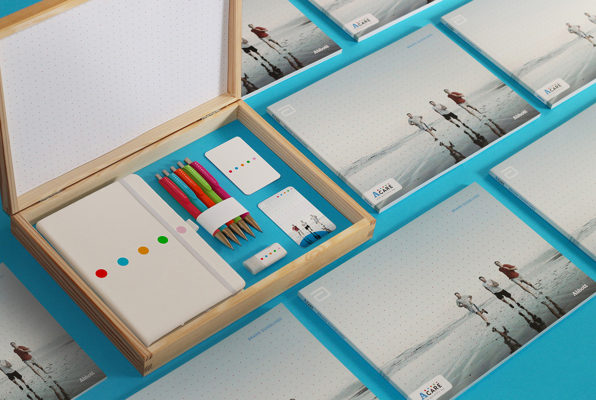
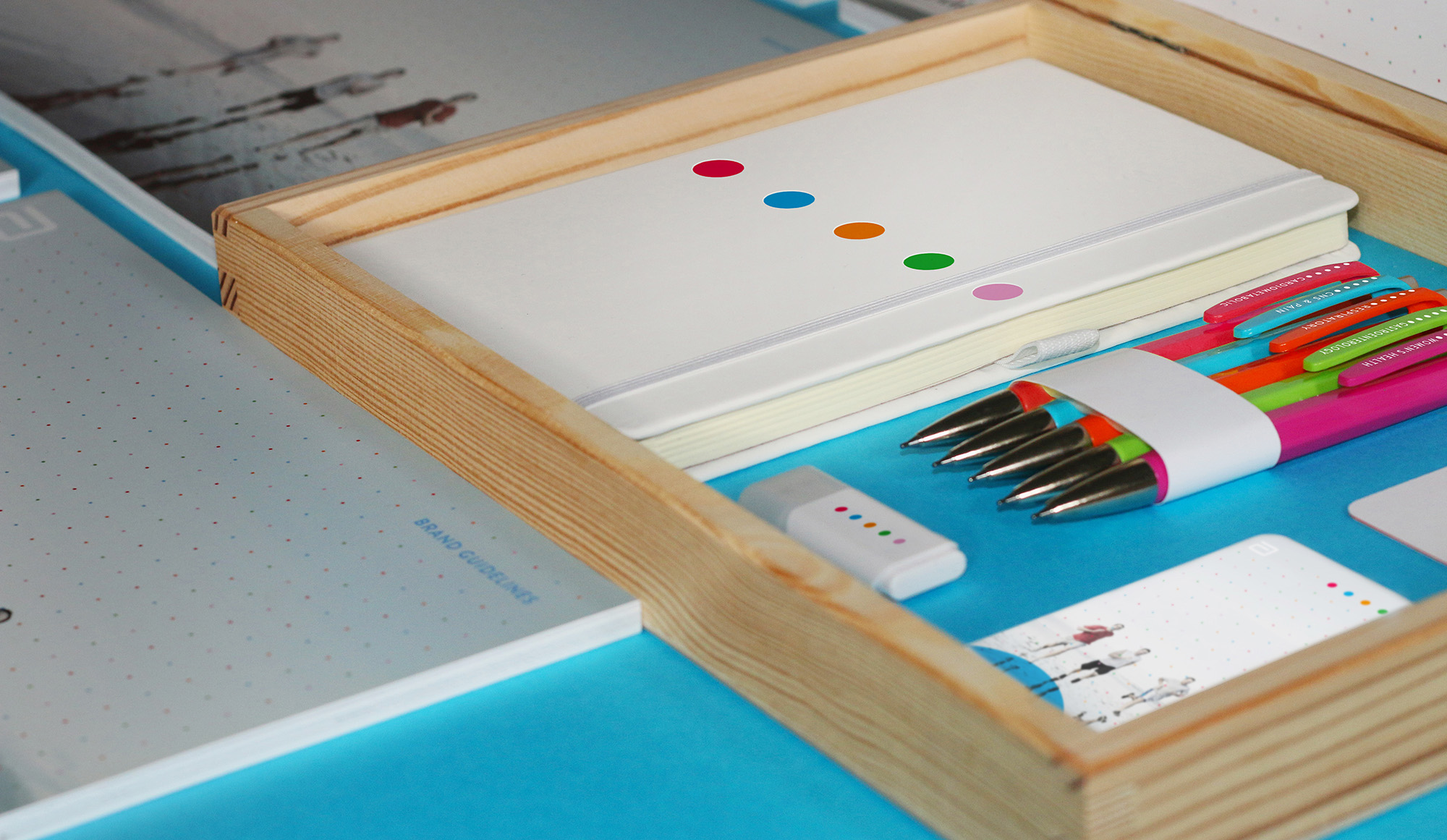
A wooden ACare presentation box was created for the launch of the new identity to be sent out to employees of Abbott specialising in the ACare support programme. The Box included a moleskin notebook, a usb stick, therapy area pen set, personalised business card and printed ACare brand identity guidelines,
Brand Strategy
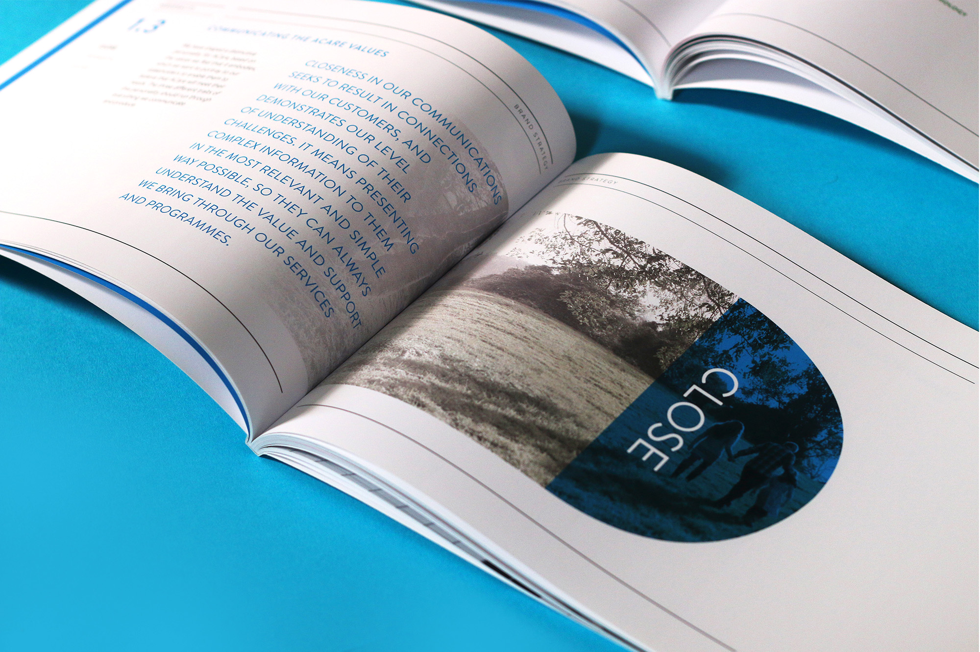
The brand strategy explains the background information on how and why ACare was developed, as a response to an ever more competitive, rapidly growing and transforming market, in which it is increasingly simple to access a broad range of information. We explain the new approach, and how this meets the needs of various stakeholders, before providing our key messages for each of these groups.
.

Brand Implementation
These guidelines also explain the brand essentials (i.e. the architecture, lock-ups, tagline, colour palette, typography, style of imagery, tone of voice and grid system), demonstrate their correct implementation and provide examples of typical applications for print, digital, third-party and advertising.
.

If you like this project, please take a second
to share with the world so the Acare app can grow!
