Scope
- Brand Identity
- Print Materials
- Creative Direction
- Advertising Campaign
- Digital Design
Project Overview
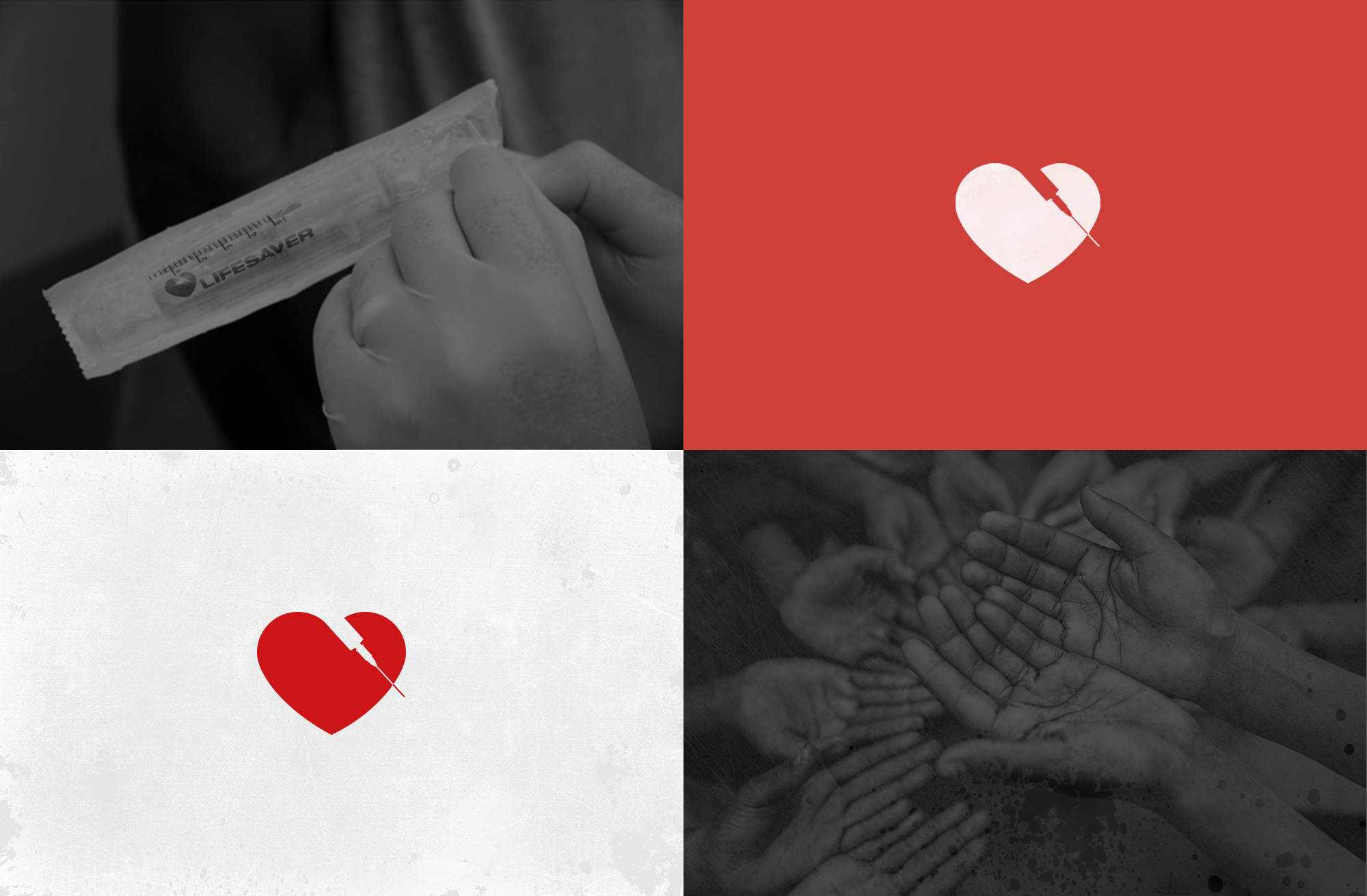
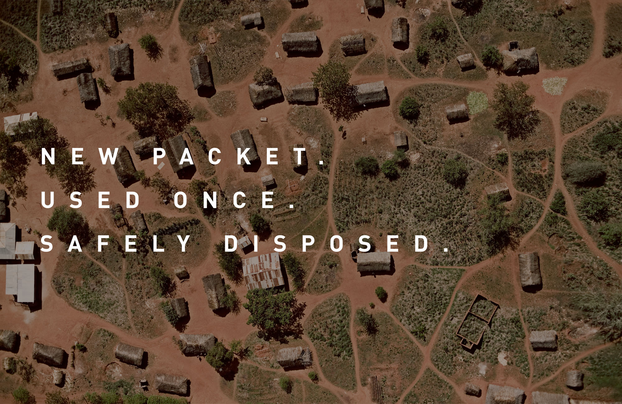
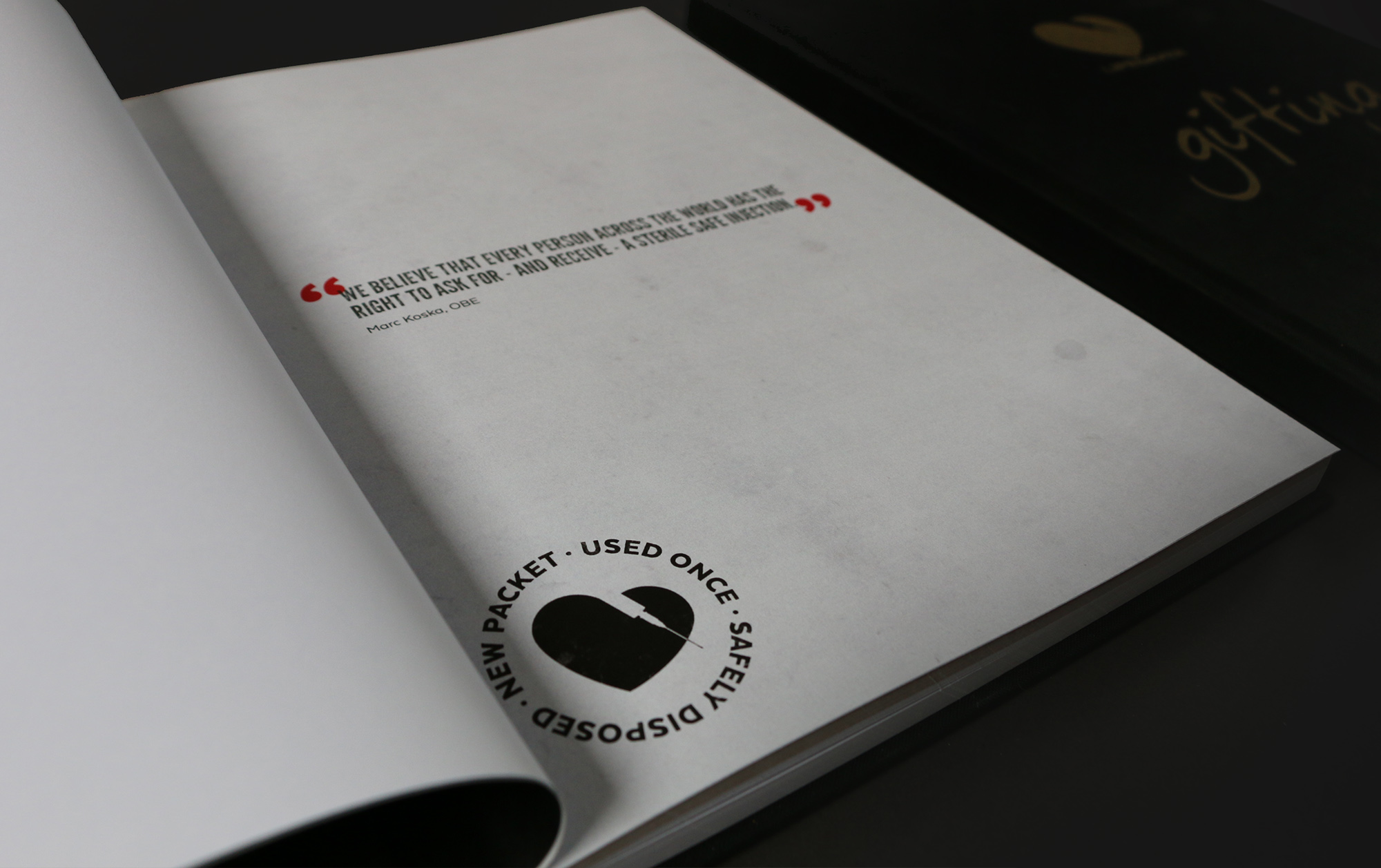
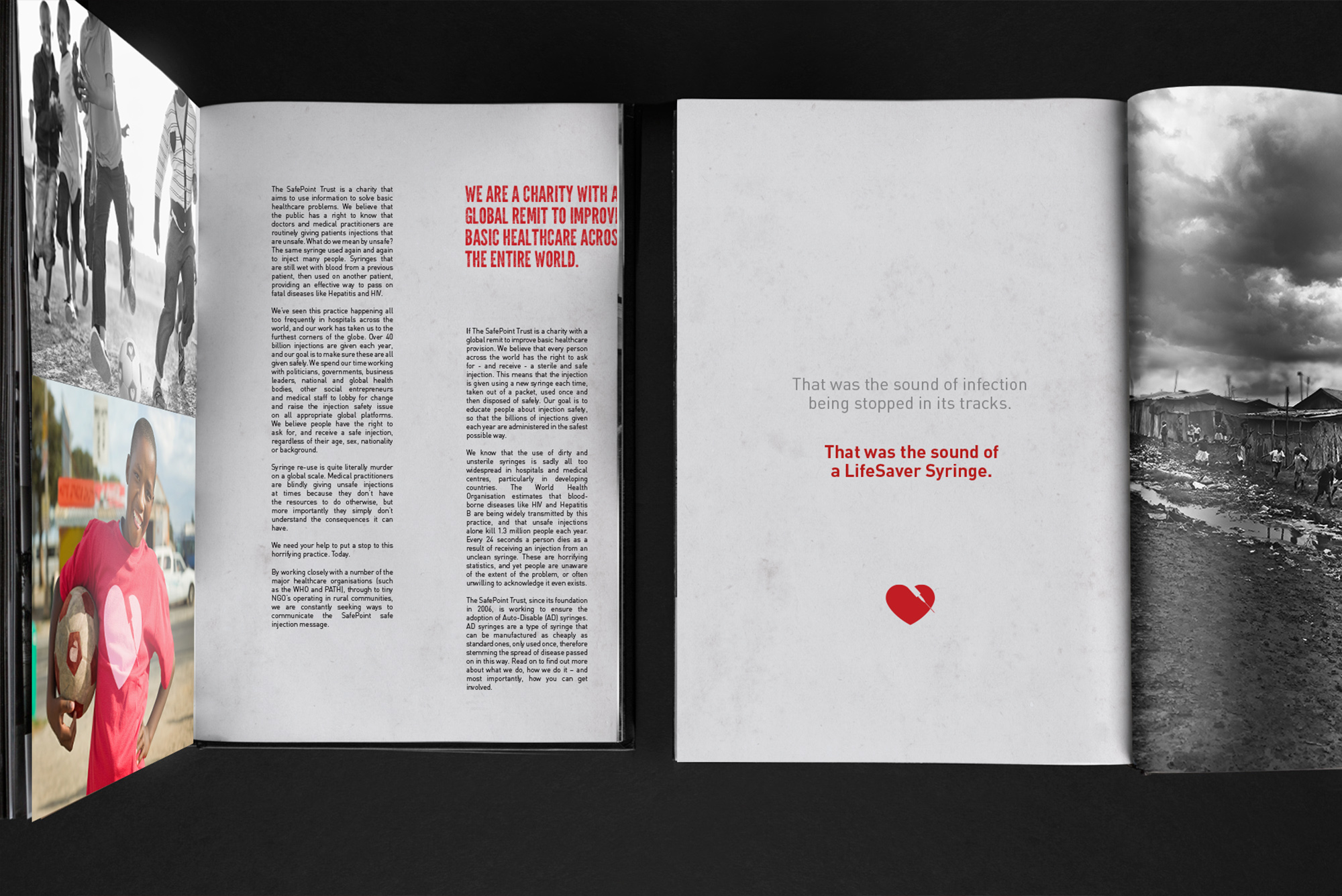
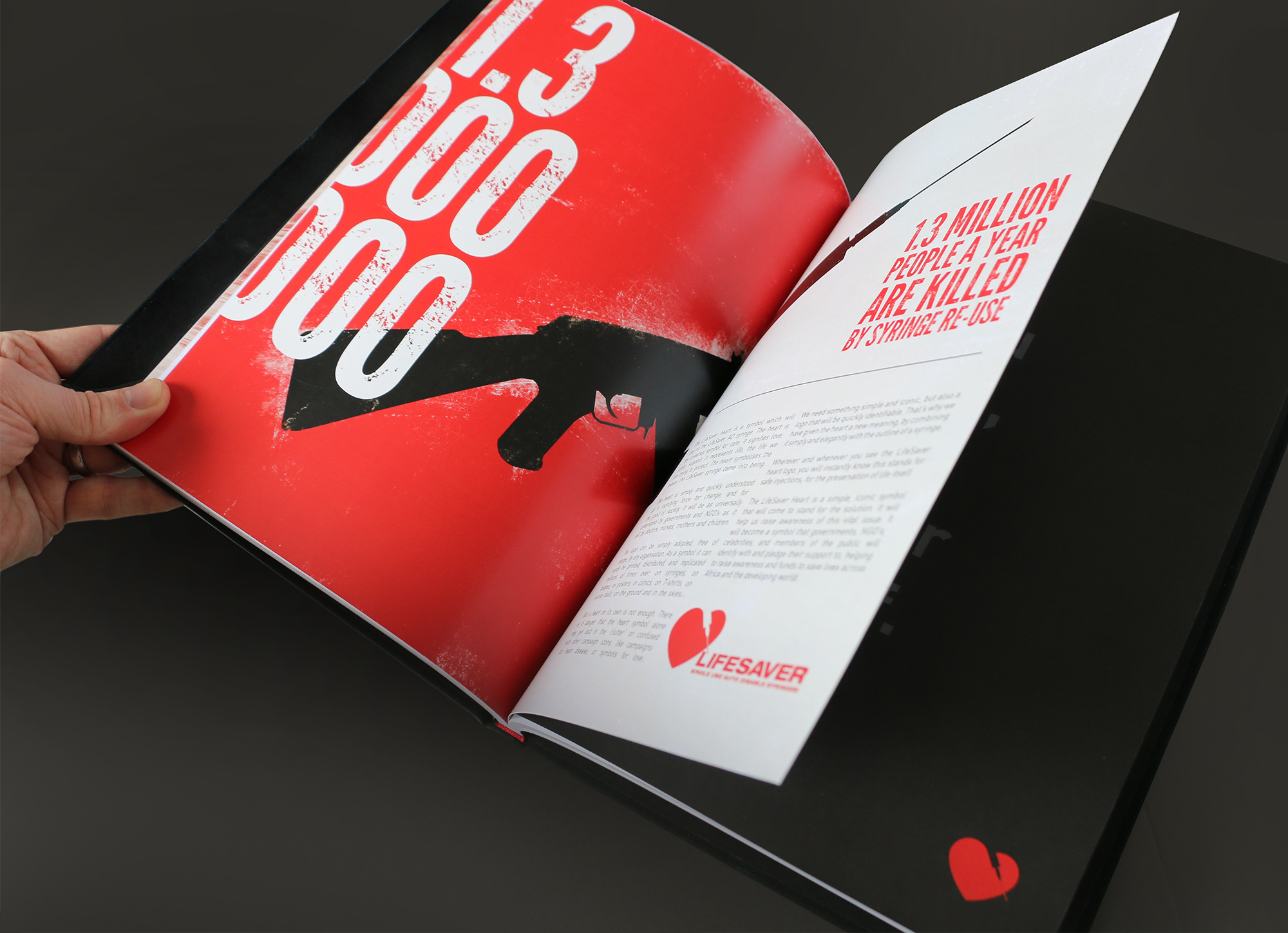
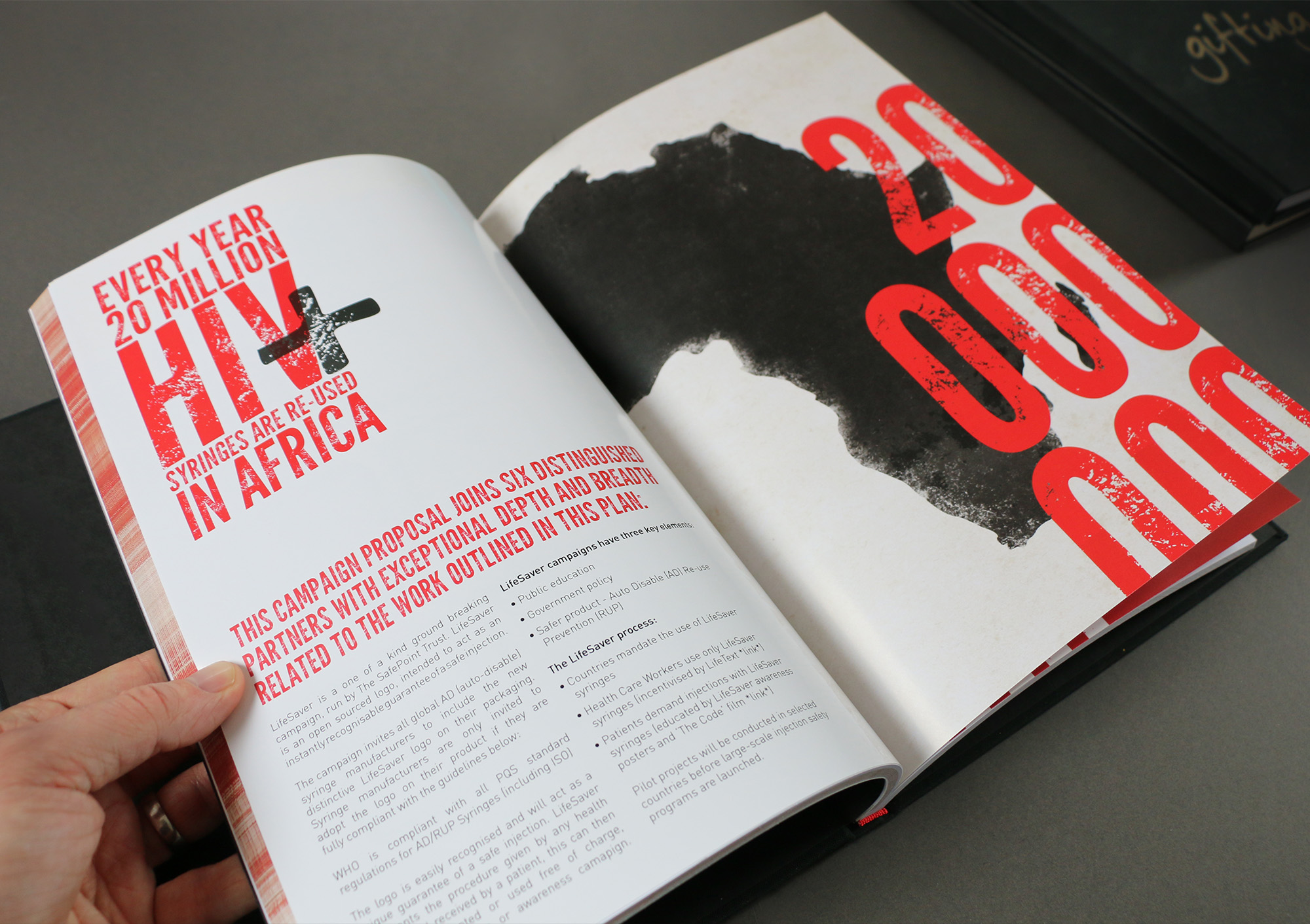
Lifesaver is a new groundbreaking ‘auto-disable’ syringe which breaks after just one use to stop the spread of infection. Syringe reuse are the cause for millions of cases of HIV, Hepatitis and infection so Marc Koska created this ‘lifesaving’ syringe. ‘New Packet. Used Once. Safely Disposed’.
The multi award winning Lifesaver project initially started as ‘just a logo and simple identity’ job. However this quickly snowballed into a full on advertising campaign, a website and a 120 page in depth book on Lifesaver from where it began to how it works.

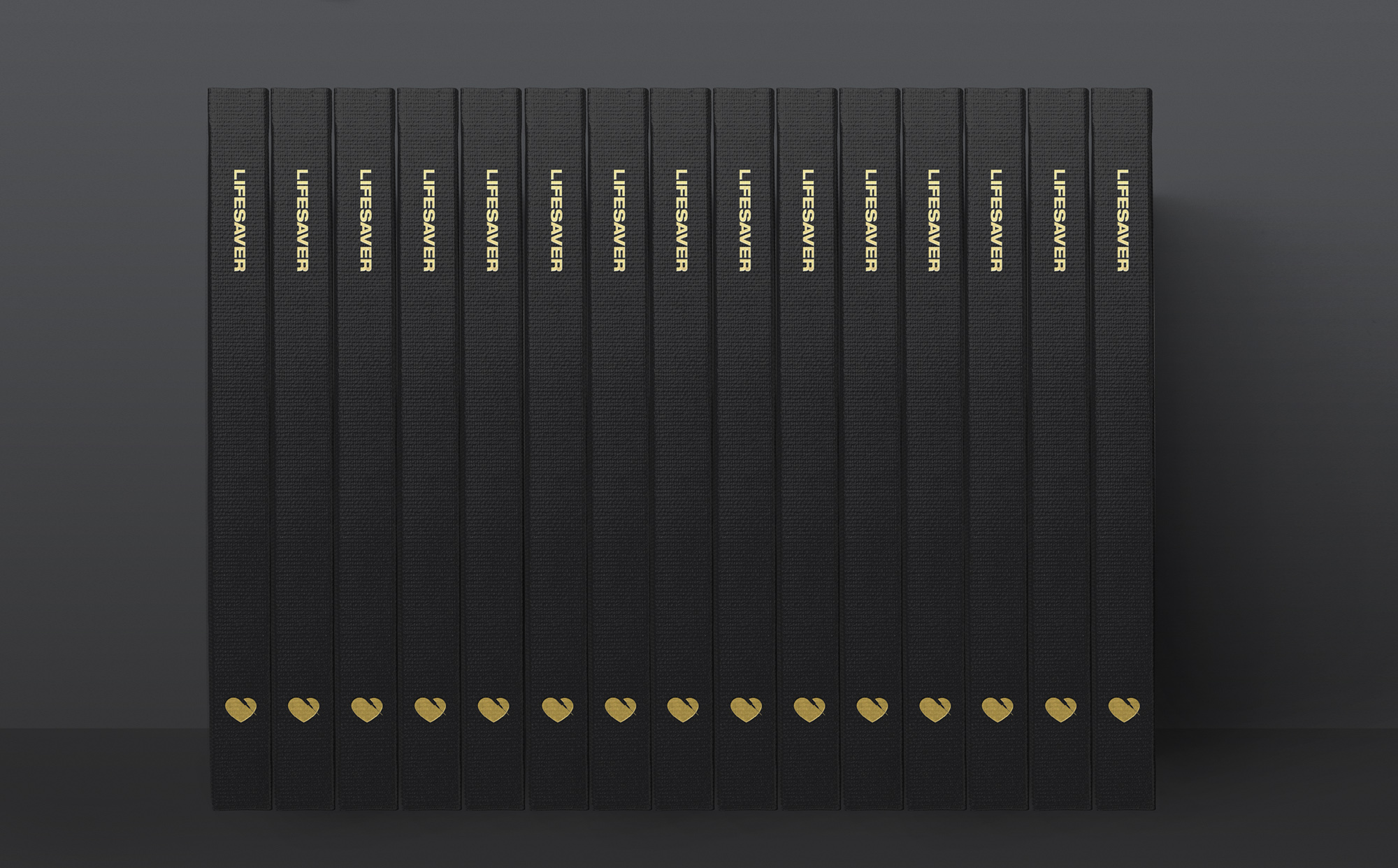
Lifesaver Identity
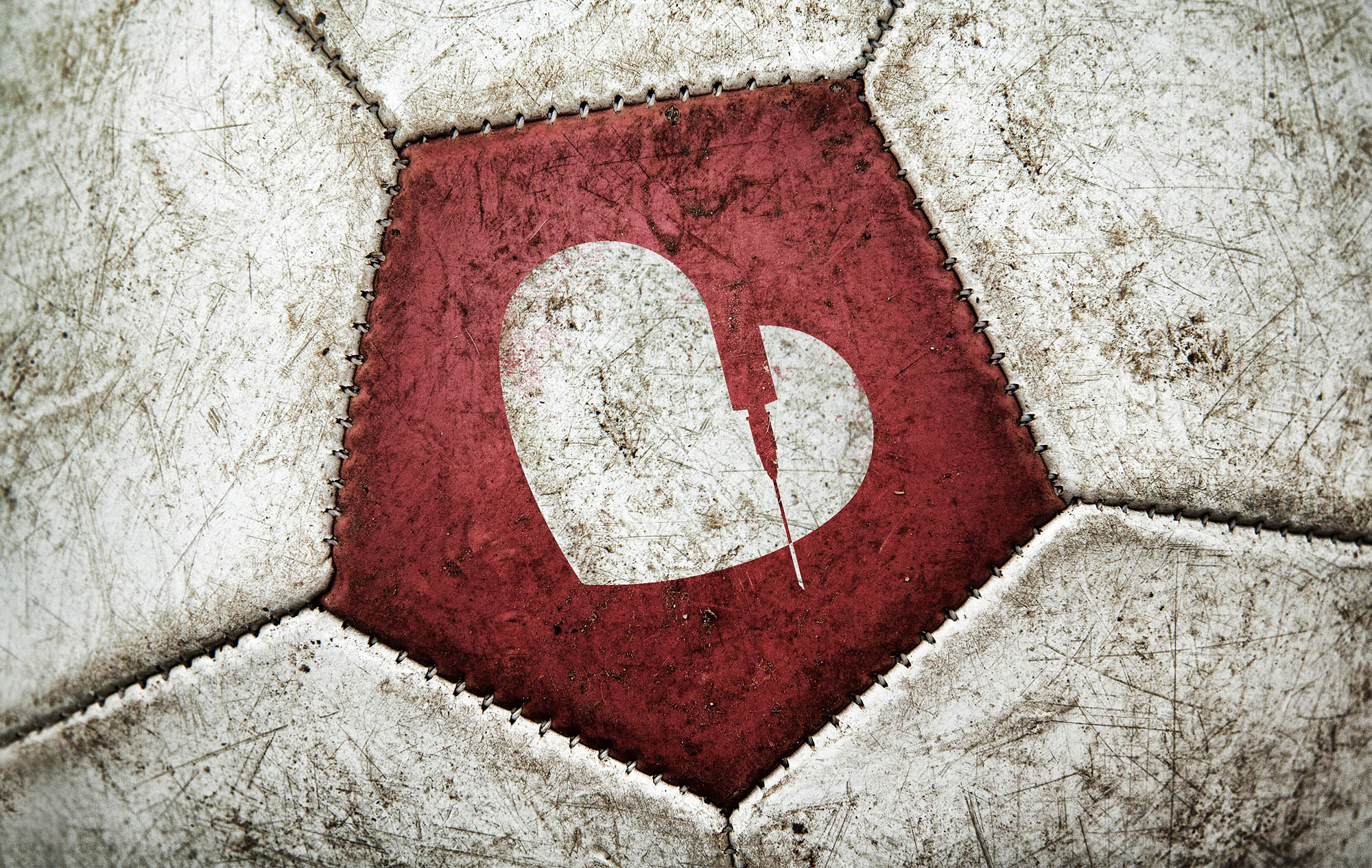
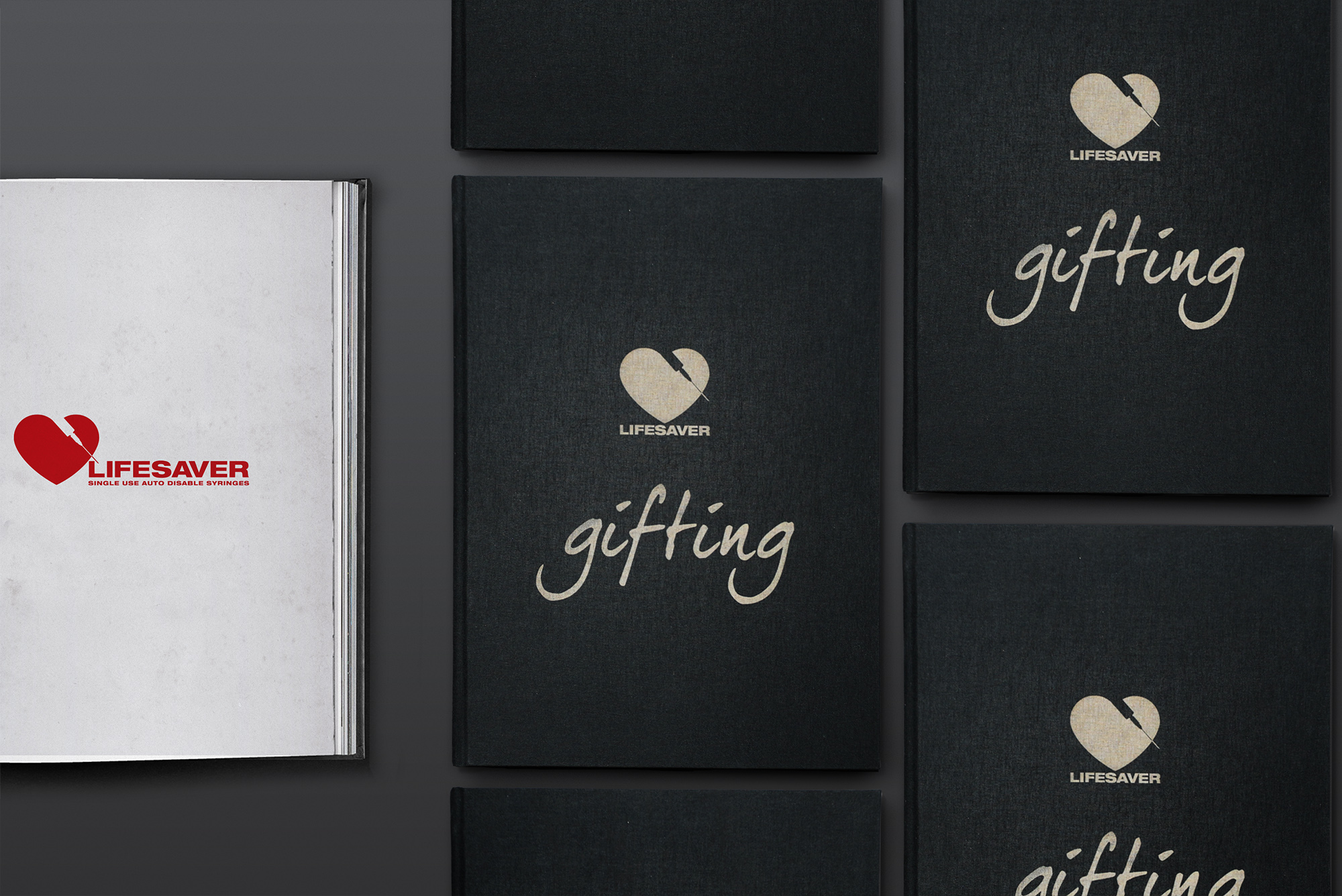
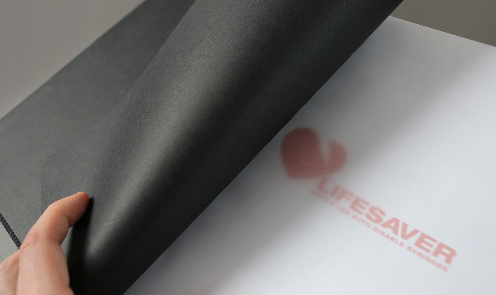
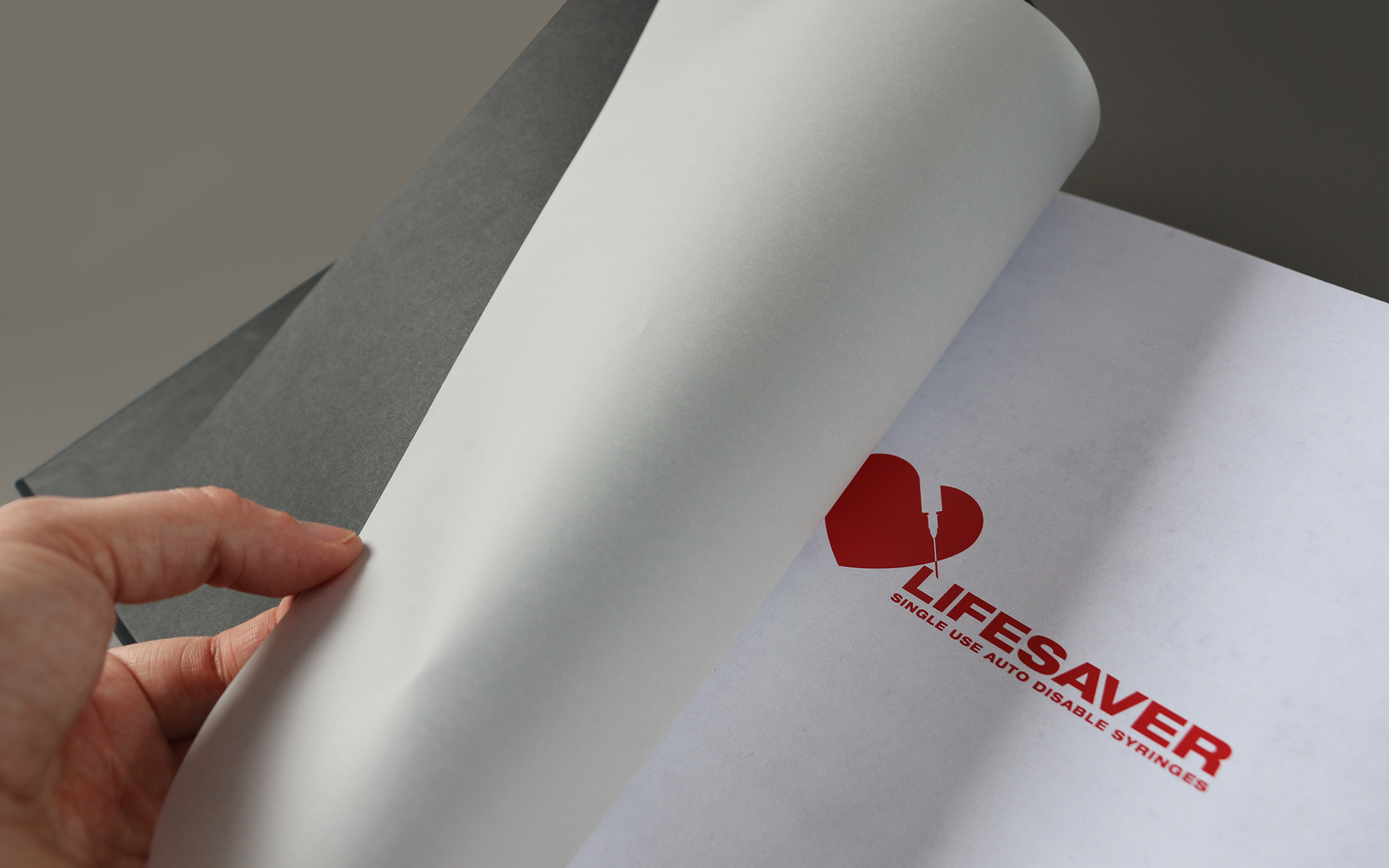
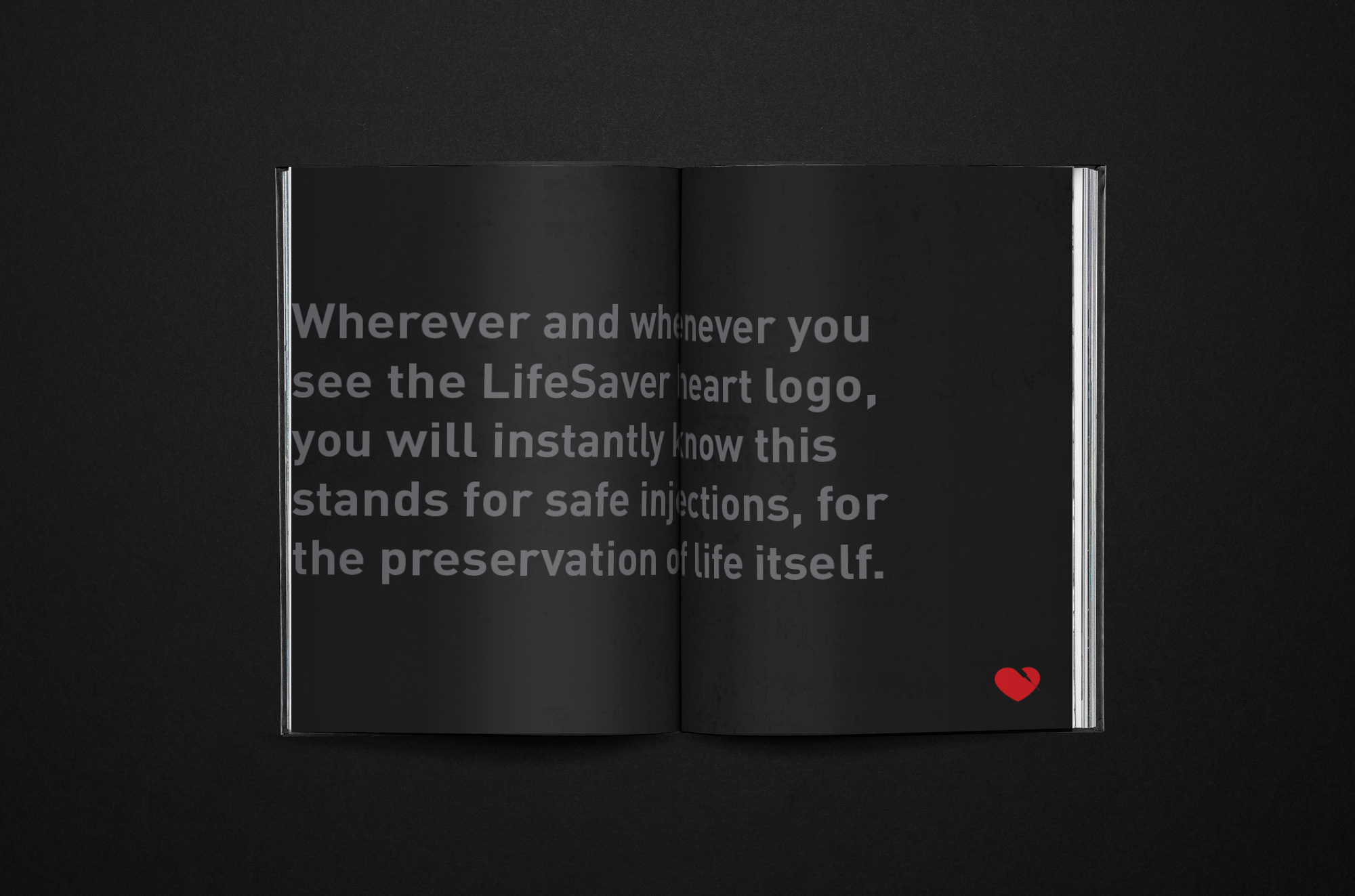
The LifeSaver logo was created to make an instantly recognisable logo mark that is intended to act as an instantly recognisable guarantee of a safe injection. The logo will be stamped on all packaging and materials, signifying that it is a new and clean syringe and needle, that it can be used only once and which will then be disposed of safely. The were a lot of initial concepts produced before settling on the logo incorporating a heart.
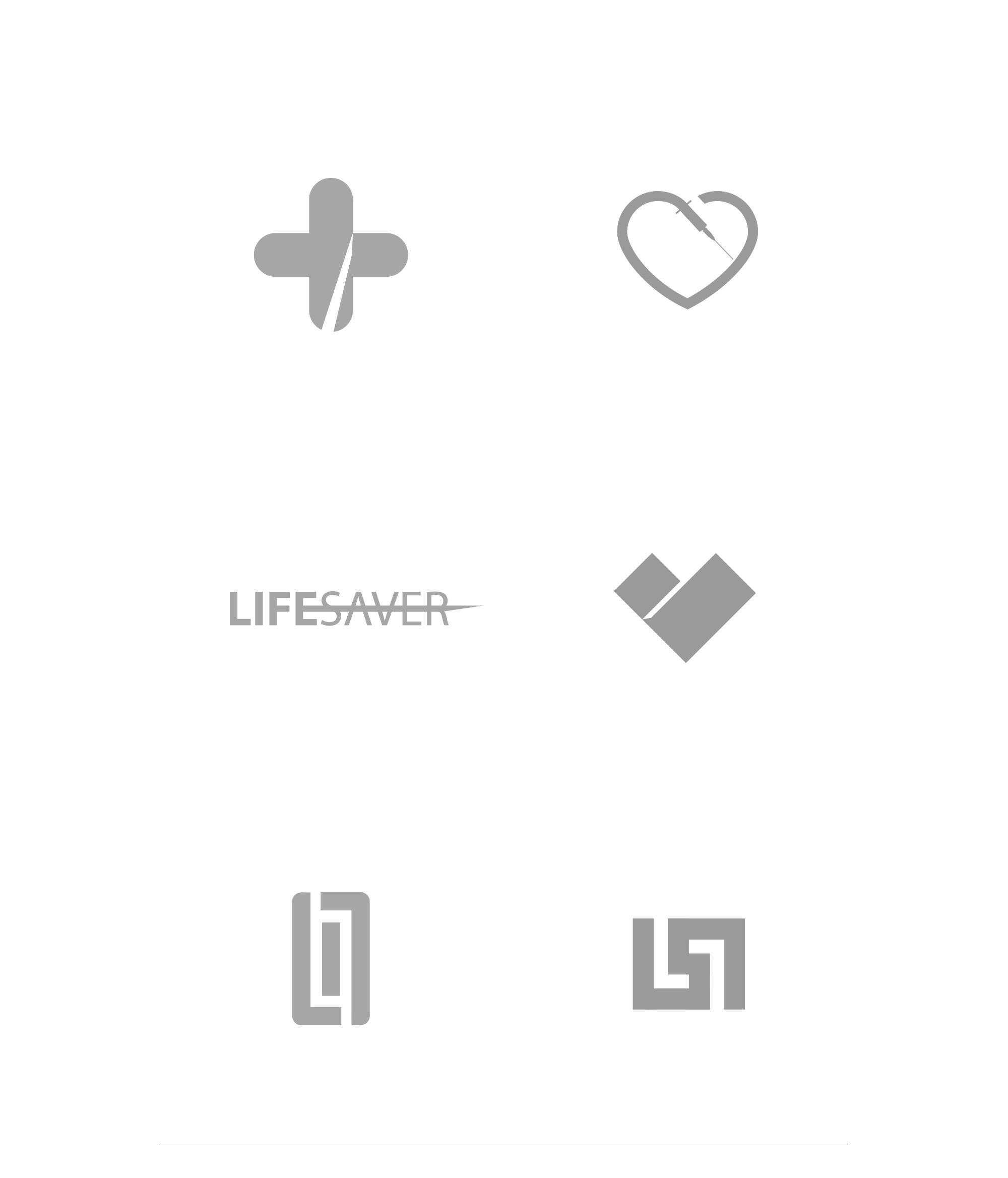
The Lifesaver Logo
The heart is a universal symbol for care. It signifies love, unity, support. It represents life, the life we are trying to protect. The heart symbolises the reason the Lifesaver syringe came in to being. The logo needed to be simple, iconic and quickly identifiable. The heart on its own is not enough but by combining it simply and elegantly with outline of a syringe ‘The Lifesaver Heart’ is an unique symbol that will stand for the solution and raise awareness of this vital issue.
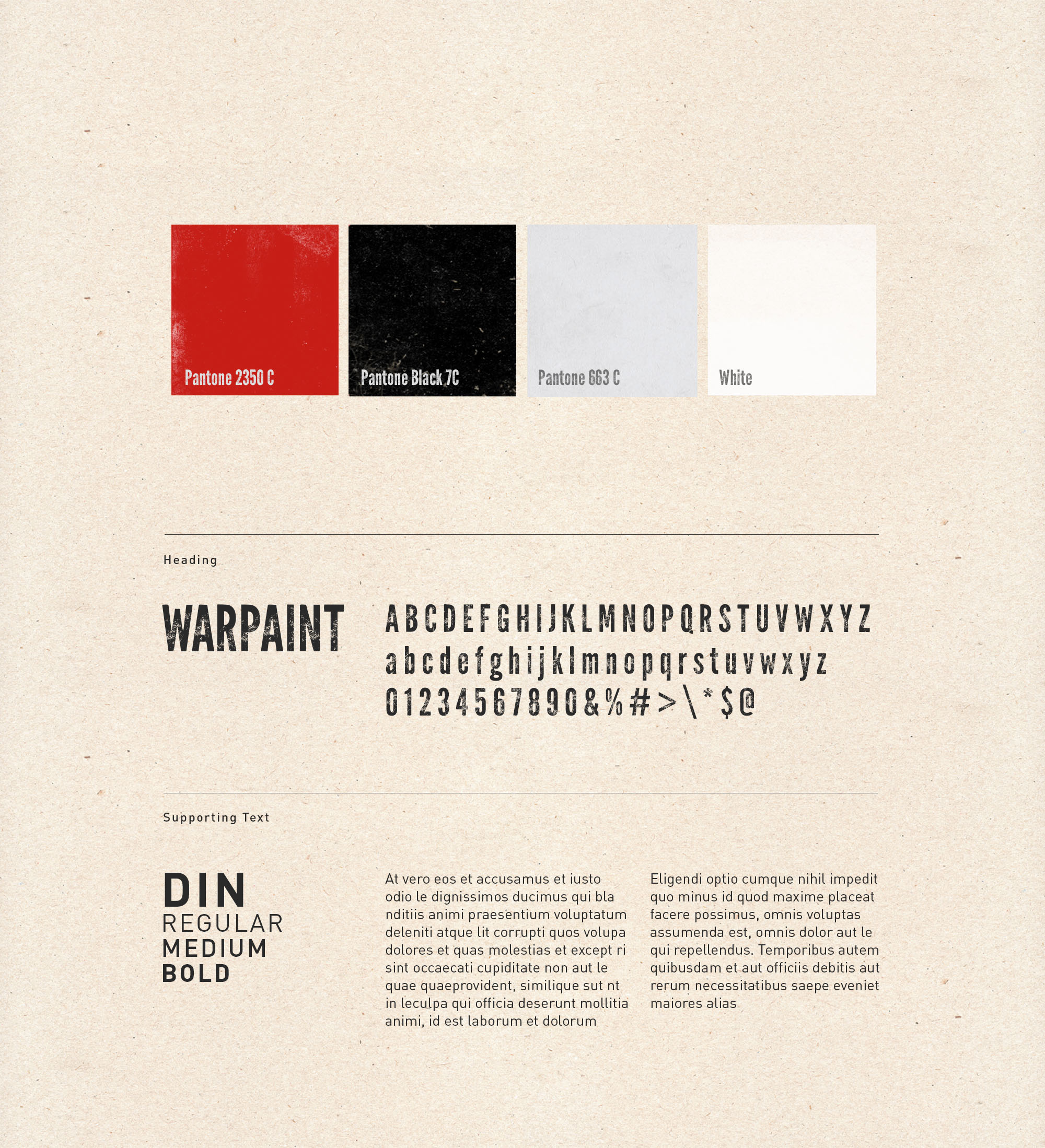
Typography and Colour
Red and black together with the neutral tan and white make the identity and artwork immediately standout. Red is the colour of blood and symbolises love and life. These classic tan and white minimalist tones mixed with the strong black and bright red makes for a very emotionally intense colour palette.
The eroded type of Warpaint was chosen for its eroded feel which sits well with the distressed graphic identity created. The simple to read Din was chosen for its supporting text across all materials on and off line.
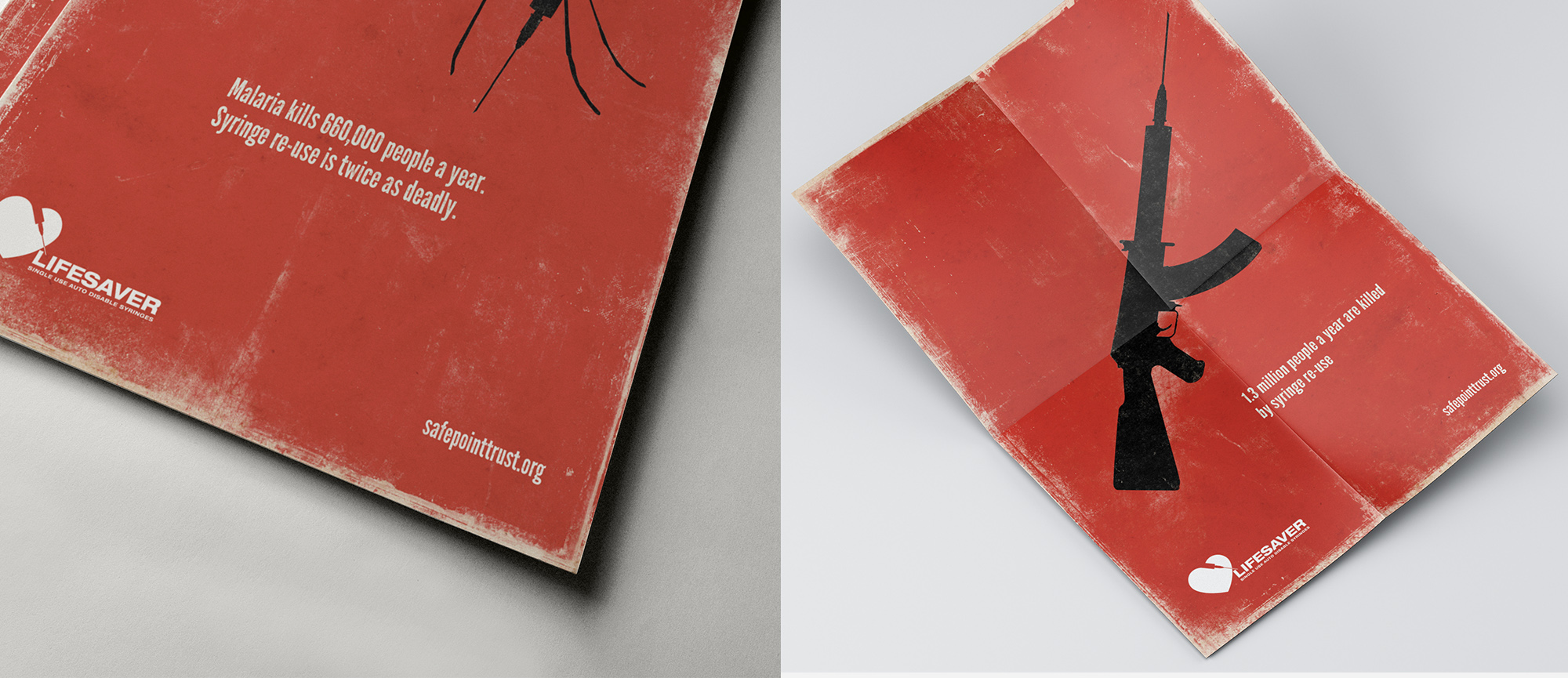
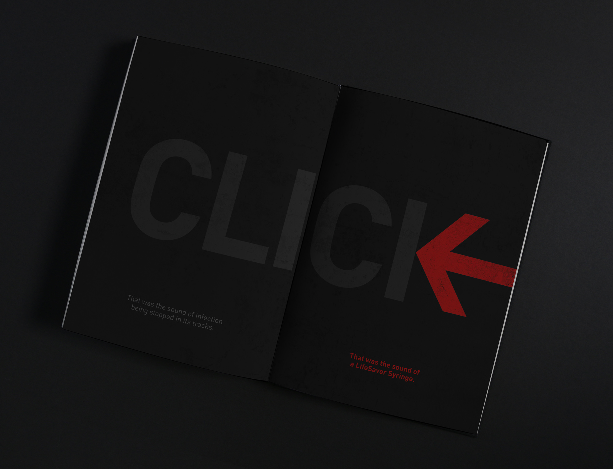
Advertising Poster Campaign
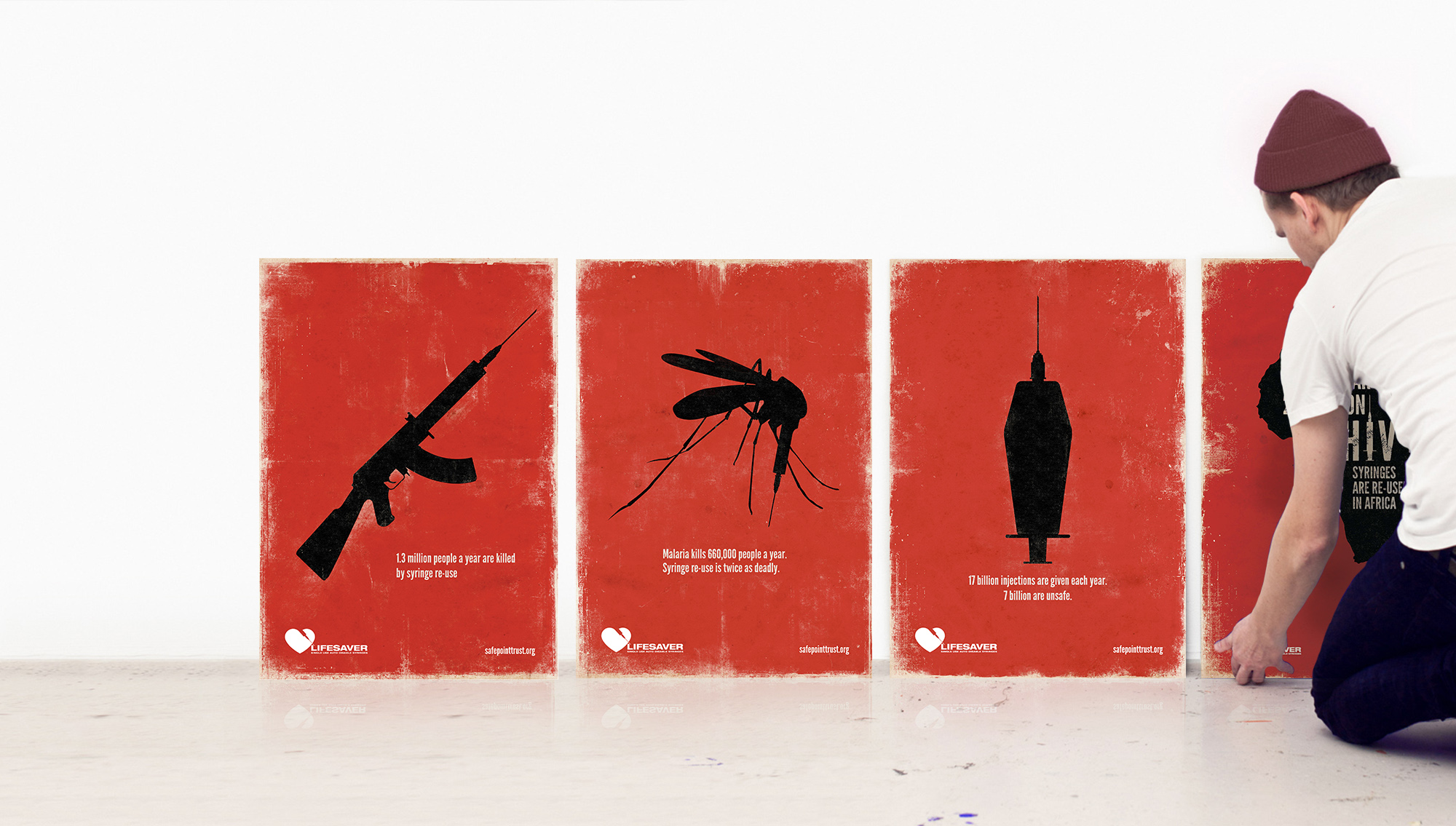
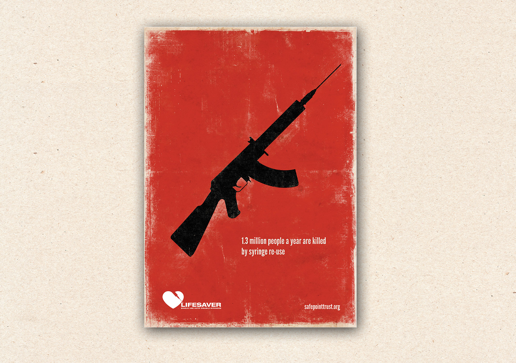
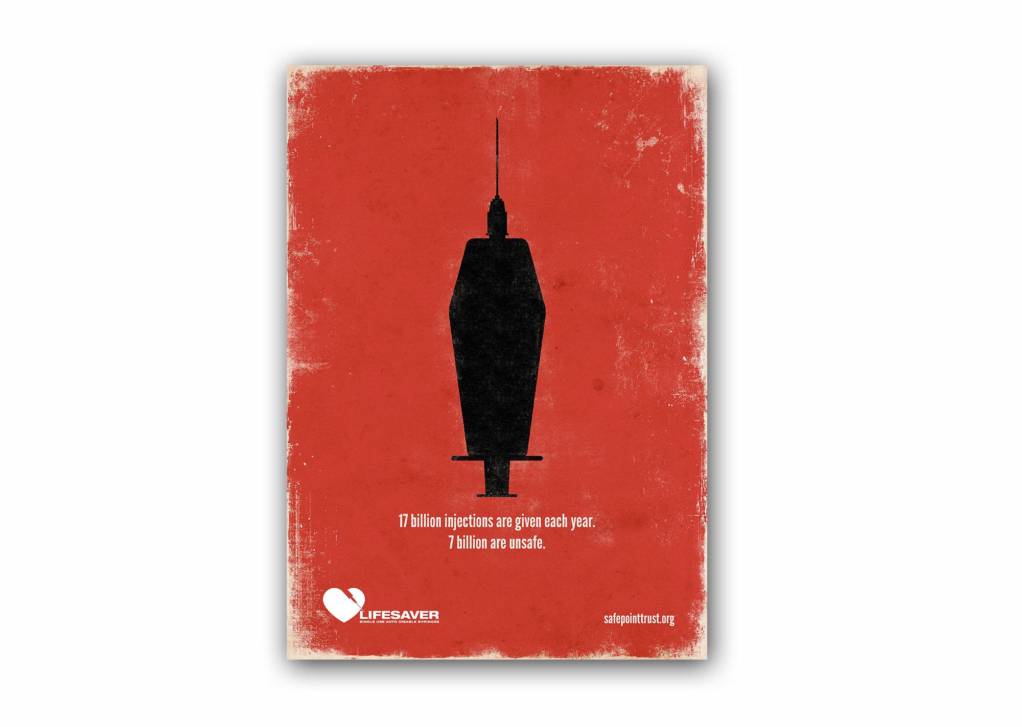
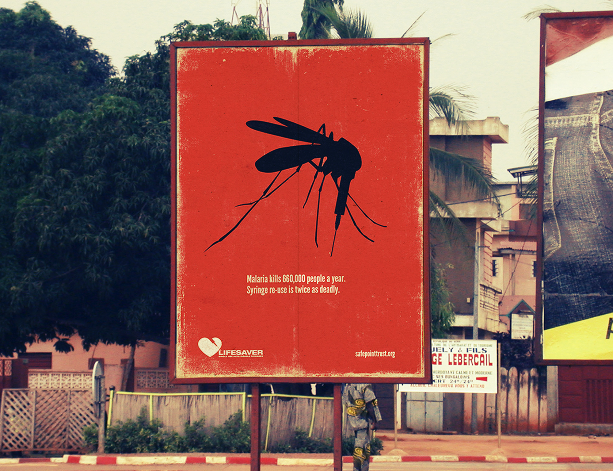
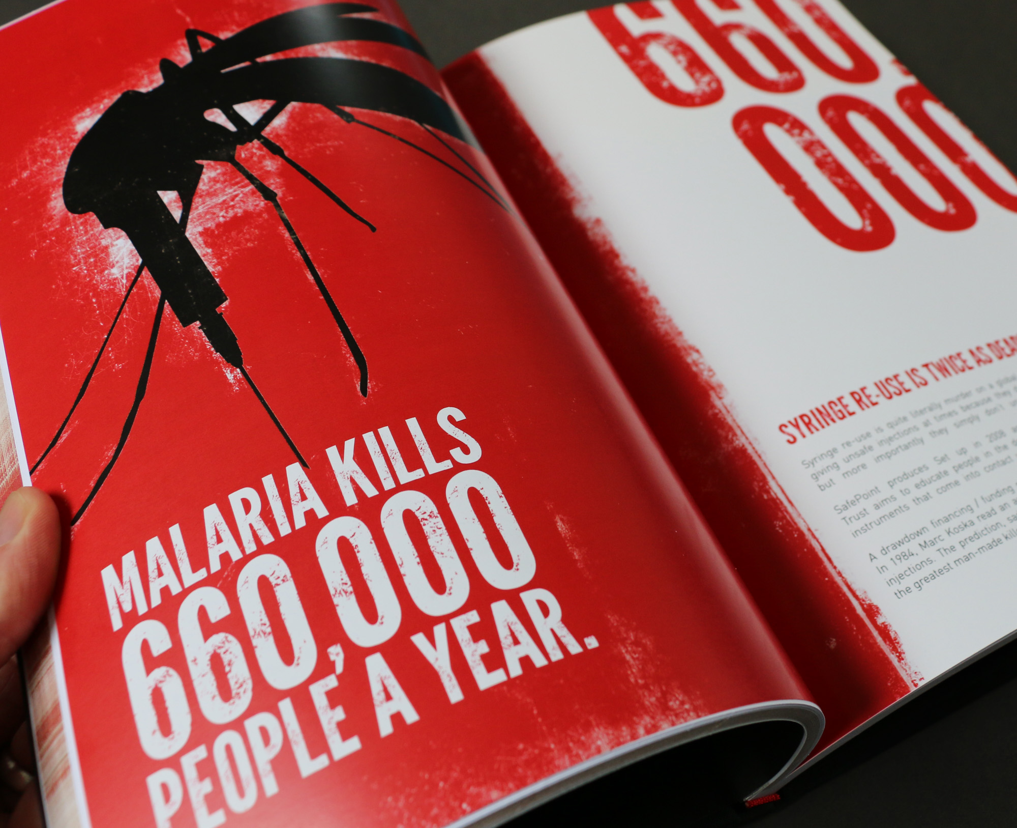
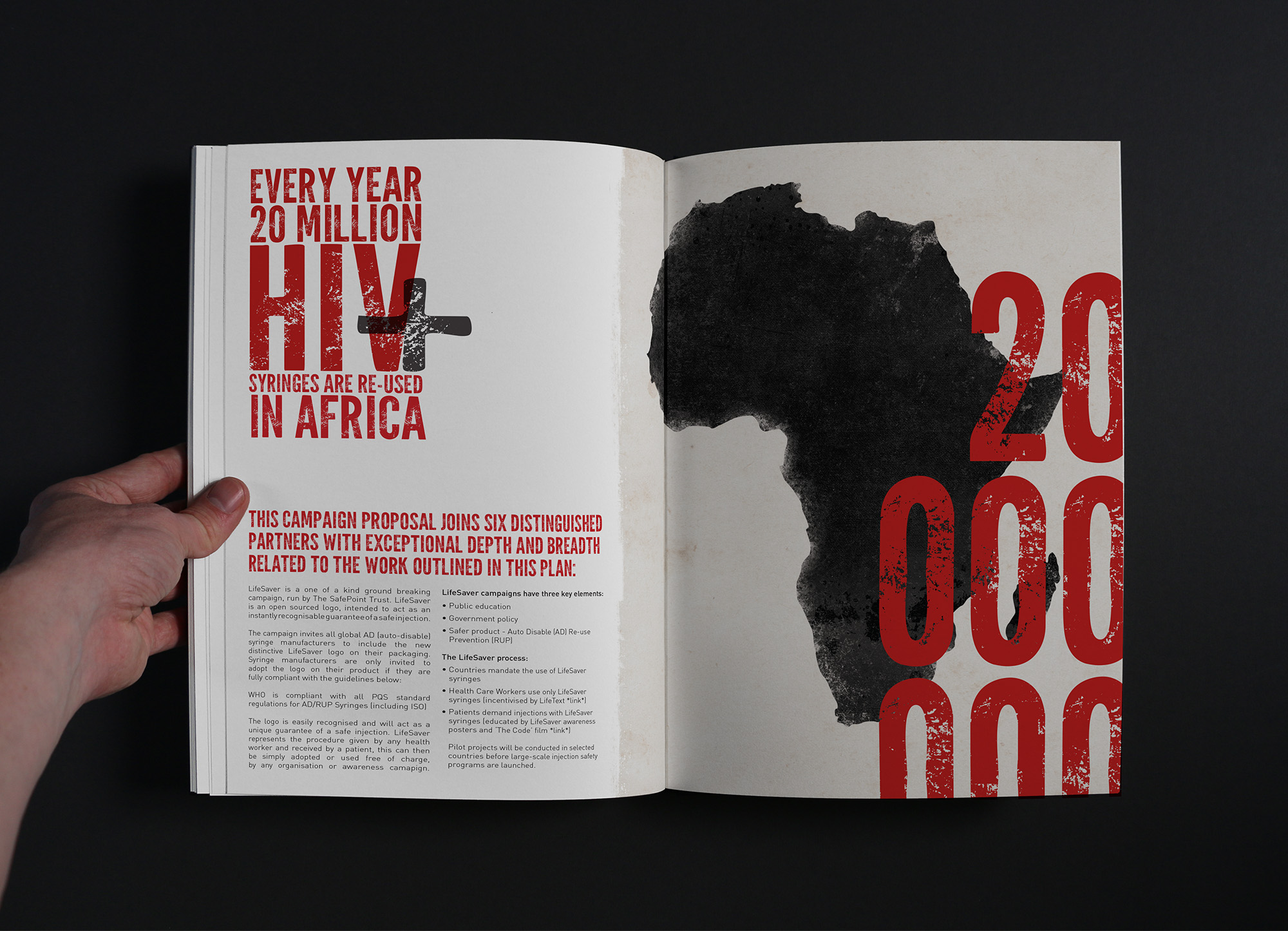
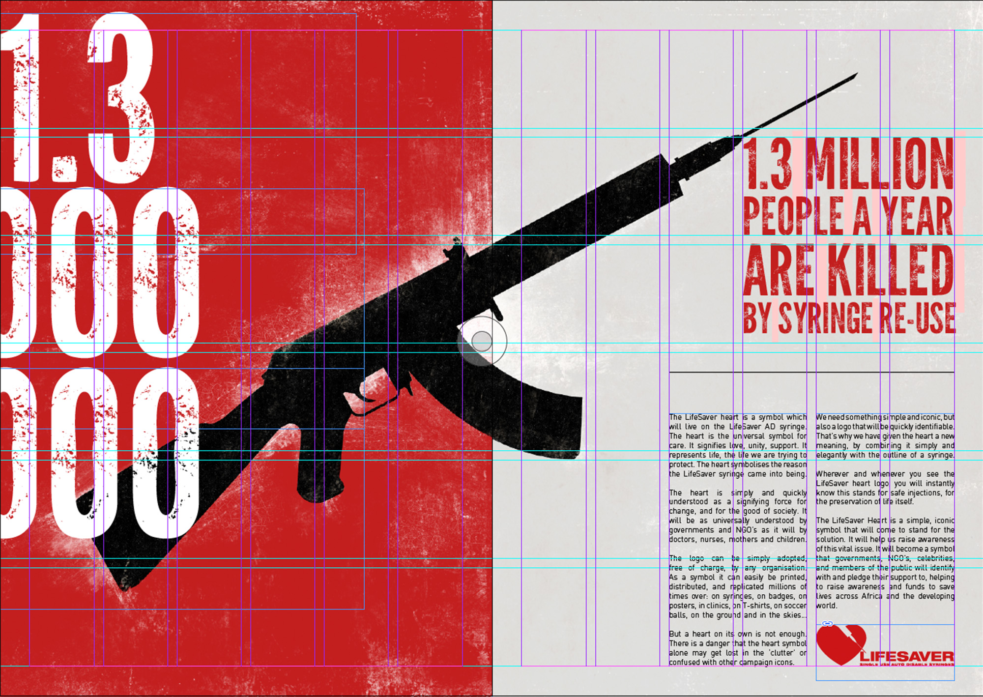
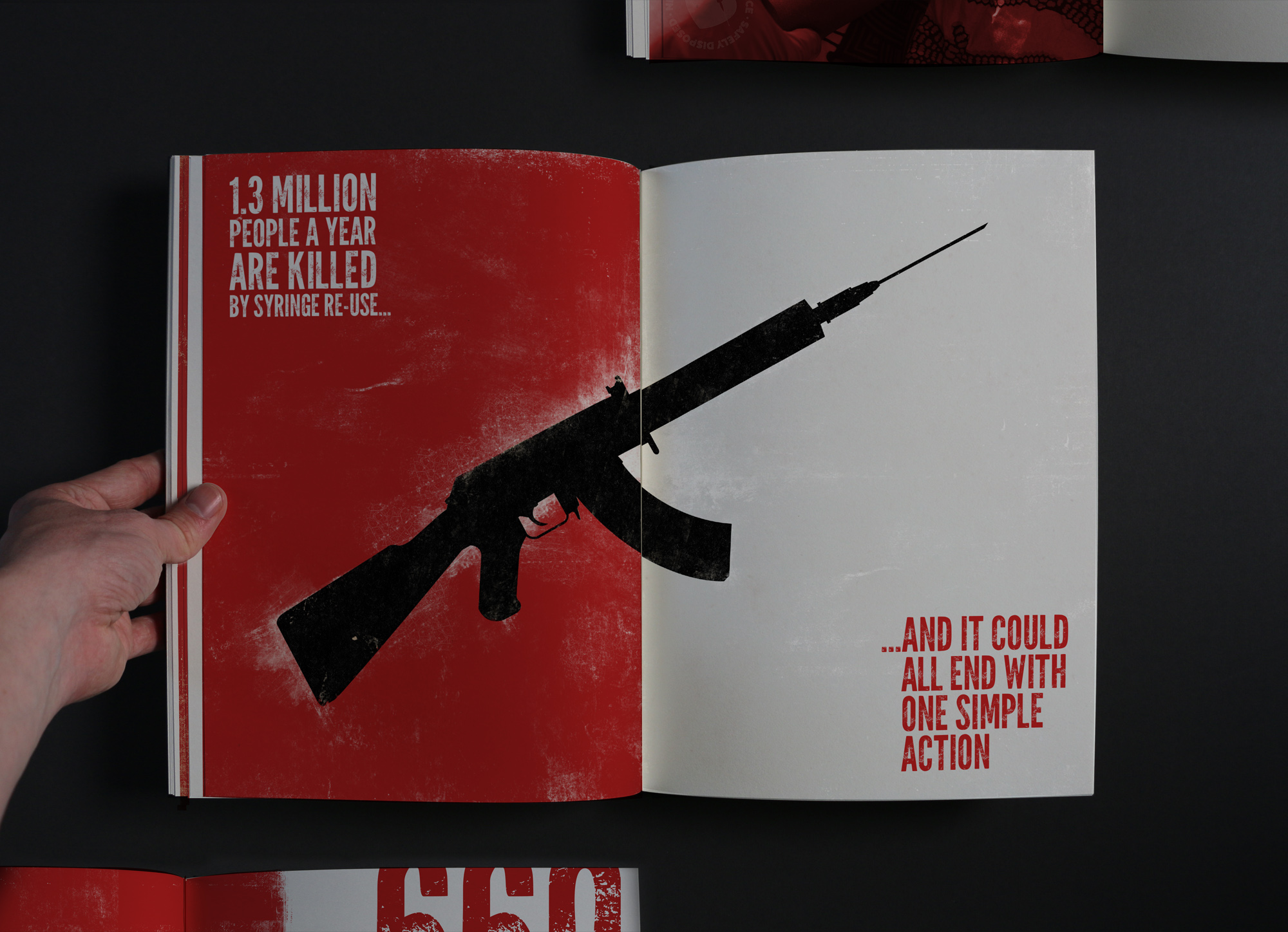
The advertising campaign just like the logo needed a unique outcome to stand out among the crowd and follow the same path as other mainly photographic based charity campaigns. With this in mind I created an illustration style for the very impactful images of a Gun, Mosquito and Coffin all incorporating a syringe with accompanying syringe re-use message.
As often taking about the danger and dirtiness of syringe re-use I wanted to carry this over to the illustrations of the posters to hit home about the implications of this and I did this by adding depth, texture and ‘erosion’ to the illustrations, background and typography.
The outdoor advertising campaign was developed to be placed not only in the UK but worldwide to 64 developing countries. The ad campaign also included footballs, bags, t-shirts and clothing displaying the Lifesaver identity to areas of need in many developing countries across the world.
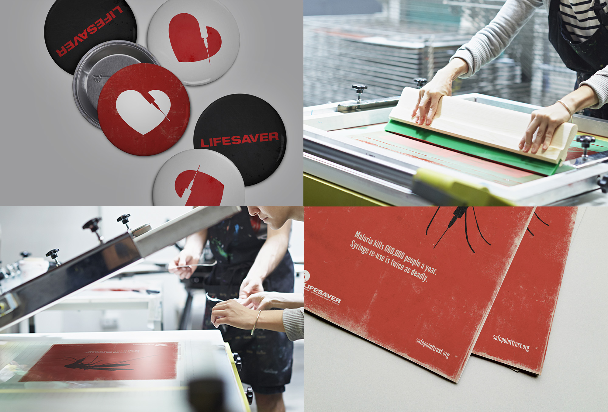
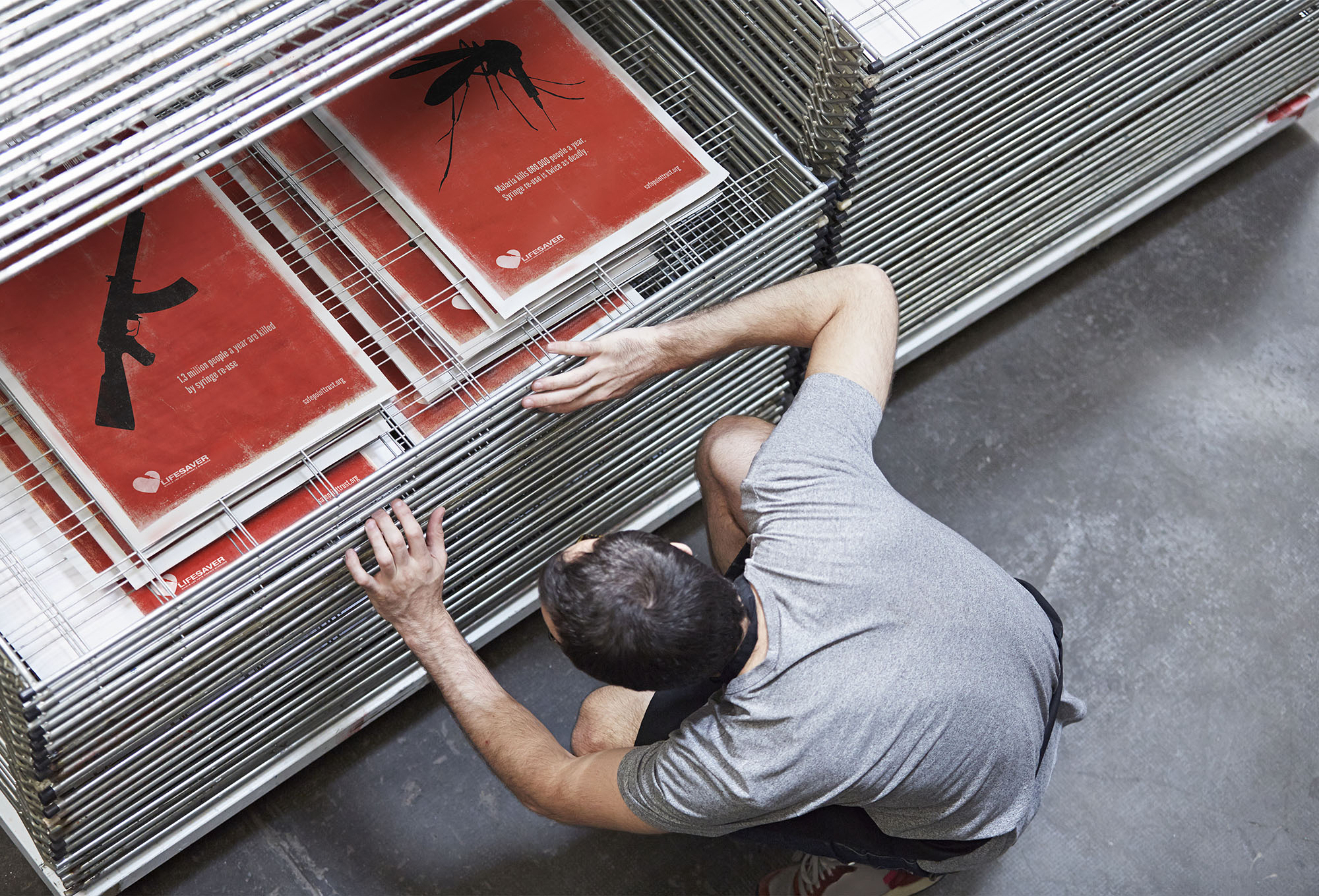
Poster Printing Process
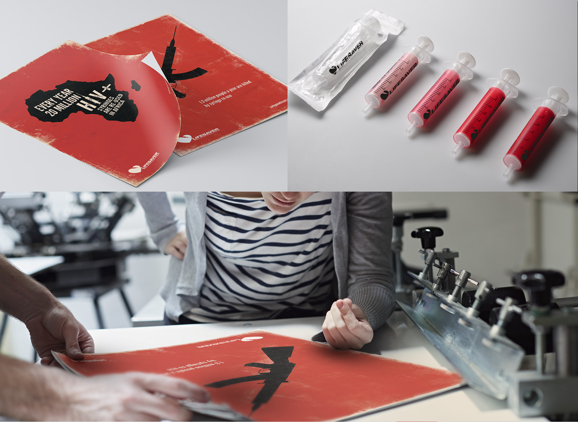
To give the poster a good amount of lighting and depth, even with the limited color pallet, I like to make the piece appear to have more colors than it actually does. I decided to use a cream-colored paper to allow for 2 shades of tan and 2 shades of red, mixed with the black line art.
After receiving approval from the client, I set up the final artwork to be screen-printed I busted out my handy PANTONE color guide and picked some nice “uncoated” ink colors for the printer to use. I chose ink colors from the uncoated book, not coated. This is because papers used for screen-printing will generally not be coated and the ink color reacts differently on each. See below for some of the photos of the poster production process.
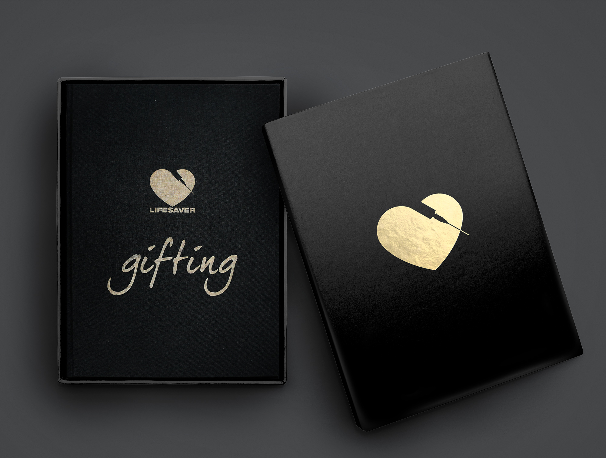
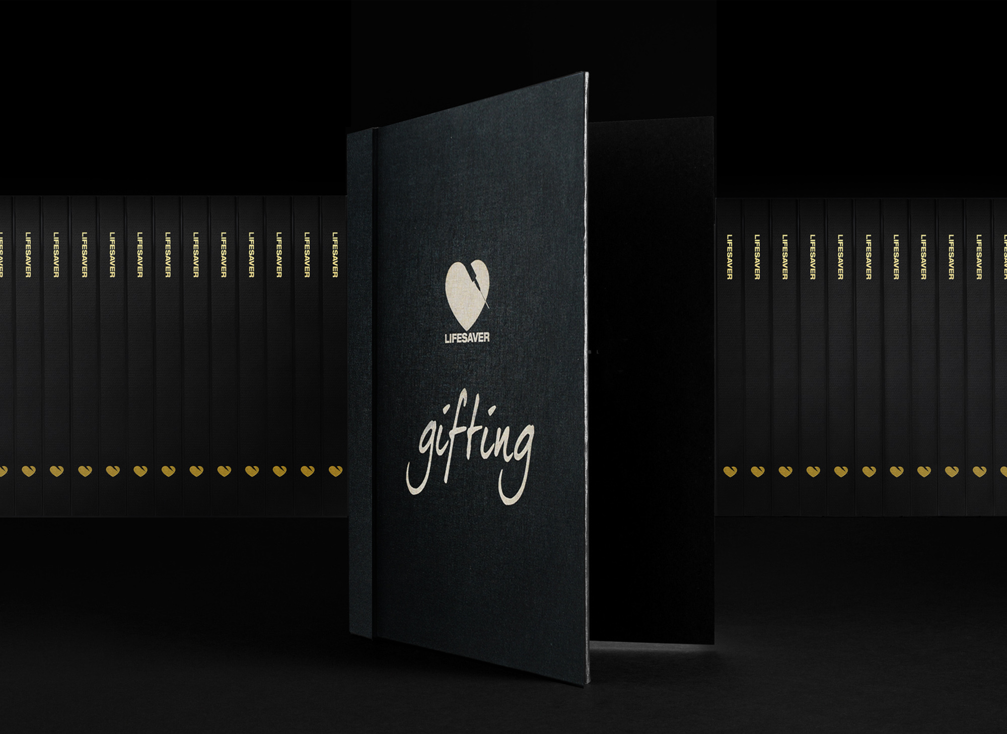
Lifesaver Gifting Book
The plan for the Lifesaver ‘Gifting’ book was started mid process when photographers were going out to the developing countries with Lifesavers creator Marc Kosca and shooting many images of the deprived areas, but by giving them branded clothing and footballs and spreading the message to these countries that they shouldn’t put up with syringe re-use any longer. We set about documenting this message in the form of a 120 page book. Gifting.

Page Spread Designs
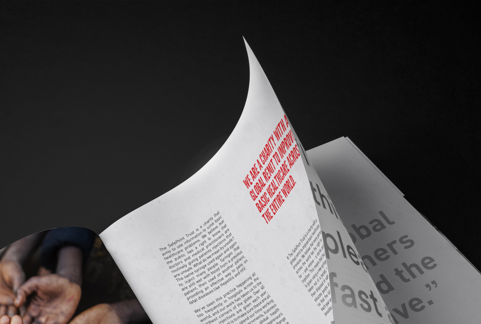
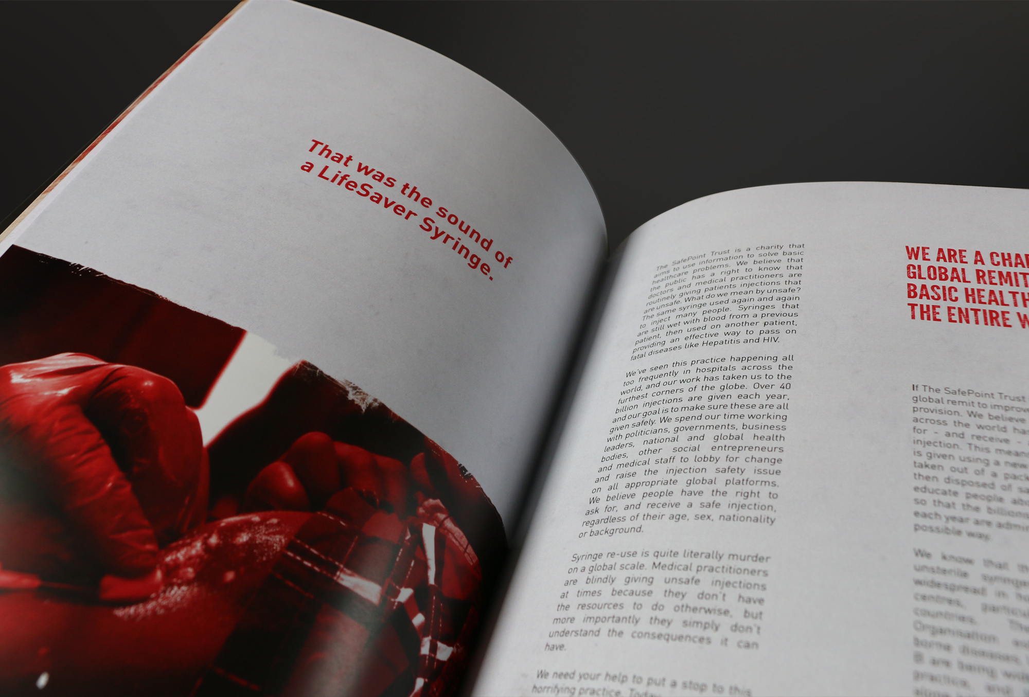
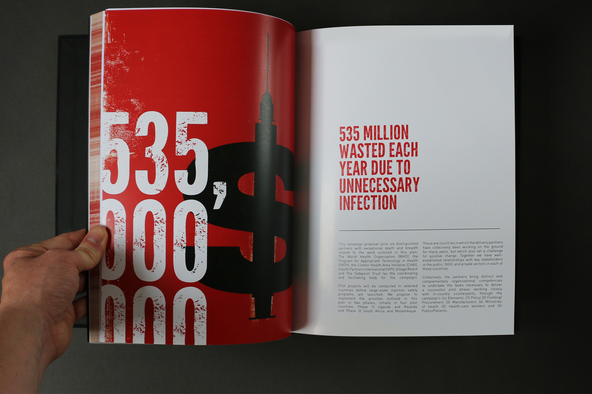
The Lifesaver ‘Gifting’ book page spread designs are all different. Although the same flexible grid system is used throughout each spread is different. Some images were used full page full bleed, others just with typography, some more copy heavy pages were layout but were possible always accompanied by imagery and graphics from the ‘distressed’ Lifesaver identity created.
The Grid
All 120 pages of the book are based on a complex grid consisting of six primary and six secondary columns that account for the binding. The grid enabled untold exploration and flexibility of composition for images, titles, text and spreads.
.
The Website
The website design needed to follow the same look and feel as all the other printed materials created to form a solid unified identity. I created a scrolling site homepage split into the desired section headers each displaying imagery, icons and distressed illustration style.
The Web Grid
The site was built with a 16px column responsive web grid so everything on the website was designed for smooth operation on a variety of devices. The less developed countries areas were still mainly viewing on desktop computers but we wanted to also future proof this by building a site to accommodate a flood of mobile and tablet traffic.
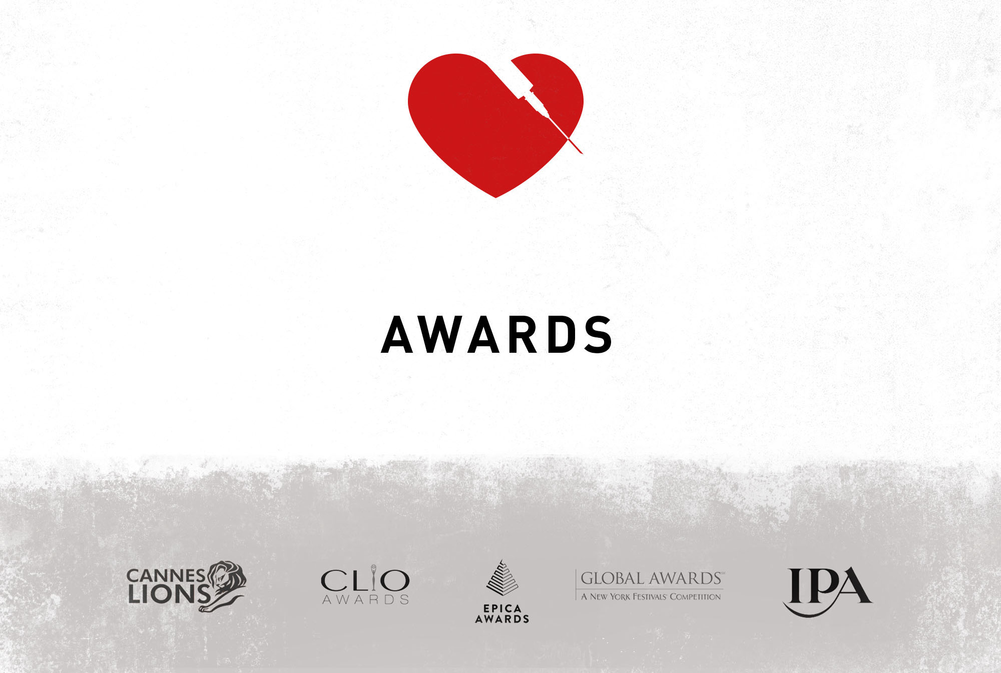
AWARDS
Cannes Lions
Bronze 2015
Outdoor Print Technique and Campaign
CLIO
Silver 2015
Outdoor Print Campaign
EPICA
Silver 2015
Print Campaign
GLOBAL
Silver 2015
Poster Campaign
IPA
Silver 2015
Print and Press Campaign