Scope
- Brand Identity
- Brand Strategy
- Creative Direction
- Packaging Design
- Digital Design
Project Overview
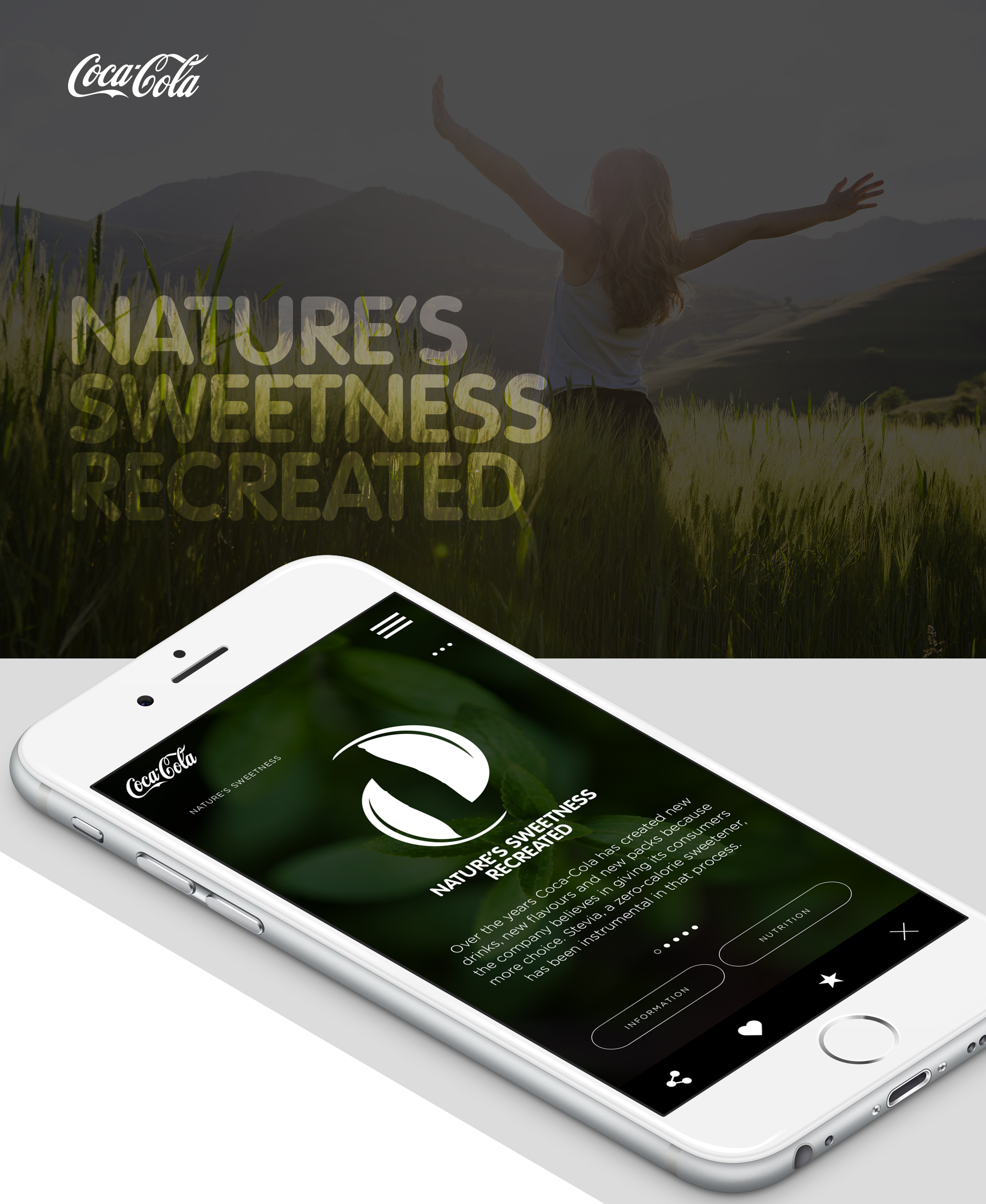
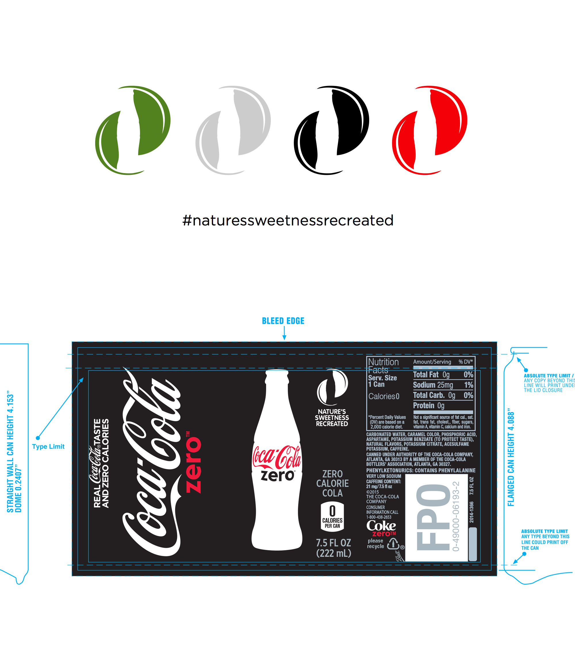
Coca-Cola announced it would undergo its first recipe change since its initial launch by reducing the amount of sugar in its drink and replacing it with stevia plant extract. The company wanted an iconic logo mark synonymous with coca cola to be created displaying this which would be a secondary symbol to go on all drinks cans, bottles and campaign materials.
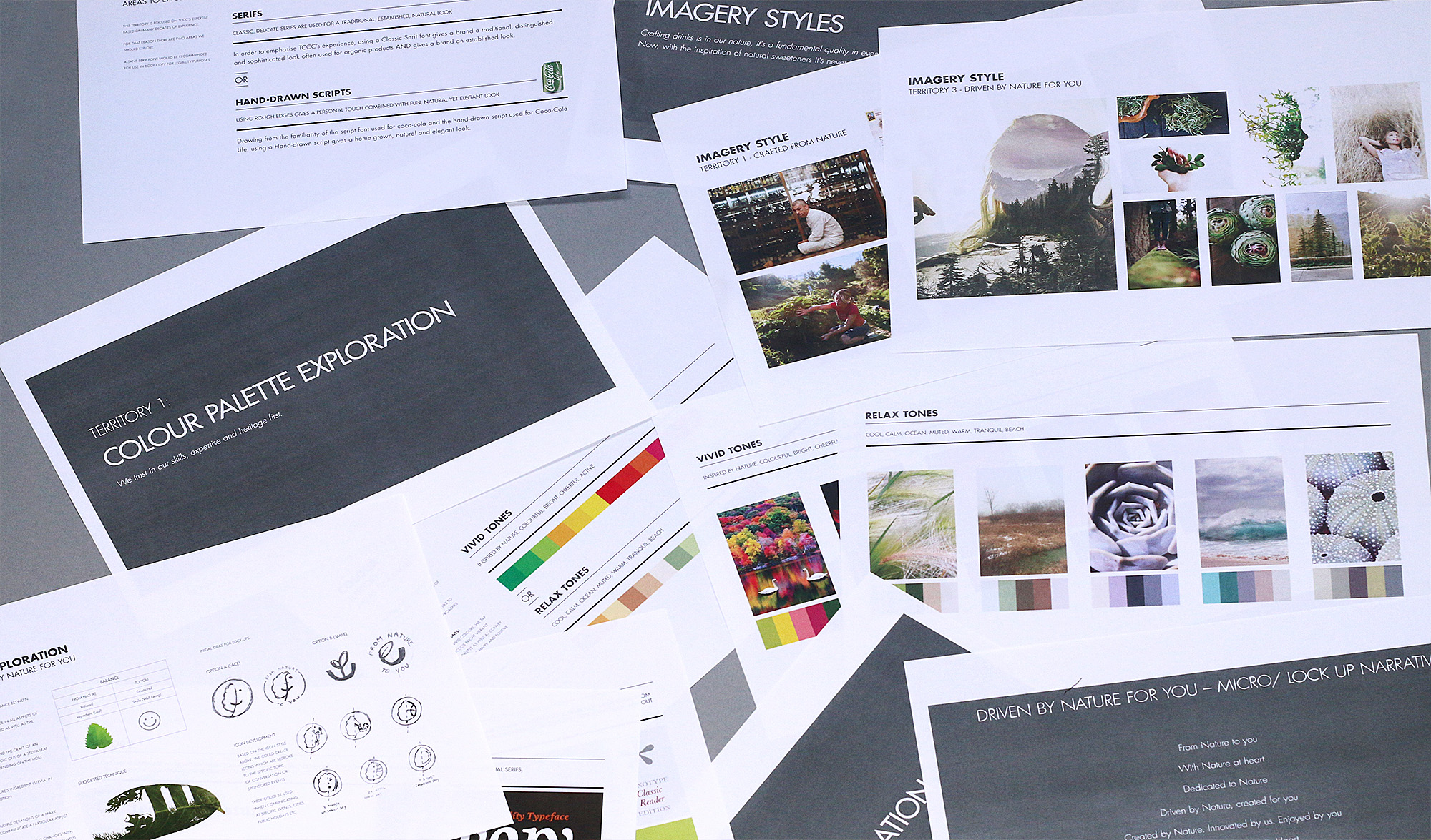
Initial Research and Concept Routes
To understand the client’s objectives, and to guide our discovery phase, we first went over the client’s research and started looking at competitors, colour analysis, typography and imagery styles.
Once we had a thorough analysis of the market, we concentrated on the core values, brand strategy, competitive advantages, and positioning of the new recipe of the brand and it still has to link back to its heritage of Coca Cola. We worked with our client using our branding exercises and meetings to create a brand brief consisting of the brand’s essence, human attributes, and key objectives. This provided a solid foundation to get to work on the project.
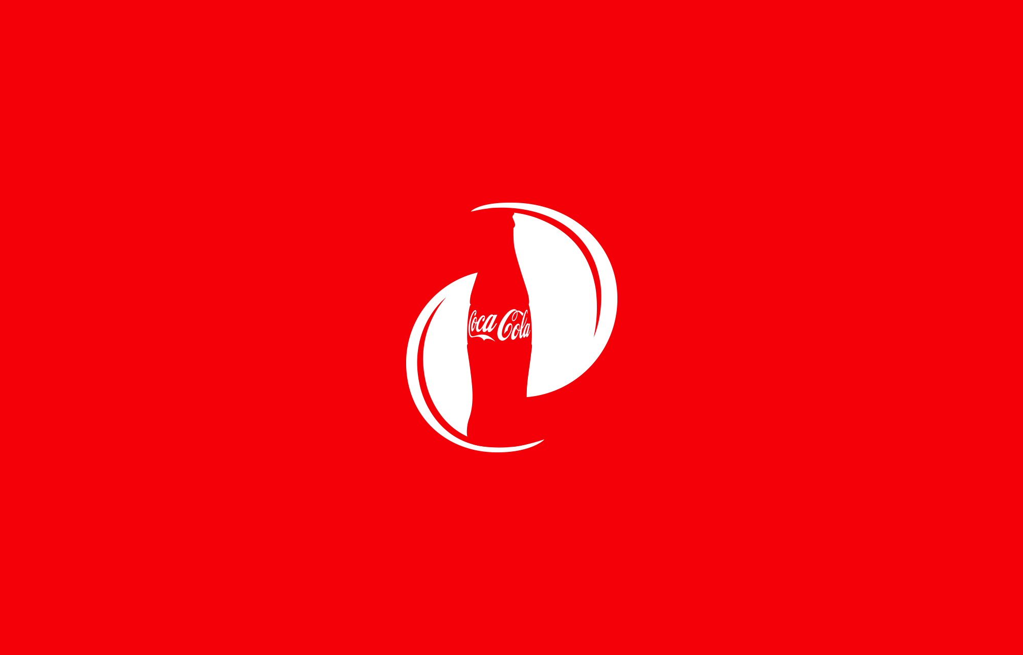
Logo Icon Mark
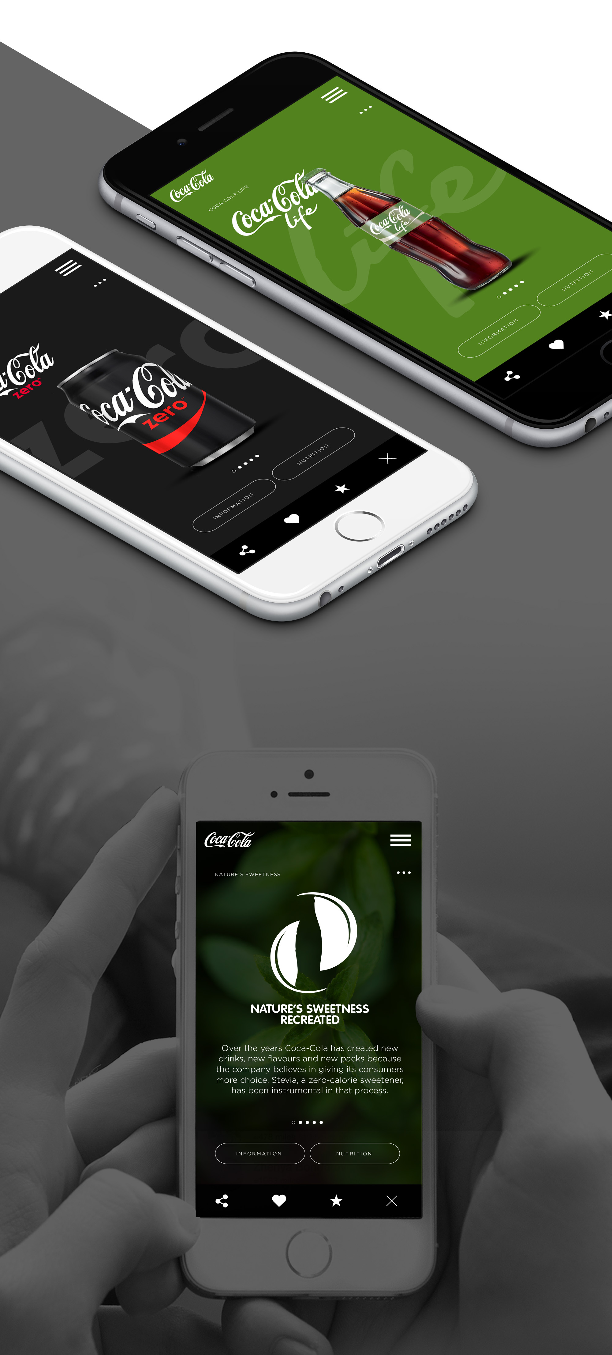
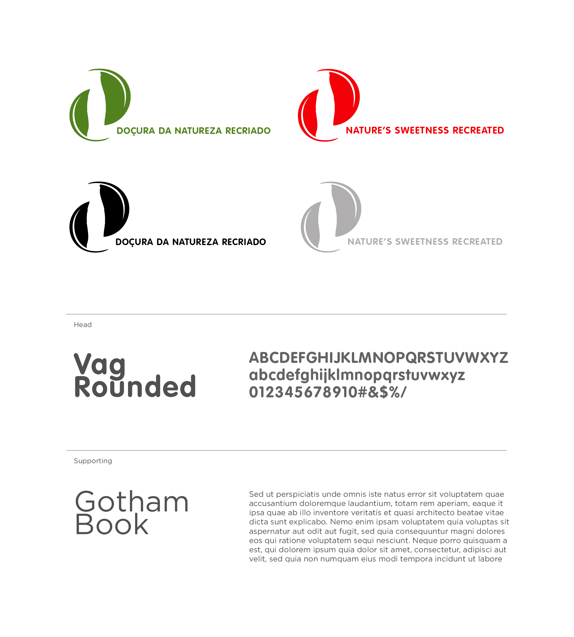
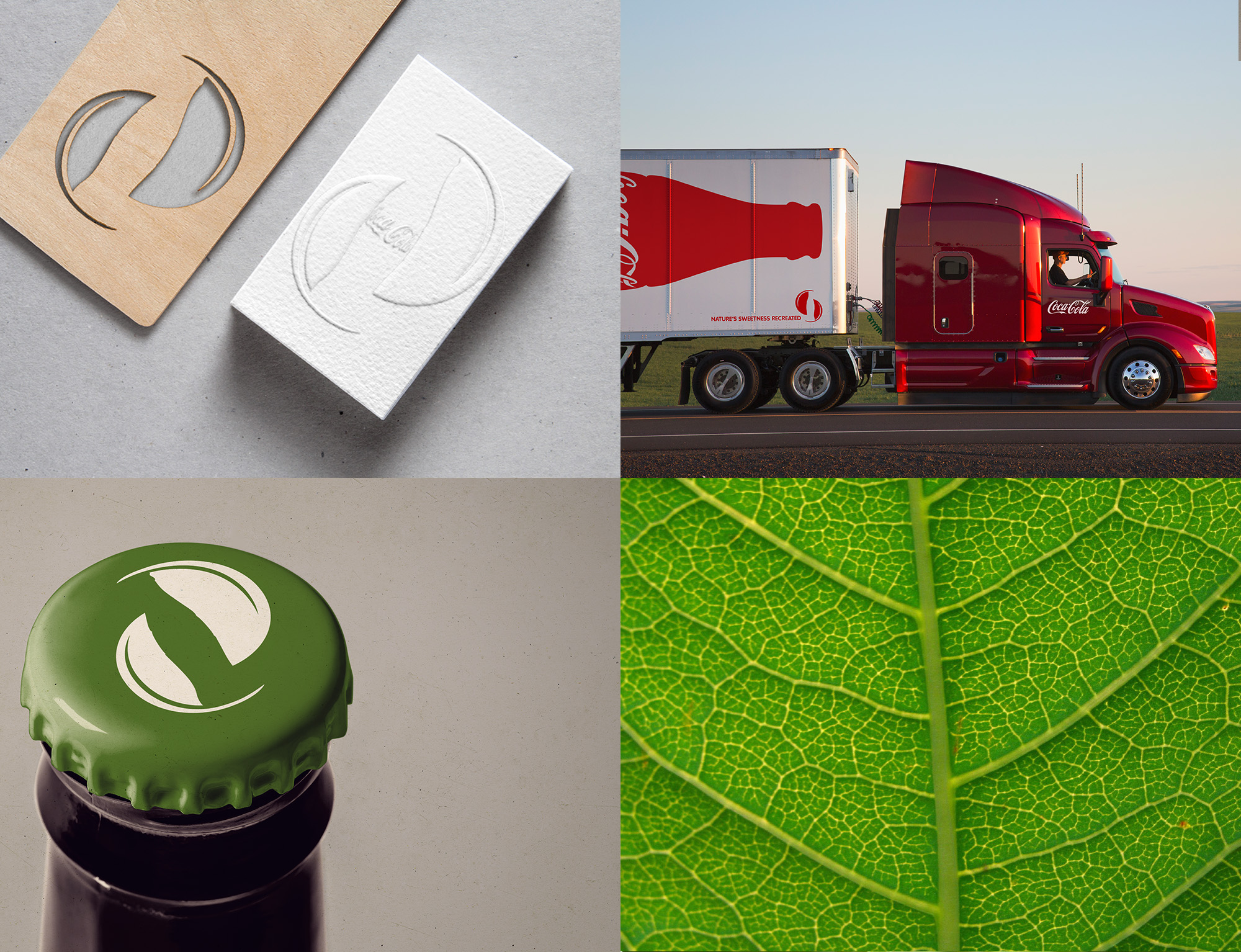
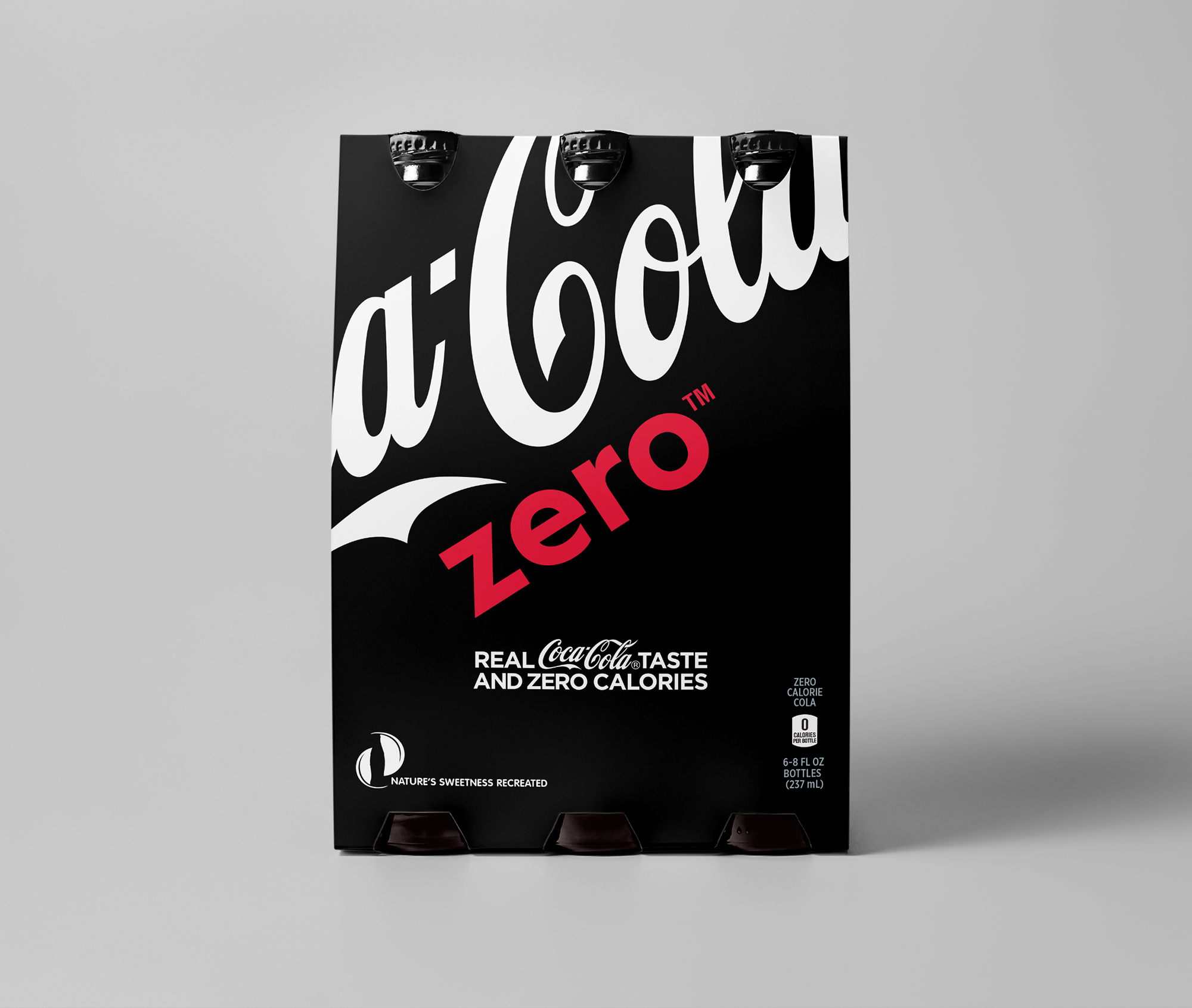
After many concepts and idea’s were drawn and sketched up the clear favourite which stood out from the rest of the concepts was the one that ticked all the boxes outlined in the brief. This being by maintaining the heritage of the brand, introduced in the form of the Coke Bottle displayed in negative space from the stevia plant extract leaves. Which forms a beautiful rounded iconic stamp which can sit either subtly or primarily on a product or page.
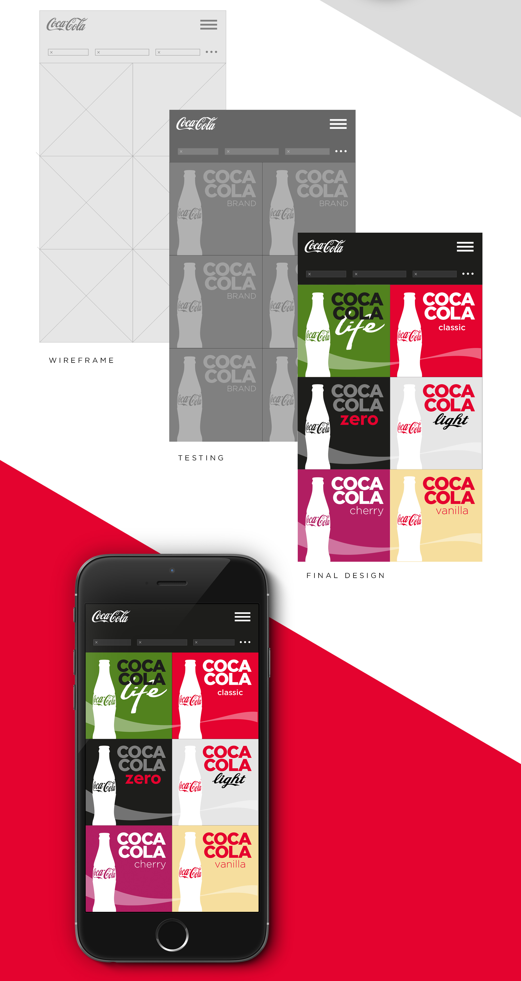
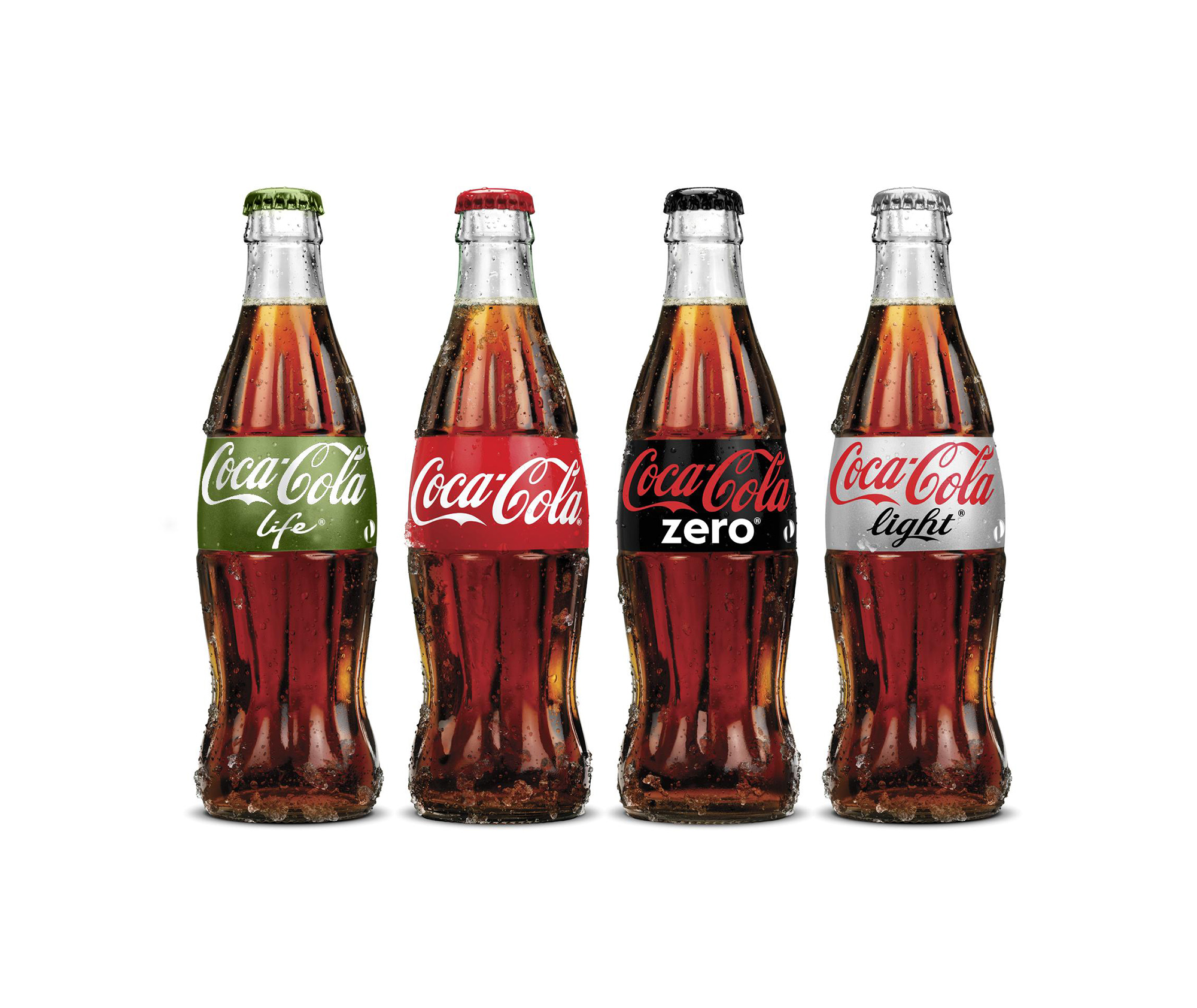
Colour and Typography
The icon mark works and can inter-change across the 4 primary coca-cola colours chosen from their palette. The typography for the ‘Nature’s Sweetness Recreated’ strapline was researched and considered to be a different typeface from the Coca-Cola chosen typefaces, however it was felt it looked to disconnected from the brand so the Coca-Cola Vag Rounded face was chosen for the streamline with the Coke Gotham typeface chosen for sub and body copy.

Campaign Test Launch
As soon as the agreed icon mark had been approved by client this went in to a testing launch phase in South America, mainly in Brazil and Argentina. The Natures Sweetness Recreated icon mark was placed on an all Coca-Cola products, bottles cans and campaign materials.

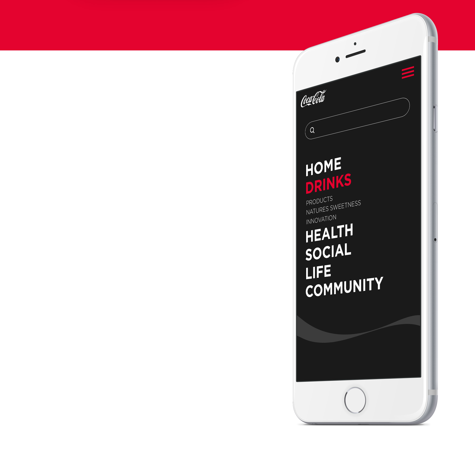
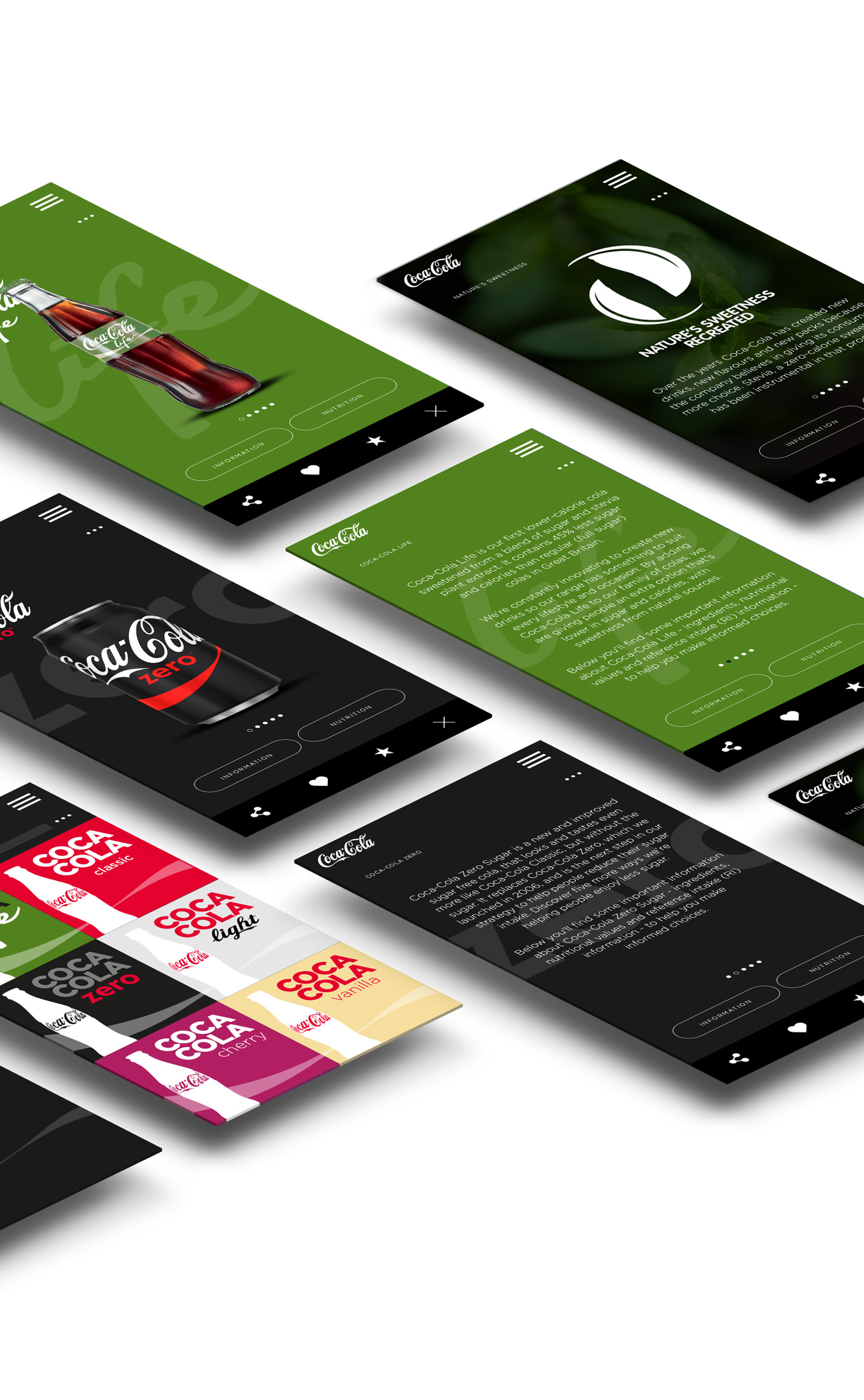
Nature’s Sweetness Recreated App
A mobile site app was designed and launched to coincide with the test launch in South America, it was mainly designed to spread the message about the new stevia plant extract, but this quickly turned into a hub containing product imagery, content and nutritional information on each of the main coca-cola brands.